B2B Accounting Brand Identity Dubai - UK

Integra Global Partners is a B2B offshore staff augmentation provider supplying dedicated, full-time bookkeepers and accountants to UK accountancy practices covering bookkeeping, payroll, VAT, year-end accounts, Making Tax Digital compliance, and tax return completion. In a sector facing genuine capacity pressure and a real shortage of qualified talent, Integra positions itself as a way for practices to scale without the overhead of hiring directly. The brief was to move offshore staffing away from its usual transactional, low-trust positioning and present it instead as a serious institutional partnership. Mike Rock Studio built the brand identity, positioning strategy, and corporate collateral to do exactly that.

The Challenge:
UK accountancy is a conservative, compliance-heavy sector, and firms evaluating an offshore outsourcing partner come to the conversation with real concerns already in mind: quality control, communication friction, data security, consistency of work. A generic-looking outsourcing brand does nothing to address those concerns if anything, it confirms them, because it looks exactly like the kind of disposable, detached service the prospect was already worried about.
The job for Integra wasn't to argue against those concerns directly. It was to look like the opposite of what a sceptical UK practice expects from an offshore provider precise, consistent, regulation-literate, and built with the same institutional seriousness as the internal teams it's supplementing. The brand needed to communicate, before a single conversation took place, that Integra's offshore accountants operate to UK standards, not a discounted version of them.

The Approach:
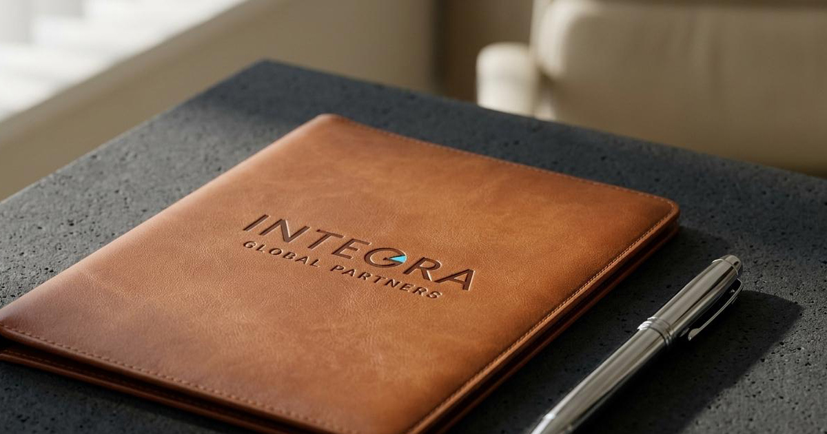
The wordmark carries the entire strategy. INTEGRA is set in a bold, customised geometric sans-serif, confident, structurally balanced, built for spatial impact on a slide or a letterhead. The detail that does the real work sits inside the counter of the G: a small, precise sky-blue triangular arrow, integrated into the letterform rather than sitting beside it. It's a quiet visual cue for forward movement and accuracy without resorting to an obvious growth-chart cliché. GLOBAL PARTNERS sits below in tightly tracked, smaller capitals, anchoring the mark with the kind of corporate stability the audience expects to see.
The colour system is unapologetically conservative by design: a deep navy-obsidian background, clean white type, and the sky-blue accent used sparingly. That's a deliberate choice for this audience - UK accountancy firms respond to the visual language of established financial institutions, not start-up energy. The palette functions as a calm, ordered backdrop for the technical material the brand actually has to carry: service capability sheets, workflow grids, onboarding documentation, where clarity matters more than personality.
The Work:
Brand Identity & System:
A complete corporate visual identity built around the customised geometric wordmark, a disciplined navy-and-sky-blue colour system, and strict typographic rules suited to the UK financial sector.
Corporate & Sales Collateral:
A set of boardroom-ready sales materials - service capability brochures, secure onboarding brief templates, data-security compliance decks, and corporate stationery built for the practices evaluating Integra as a partner.
B2B Brand Guidelines:
A guidelines document covering layout, typographic hierarchy, and icon usage, built to keep the identity consistent across offices, digital client portals, and corporate communications as the firm scales.

The Outcome
Integra Global Partners entered the UK accounting support market with a brand that doesn't read like a discount outsourcing service. The precise geometric wordmark and disciplined navy palette put the firm visually in line with the established accounting houses it's trying to win business from which is exactly the credibility a sceptical, risk-averse buyer needs to see before they'll consider handing over client data and financial workflows to an offshore team.

Project Details
Services: Brand Identity Design · Corporate Collateral · Brand Guidelines
Industry: Accountancy Outsourcing · Offshore Staff Augmentation · B2B Corporate Services
Location: United Kingdom
Market: UK Accountancy Practices