Catering Equipment Brand Identity Dubai

T&J Catering Equipment Trading FZE is a hotel and bar glassware supplier operating across the food service industry, with bases in Dubai and Czechoslovakia. Sourcing and distributing professional catering equipment and glassware to the hospitality sector, the company sits at an interesting intersection: a technically specialist B2B supplier with European manufacturing roots and a Middle Eastern trading presence. Mike Rock Studio built the brand identity, digital presence, and collateral for a business that needed to communicate quality, reliability, and the specific credibility of a supplier trusted by professional hospitality operations.
The Challenge:
B2B catering and equipment suppliers occupy a category that has historically received very little creative investment. Most operate with functional, utilitarian identities that communicate nothing beyond what the company sells. For a supplier of hotel and bar glassware in particular, this is a missed opportunity: the products themselves are objects of genuine design quality, chosen by hospitality buyers who care deeply about how a glass looks on a table and how it feels in a customer's hand. A brand that reflects that care earns a different kind of consideration from its buyers than one that treats its own presentation as an afterthought.
T&J needed an identity that communicated the quality and professionalism of its product range to a food service industry audience spanning Dubai's hospitality sector and European markets, working from two geographically distant operational bases without losing coherence.
The Approach:
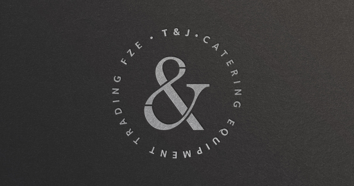
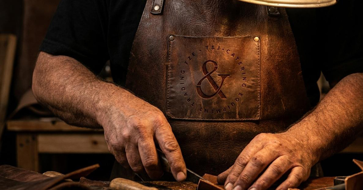
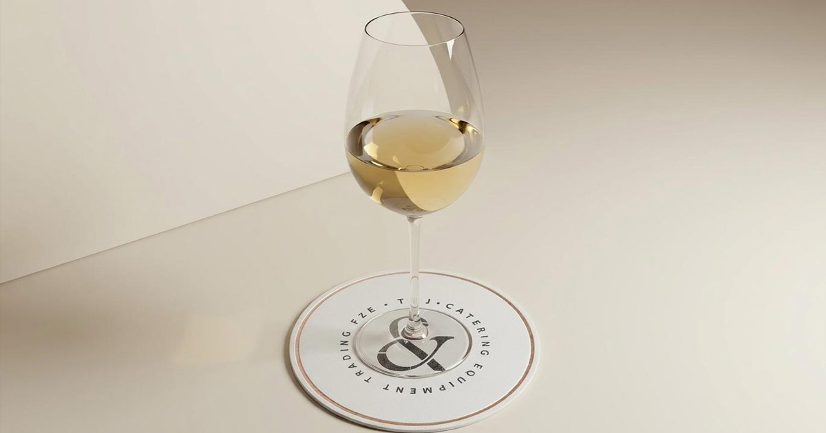
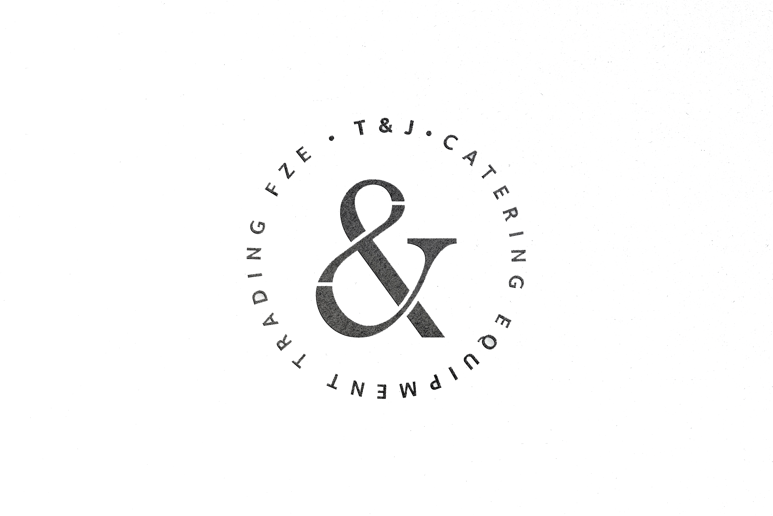
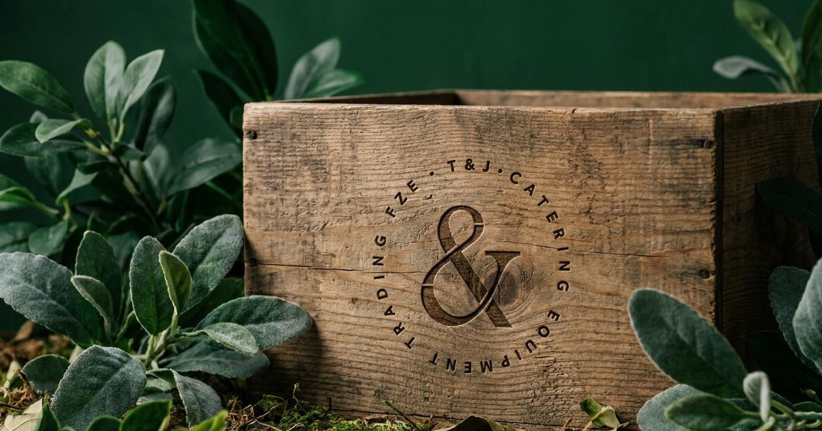
The mark is the case study. The T&J monogram is built around the ampersand, the & that sits between the two founding partners' initials, rendered in a bold, classical serif that carries the weight and authority of a professional trade mark. The circular typographic arrangement of the full company name around the central mark references the tradition of trade seals and professional stamps, the visual language of suppliers who have been trusted for a long time, applied to a contemporary business with genuine ambition.
The ampersand as the primary mark rather than the initials themselves was the right creative decision for a business defined by partnership: between T and J, between Dubai and Czechoslovakia, between European manufacturing expertise and Middle Eastern market access. The mark communicates that relationship before the company name is read.
The visual identity was built for the specific contexts in which T&J makes its case to buyers: trade catalogues, corporate presentations, digital communications, and the physical collateral of a professional supplier. Clean, authoritative, and built to hold its own alongside the premium product ranges it represents.
The Work:
Brand Identity:
A complete visual identity for T&J Catering Equipment built around the TJ ampersand monogram, circular typographic mark, and the brand language of a professional B2B catering and glassware supplier with dual European and Middle Eastern operations.
Digital:
A digital presence built for T&J's food service industry audience, carrying the brand's professional authority into the online channels where buyers research and evaluate suppliers.
Collateral:
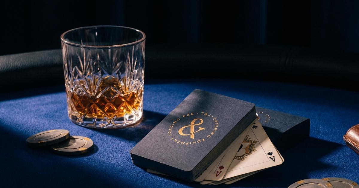
A suite of corporate materials for T&J's trade communications, presentations, and client-facing documentation, ensuring the brand's quality signal is consistent across every professional interaction.
The Outcome:
T&J Catering Equipment has a brand identity that communicates the professionalism and product quality of a serious hospitality supplier. The circular monogram mark gives the company a distinctive and memorable presence in a category where most competitors look generic, and the consistent application across digital and collateral ensures that T&J looks like the calibre of supplier its product range represents.
Project Details:
Services: Brand Identity, Logomark, Digital, Collateral
Industry: Catering Equipment, Glassware, HORECA Supply, Food Service
Location: Dubai, UAE · Czechoslovakia
Market: UAE Hospitality, GCC Food Service, European Catering Industry