Dubai Coffee Brand Identity
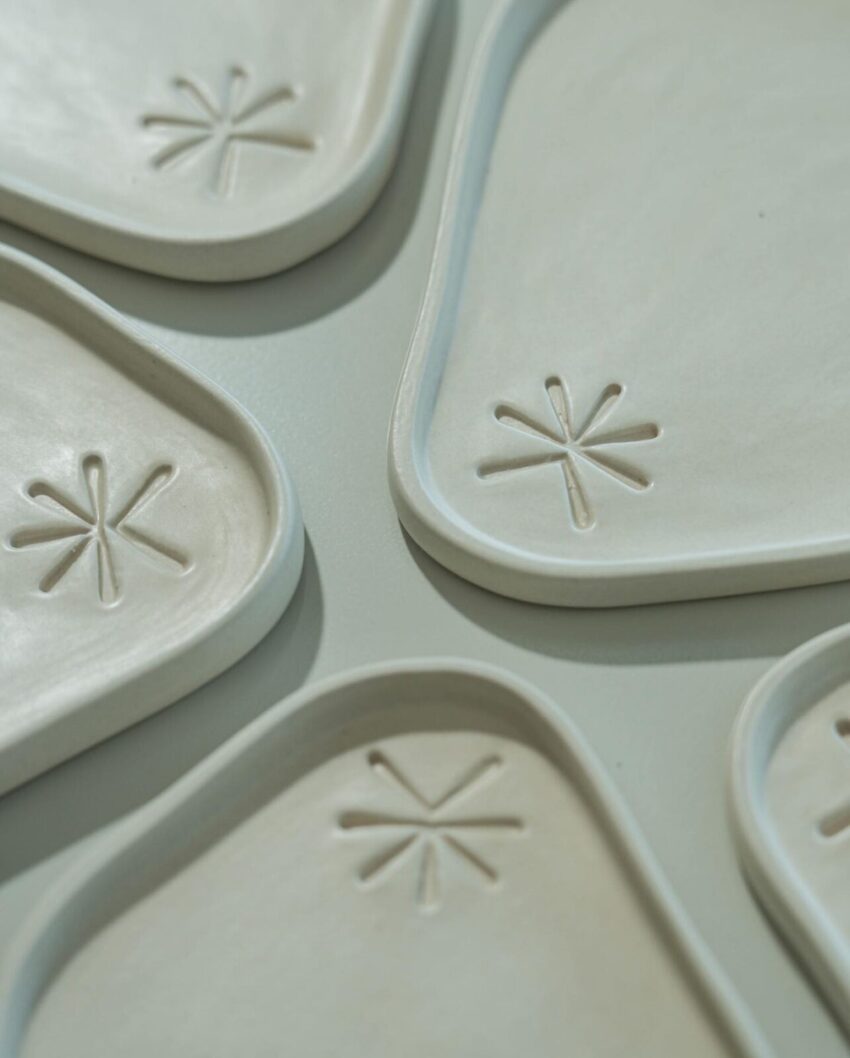
Ile Dubai Coffee is a specialty coffee brand built around a specific and genuinely interesting tension: the modern world of contemporary coffee culture and the nostalgia of traditional coffee ritual. Not a heritage brand performing modernity, and not a trend-led brand performing tradition, something that holds both honestly, in the same cup. Mike Rock Studio built the complete brand from scratch, delivering identity, packaging, print, stationery, and art direction for a coffee brand with genuine ambition to become a daily ritual for a new generation of Dubai coffee drinkers.

The Challenge:
Dubai's coffee market has matured rapidly. Specialty coffee is now a mainstream expectation rather than a niche preference, and the visual landscape that has grown with it tends toward two poles: the aggressively contemporary (clean geometric marks, cold palettes, the aesthetic of a Scandinavian roastery) or the self-consciously heritage (warm sepia, vintage type, the performance of age). For a brand that genuinely wanted to occupy the space between those two registers, neither was an honest option.
Ile Dubai Coffee also needed to speak to a genuinely broad audience, from the casual sipper to the serious connoisseur, without flattening the brand into the generic middle ground that tries to please everyone and ends up interesting to nobody. The packaging had to carry an eco-conscious, minimalist design ethos that reduced waste without sacrificing the premium quality signal that a specialty coffee audience expects.
The Approach:
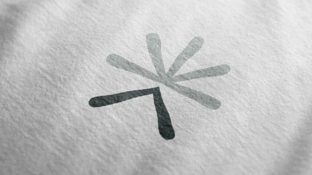
The logomark drew on ancient coffee symbols as its starting point, but the direction was always forward. The brief described the rebrand as giving a traditional icon a sleek makeover, and that's the right way to think about it: the mark carries the depth and cultural weight of coffee's long history, but it reads as clean and contemporary rather than nostalgic. The two registers coexist rather than compromise.
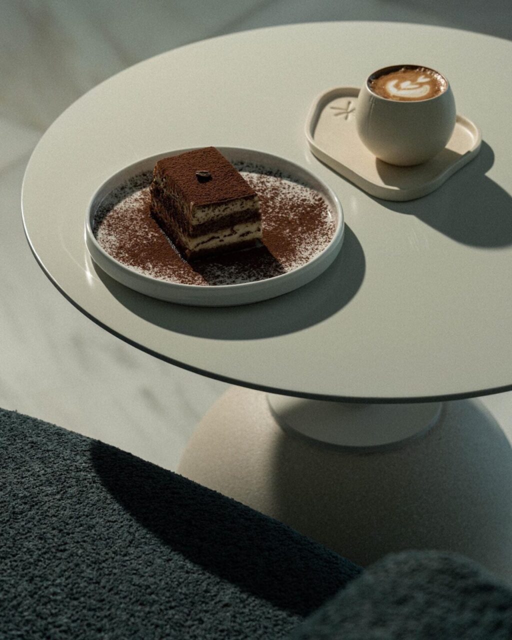
The palette came directly from the material itself. Earthy tones drawn from coffee beans at different roast levels, warm without being retro, grounded without being heavy. The result is a colour system that communicates warmth and comfort while feeling entirely current, which is the specific quality Ile Dubai Coffee needed to carry into both the specialty coffee environment and the broader consumer market.
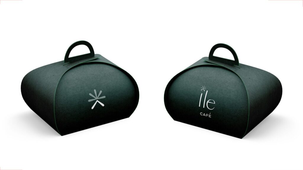
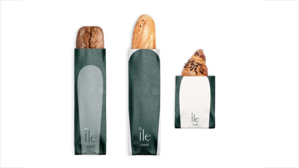
Packaging was developed with eco-friendly materials and a minimalist design language that reduces waste without the visual austerity that can make sustainable packaging feel like a sacrifice. The print and stationery system extended the same considered approach into every physical touchpoint, building a brand presence that felt consistent whether encountered on a café shelf, in a gifting context, or across the full suite of daily business communications.
The Work:
Brand Identity:
A complete visual identity for Ile Dubai Coffee, logomark rooted in coffee heritage and refined for a contemporary audience, earthy palette, and a visual language that holds tradition and modernity without choosing between them.

Packaging:
Eco-friendly packaging with a minimalist design, developed to carry the brand's premium positioning and sustainability values across the full product range, from everyday blends to the full spectrum of specialty coffee offerings.

Print & Stationery:
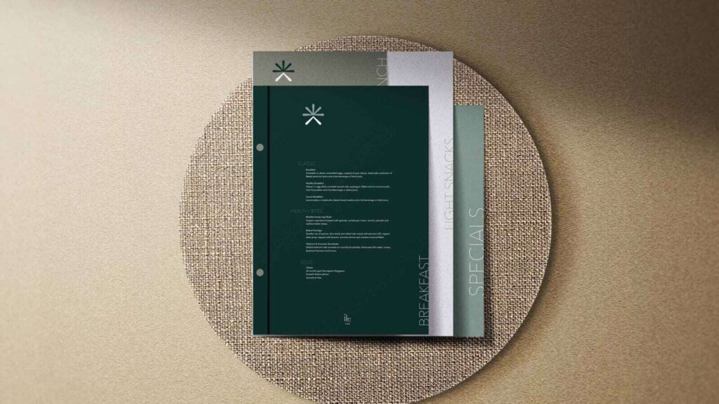
A complete suite of print materials and branded stationery, carrying the Ile Dubai Coffee identity consistently across every physical brand touchpoint, from café collateral to business communications.

Art Direction:
Visual direction establishing how the brand looks and feels across photography, layout, and the wider brand world, giving the brand a consistent sensory presence beyond the logomark.


The Outcome:
Ile Dubai Coffee launched with a brand identity that does the specific thing its brief asked for: it holds coffee's past and present in the same visual system without either register undermining the other. The earthy palette and heritage-informed mark give the brand warmth and depth, while the clean, minimalist execution keeps it firmly in the present. A coffee brand built to become a daily ritual, with an identity that earns that place.
Project Details:
Services: Brand Identity, Logomark, Packaging, Print, Stationery, Art Direction
Industry: Specialty Coffee, Food and Beverage, Hospitality
Location: Dubai, UAE
Market: Dubai Coffee Market, GCC Specialty Coffee, Consumer F&B