Dubai Photography Studio Brand
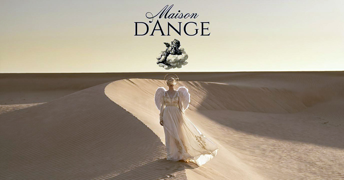
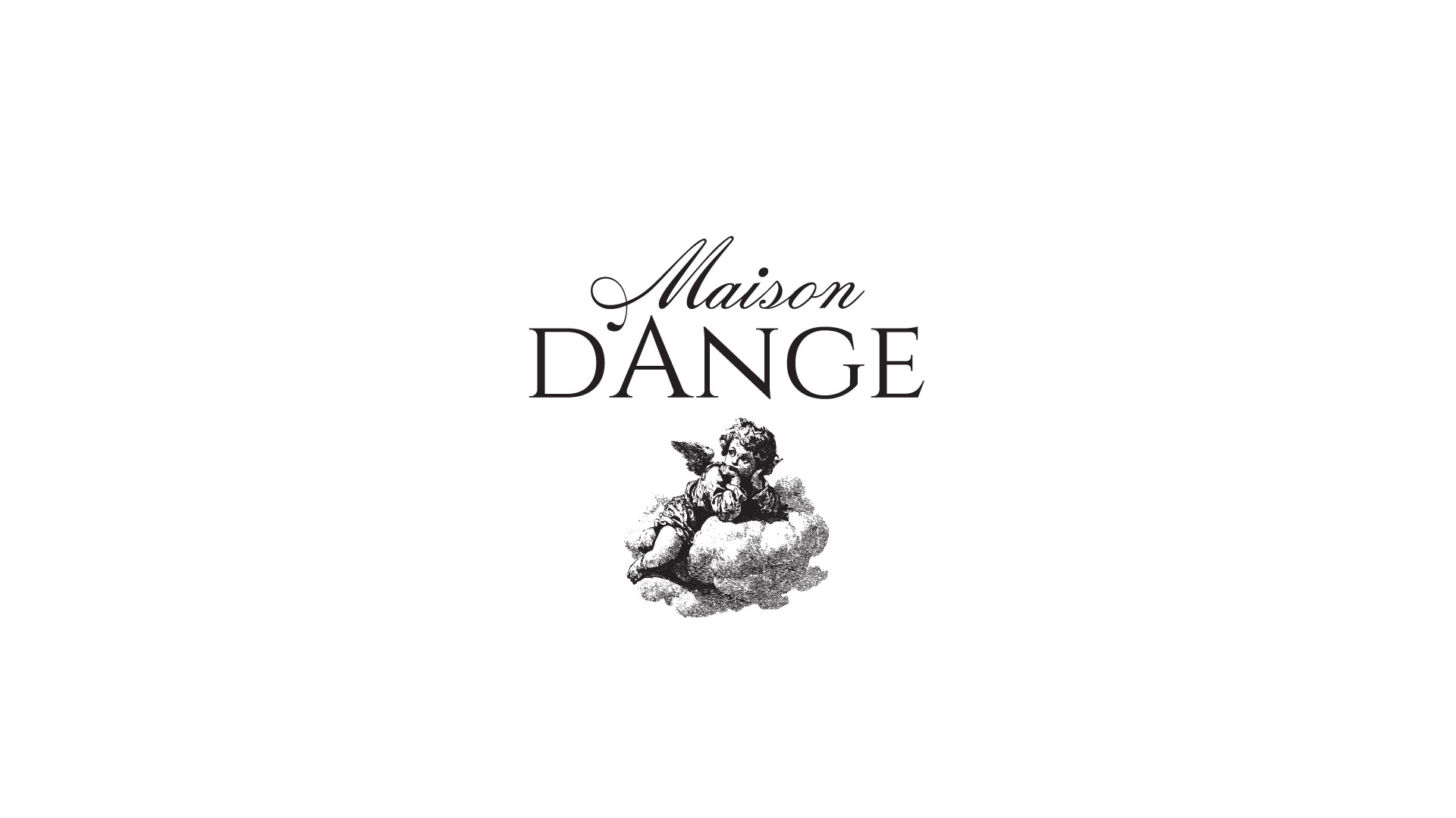
Maison D'Ange is a fine art family portrait studio in Dubai, built around the belief that a family photograph should be more than a record of a moment. It should be an heirloom. The name, House of Angels, gave the brand its entire creative direction: cherubim iconography, the sacred quality of classical portraiture, a visual language drawn from illuminated manuscripts and historical fine art rather than the contemporary photography studio conventions of clean backgrounds and modern sans-serifs. Mike Rock Studio built the brand identity and guidelines for a studio that needed to communicate reverence, artistry, and the specific emotional weight of a photograph worth framing and keeping for generations.
The Challenge:
The luxury photography market in Dubai is competitive and visually homogeneous. Most studios at the premium end of the market have adopted the same aesthetic: minimal, modern, cool-toned, a visual language borrowed from high-end fashion and applied to family portraiture. For a studio whose entire proposition is the opposite of that, the challenge was building an identity that stood clearly apart without feeling theatrical or costume-like.
The secondary challenge was communicating an emotional and spiritual message, the sacredness of family, the idea of children as things worth protecting and preserving, to a multicultural, high-net-worth Dubai audience that spans many different cultural backgrounds. The iconography needed to carry universal resonance rather than referencing a specific tradition too narrowly.
The Approach:
The creative strategy centred on historical reverence. Rather than treating classical art references as decoration, the brief treated them as the structural logic of the entire identity system. The cherubim, those guardian figures that appear across Renaissance painting, Byzantine iconography, and sacred manuscript illumination, are among the most universally recognised symbols of innocence, beauty, and protection. For a studio dedicated to photographing children and families, the choice was not arbitrary. It was the most honest possible visual statement of what the studio believes its work is for.
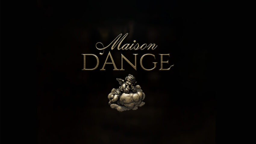
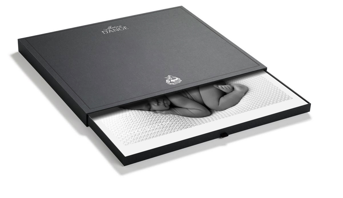
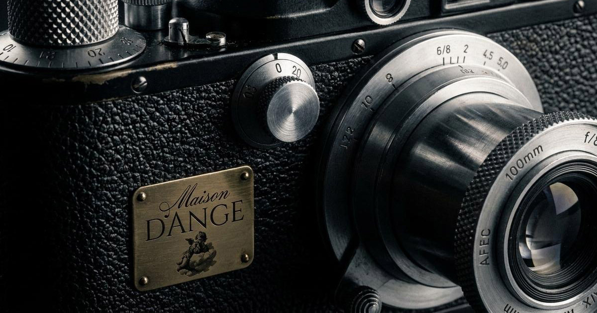
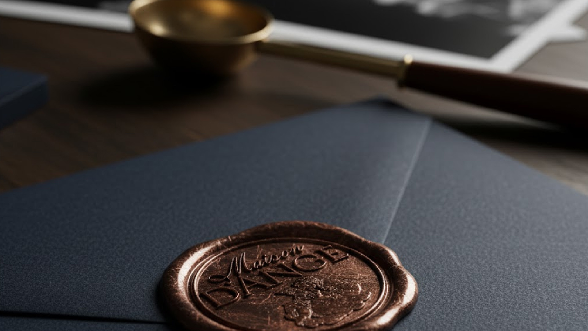
The cherubim-inspired monogram functions as a seal of quality and protection across every application, from the studio's stationery to the physical packaging that delivers a client's final portraits. Typography was selected for its historical manuscript reference, high-contrast serif letterforms with spacious kerning that reads as both antique and luxurious. The palette of aged gold, gentle ivory, and soft neutrals mimics the specific quality of vintage film and sacred art, warm and timeless rather than cool and clinical. Tactile packaging, wax seals and textured linen papers, extends the heirloom quality of the photography into the physical experience of receiving it.
The Work:
Brand Identity:
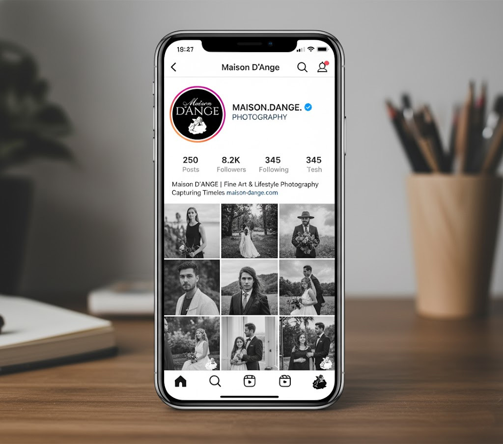
A complete visual identity for Maison D'Ange built around the cherubim-inspired monogram seal, high-contrast historical serif typography, an aged gold and ivory palette, and the visual language of a fine art portrait studio positioned as a sanctuary for family memory.
Brand Guidelines:
A comprehensive guidelines document covering every application of the Maison D'Ange identity, from the studio environment and client communications to the physical packaging that carries a family's portraits home.
The Outcome:
Maison D'Ange launched with a brand identity that occupies a genuinely distinct position in Dubai's luxury photography market. The historical fine art visual language, the cherubim monogram, and the tactile, heirloom-quality packaging set the studio apart from the modern minimal aesthetic that dominates the sector, and communicate to a high-net-worth multicultural audience that this is a studio that takes the weight of its work seriously.
A house of angels. A brand that feels like one.
Project Details:
Services: Brand Identity, Logomark, Brand Guidelines
Industry: Fine Art Photography, Family Portraiture, Luxury Creative Services
Location: Dubai, UAE
Market: Dubai Luxury, High-Net-Worth Families, GCC Premium Photography