Startup City Brand Identity Caribbean
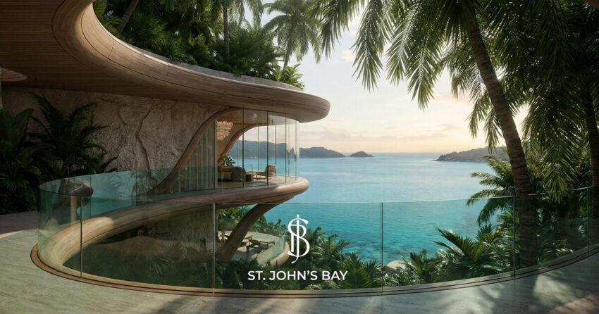
St. John's Bay is not a resort. It is not a co-working space. It is not a tech campus. It is something that has rarely been attempted before: a startup city, a fully conceived, purpose-built innovation community on the Caribbean island of Roatán, Honduras, operating within the Prospera special economic zone. Its ambition is to become the world's foremost innovative startup city: a place where entrepreneurs, investors, remote workers, and builders of all kinds can live, work, and create within one of the most naturally extraordinary environments on the planet. Mike Rock Studio was commissioned to build the complete brand — strategy, identity, digital, and collateral for a project that required a visual language as ambitious and unprecedented as the concept itself.

The Challenge
Branding a startup city is a category of brief that has almost no established precedent. The closest references - tech campuses, innovation hubs, island resorts, special economic zones - each capture a fragment of what St. John's Bay is, but none of them capture all of it. A brand built too close to any one of those references would misrepresent the whole.
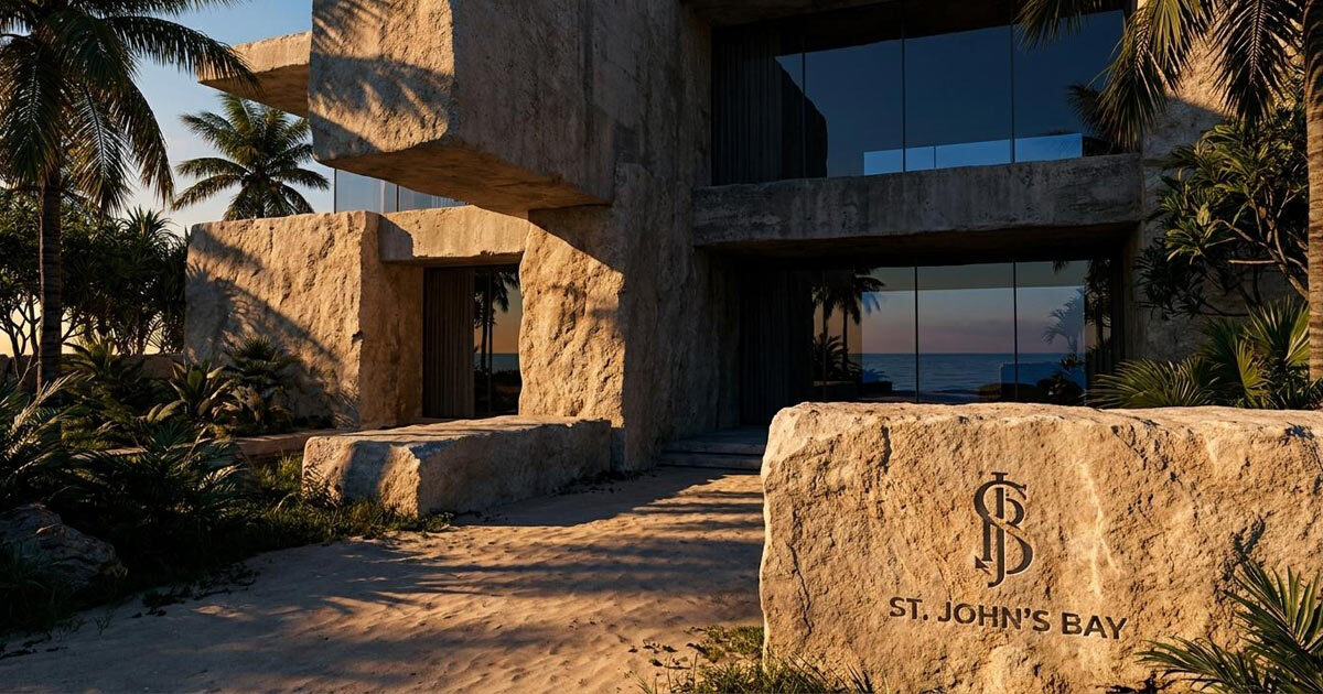
The audience made the challenge more complex still. St. John's Bay needed to speak simultaneously to tech entrepreneurs and startup founders evaluating where to build their next company, impact investors and venture capital looking for the next significant opportunity, and remote workers and digital nomads seeking a place that offers genuine community alongside natural beauty. These are not the same person, and they are not persuaded by the same things - yet the brand needed to resonate authentically with all of them without feeling like it was trying to be everything to everyone.
The location added a final layer of creative possibility. Roatán is a Caribbean island of genuine natural beauty: coral reefs, tropical landscape, extraordinary light. That environment was not incidental to the brief; it was foundational to what makes St. John's Bay different from every other innovation community in the world. The brand needed to honour the island without being consumed by it.

The Approach
The strategic foundation was the tension at the heart of the concept: innovation and nature. Progress and place. The relentless forward momentum of a startup community and the deep-rooted permanence of a Caribbean island. Most brands in either of these spaces choose one register or the other: the clean, geometric language of technology, or the organic warmth of tropical living. St. John's Bay required both, working in genuine synthesis rather than uneasy compromise.

The brand strategy positioned St. John's Bay not as a destination but as a proposition: a new way of thinking about where ambitious people choose to build their lives and their companies. The tagline direction, the world's foremost innovative startup city was not a marketing claim but an accurate description of something that genuinely does not exist anywhere else. The brand's job was to make that proposition feel as real, considered, and credible as the concept deserved.
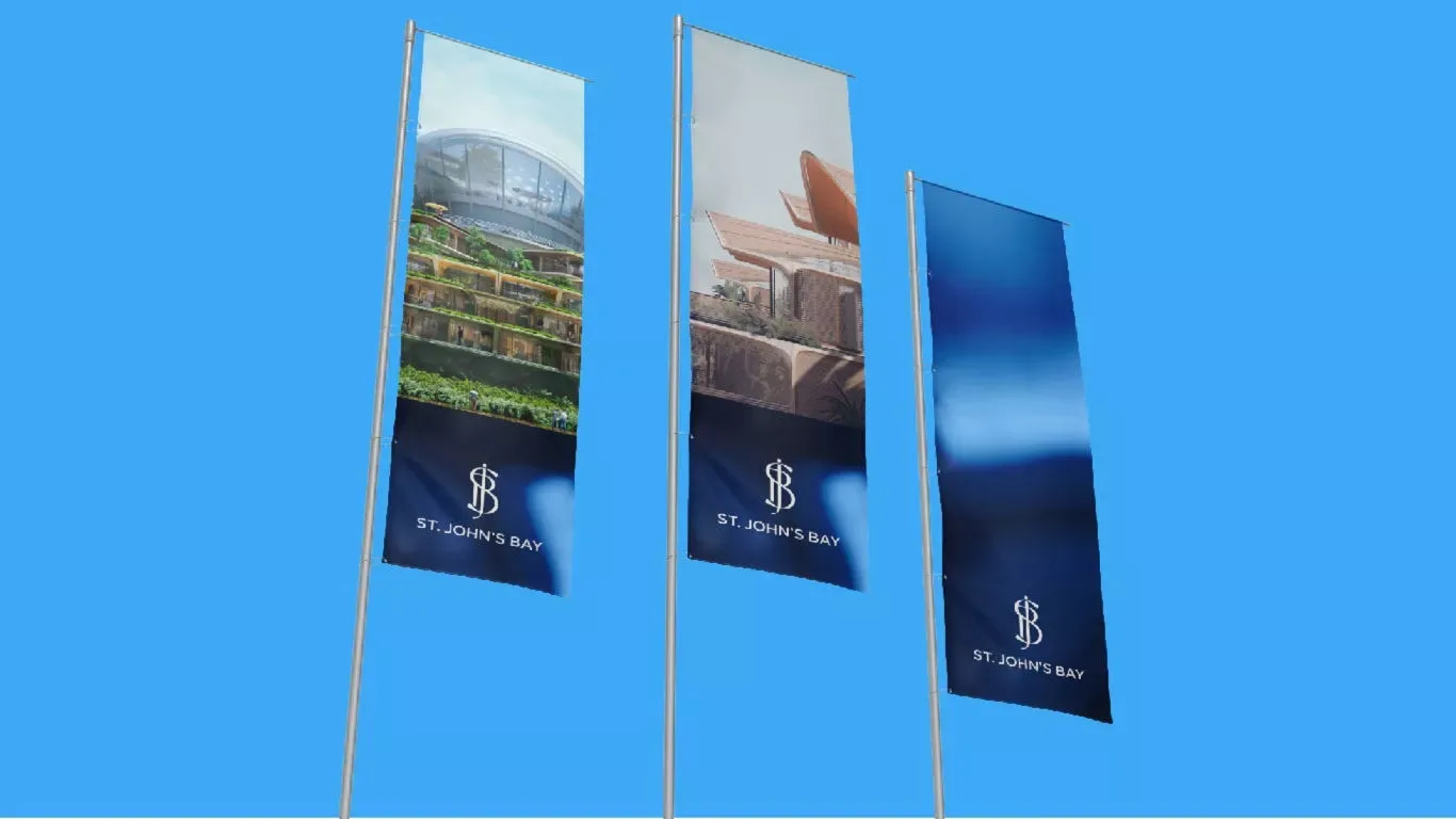
The visual identity drew on the island's tropical landscape for its colour: vibrant, specific, rooted in the natural environment of Roatán rather than generic tropical palette conventions. The logomark was designed to symbolise progress: forward movement, the dynamic energy of a community in formation, the sleek precision of a technology-forward brand. The two languages - natural and technological - were composed into a system that felt neither like a resort brand nor a tech brand, but like something genuinely new.

The digital presence and collateral were built to serve three distinct audience journeys, the entrepreneur evaluating a place to build, the investor assessing an opportunity, the remote worker imagining a different kind of daily life with enough shared visual language that all three are clearly experiencing the same brand.

The Work
Brand Strategy
A complete brand strategy defining St. John's Bay's positioning, audience architecture, and the creative platform that all subsequent design decisions were built upon. The foundation for a brand as unprecedented as the concept it represents.

Brand Identity & Guidelines
A complete visual identity system: logomark, typography, colour palette drawn from Roatán's tropical landscape, and a comprehensive brand guidelines document covering every application across digital, print, environmental, and marketing contexts.

Digital
A digital identity and web presence built to introduce St. John's Bay to a global audience of entrepreneurs, investors, and remote workers across the channels where this audience discovers, evaluates, and makes decisions about where to build their next chapter.
Collateral
A suite of brand collateral covering the full range of St. John's Bay's communications — from investor materials and pitch documentation to destination marketing and community-facing content. Every piece built on the same visual system, every piece making the same case: that this is the most compelling place in the world to do something that matters.
The Outcome
St. John's Bay launched with a brand that matches the ambition of its concept — one that communicates the rare and genuine combination of innovation, community, and natural beauty that defines the project. The visual identity is unlike anything else in either the startup city or Caribbean island space: a brand that is simultaneously rigorous enough for the investment community and vivid enough for the people who will actually choose to live there.
The world's foremost innovative startup city deserved a brand built to the same standard as its ambition. It has one.
Project Details
Services: Brand Strategy · Brand Identity · Logomark · Brand Guidelines · Digital · Collateral
Industry: Innovation · Startup Ecosystem · Special Economic Zone · Real Estate · Destination
Location: Roatán, Honduras — Caribbean
Market: Global Tech Entrepreneurs · Impact Investors · Remote Workers · Digital Nomads