UK Data Consultancy Brand Identity
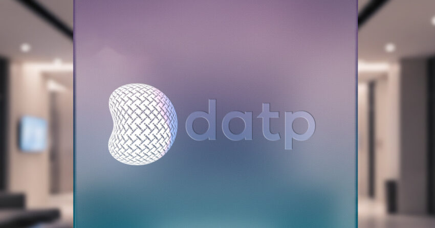
DATP is a UK-based data and analytics consultancy — a business whose value to its clients is built on three qualities that are difficult to demonstrate and easy to claim: durability, transparency, and trustworthiness. When Mike Rock Studio was commissioned to build the DATP brand identity and stationery, the brief was to find a visual foundation for those qualities that went deeper than aesthetic preference something almost archetypal, rooted in the kind of meaning that communicates before it is consciously processed. The solution was the Seed of Life: a sacred geometric pattern representing seven stages of creation, process, and methodology. For a data consultancy whose entire proposition is the rigour of its approach, it was the most honest possible foundation.
The Challenge:
Data and analytics consultancies face a particular brand identity challenge: their product is invisible. Unlike a manufactured good or a physical service, the value a data consultancy delivers, the insight, the methodology, the quality of analysis cannot be seen directly. It has to be communicated through signals that build trust before a client has experienced the work firsthand.
DATP needed a brand that communicated durability, transparency, and trustworthiness to a UK business market that is sophisticated, sceptical of empty claims, and highly sensitive to the difference between a consultancy that performs credibility and one that embodies it. Generic technology branding: abstract marks, gradient palettes, the visual language of innovation-as-aesthetic would signal precisely the wrong things to this audience. The brief demanded something more grounded, more considered, and more structurally honest.
The Approach:
The Seed of Life is one of the oldest geometric patterns in human visual culture found across traditions, geographies, and millennia, always carrying the same essential meaning: creation through process, the emergence of complexity from a set of defined, repeating steps. For a data consultancy built on procedural rigour and methodological discipline, the connection was not decorative. It was structural.
Seven circles, each intersecting with the next, each step dependent on the one before it, the geometry of the Seed of Life is a precise visual analogy for how DATP works: stage by stage, with transparency at every intersection, building something reliable and durable from a disciplined sequence of decisions. The identity was crafted to make that methodology visible in the mark itself, so that a client encountering the DATP brand for the first time encounters not just a logo, but a statement of how the company operates.
The stationery system extended that precision into the physical touchpoints of the consultancy, materials that carry the brand's visual intelligence into every client interaction, from a first meeting to the documentation supporting a completed engagement.
The Work:
Brand Identity:
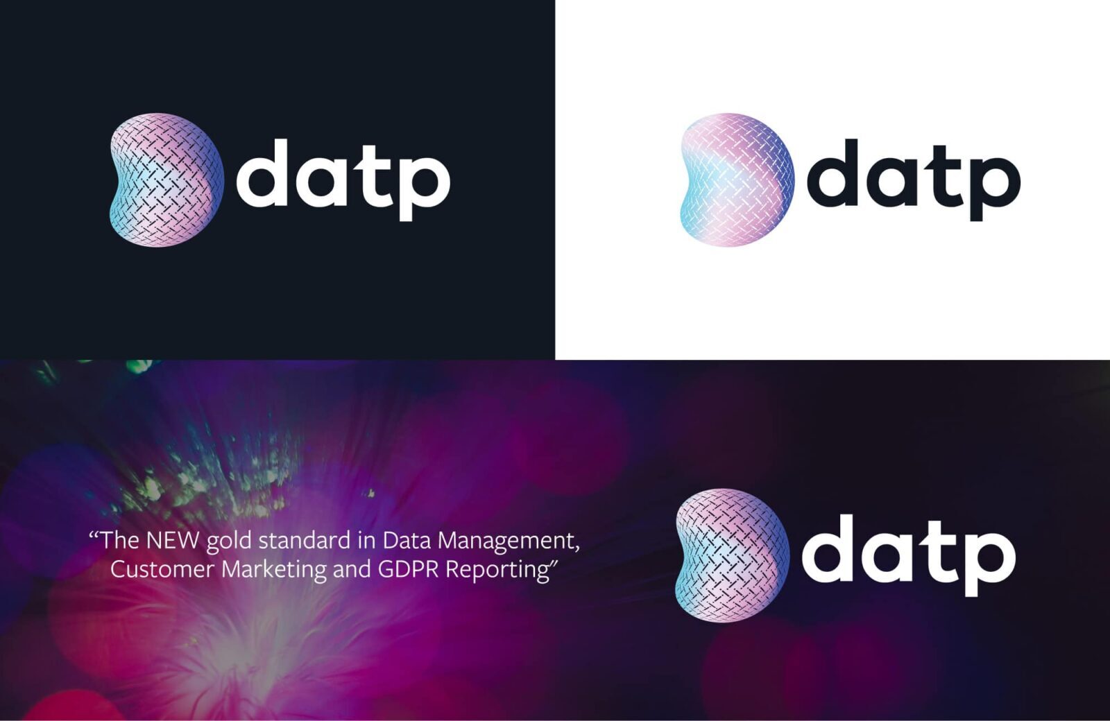
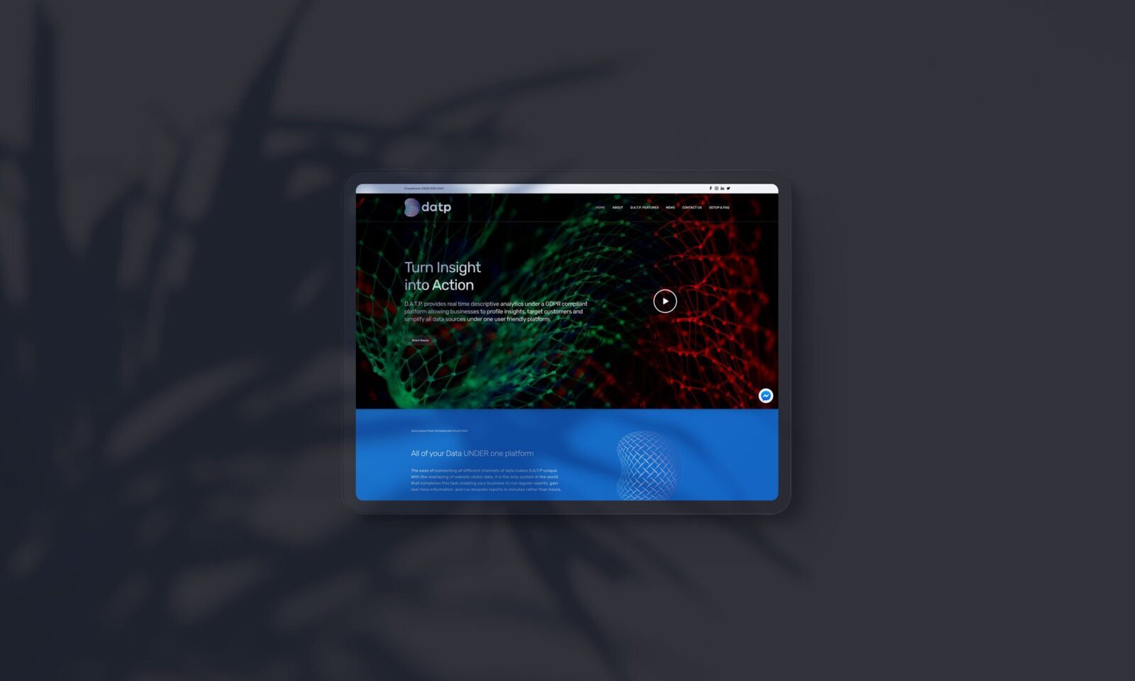
A complete visual identity for DATP: logomark derived from the Seed of Life geometric pattern, typography, colour system, and the visual language of a UK data consultancy built on durability, transparency, and methodological rigour. Archetypal in its foundation, authoritative in its execution.
Stationery:
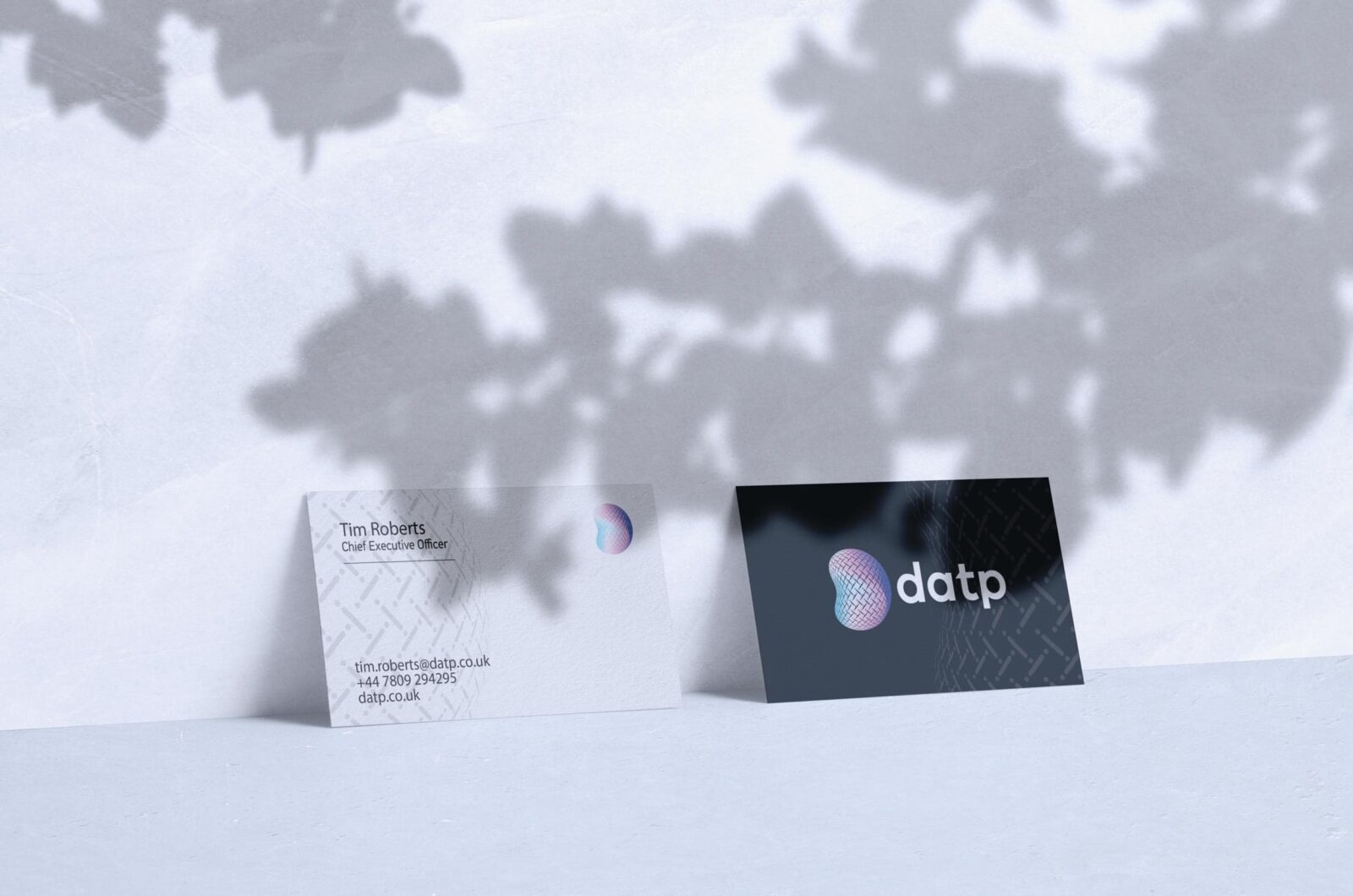
A stationery system developed for DATP's client-facing communications carrying the brand's visual intelligence and the precision of its identity into every professional interaction.
The Outcome:
DATP has a brand identity that communicates its core proposition before a word of the consultancy's offering is read. The Seed of Life mark is immediately distinctive in the UK data and analytics market deeply considered, structurally meaningful, and unlike anything a competitor could claim by accident. The identity embodies the three qualities the brief demanded: durable, transparent, and trustworthy. Not as claims. As design decisions.
Project Details:
Services: Brand Identity · Logomark · Stationery
Industry: Data & Analytics · Consultancy · Technology
Location: United Kingdom
Market: UK Data & Analytics · British Technology Sector