Aesthetics Clinic Brand Identity Birmingham
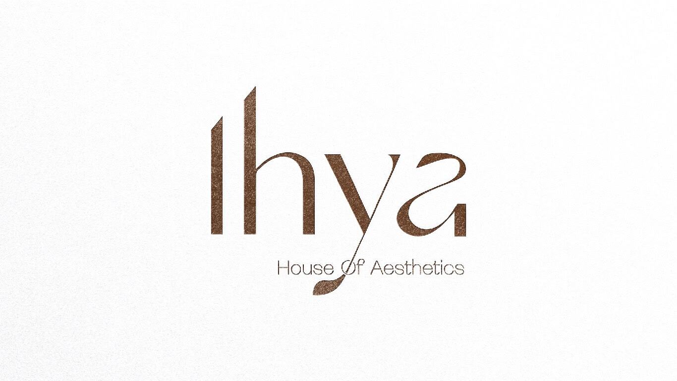
Ihya from the Arabic, meaning revival, restoration, the act of bringing something back to life is a House of Aesthetics based in Birmingham, UK, offering a holistic approach to cosmetic augmentation that considers not just the face and body, but the mind. Its treatments span HydraFacial, non-surgical face-lifts, body sculpting, hair restoration, skin rejuvenation, laser hair reduction, and anti-wrinkle therapies but the proposition is larger than any individual treatment: a journey of physical and emotional rejuvenation, undertaken in a clinic that understands the connection between how we look and how we feel. Mike Rock Studio built the complete brand: identity, signage, digital, and collateral for a clinic whose name contains its entire philosophy.
The Challenge:
The aesthetics and cosmetic clinic market in the UK is crowded, competitive, and increasingly scrutinised. Patients choosing a clinic for treatments that range from non-invasive skin therapies to needle-based augmentation are making decisions that are simultaneously emotional and clinical they need to trust the practitioner, believe in the results, and feel that the environment they are walking into is safe, considered, and genuinely invested in their wellbeing. A brand that prioritises aesthetics over credibility, or warmth over clinical authority, fails the patient at the most important moment.
Ihya's positioning: holistic, philosophy-led, mind-body in its approach set it apart from the majority of UK aesthetics clinics, which present themselves either as medical practices (clinical, cold, transactional) or as beauty destinations (soft, aspirational, light on substance). Ihya was neither. The creative challenge was building a brand identity that communicated genuine clinical credibility and the depth of a wellness philosophy simultaneously typographic in its approach, abstract and surreal in its icon, and resolved enough to carry both registers without contradiction.
The Approach:
The name was the beginning and the end of the creative strategy. Ihya revival. It is one of the most loaded words in the Arabic tradition: not merely restoration but transformation, the return of vitality to something that had diminished. As a name for an aesthetics clinic, it reframes the entire category this is not a place you visit to fix something, but a place you enter to be renewed.
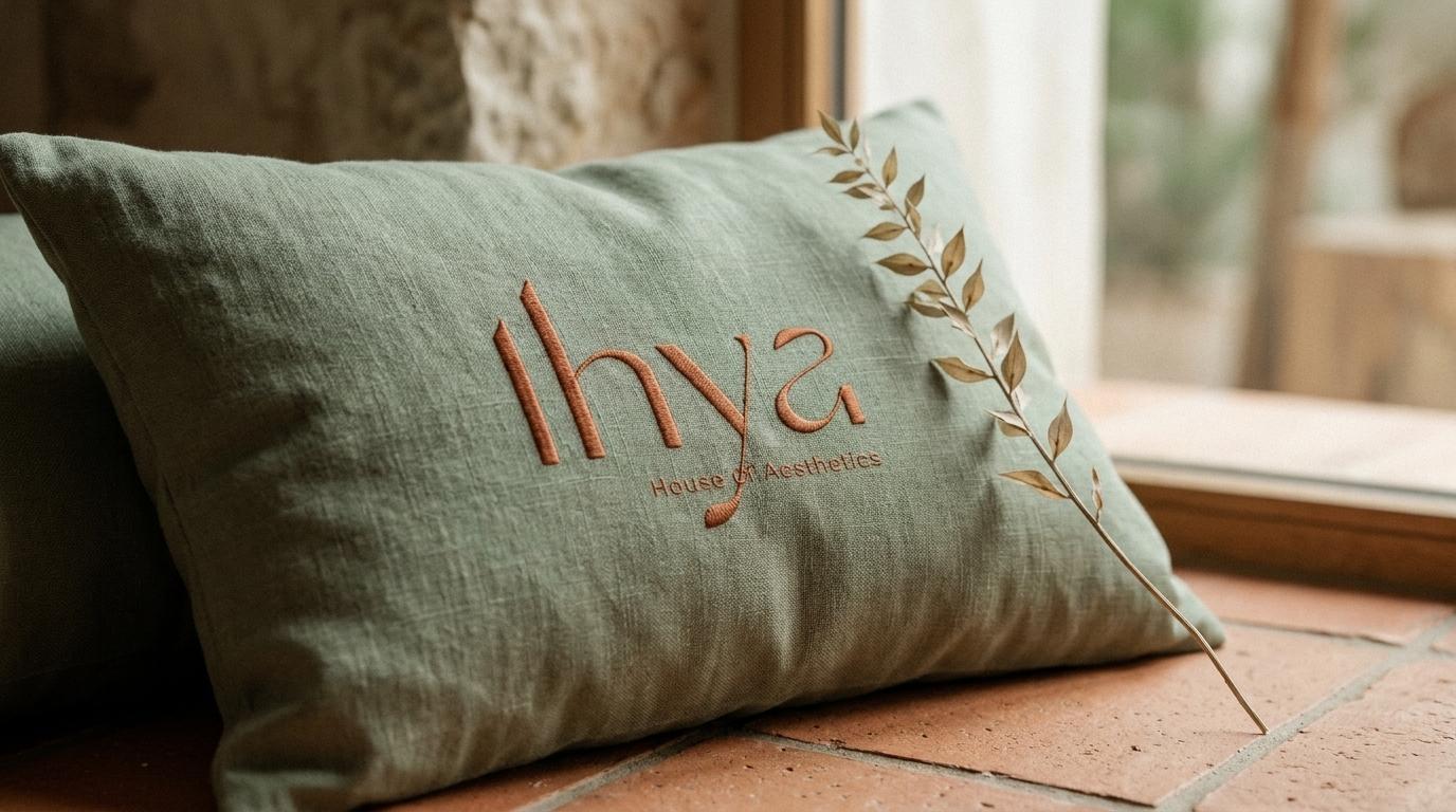
The typographic approach was chosen for its clinical precision. In the aesthetics and medical beauty sector, typography communicates trust in a way that illustrative or heavily decorative approaches cannot. Clean letterforms, considered spacing, the authority of a wordmark that holds its own on a clinical environment these are the signals that tell a prospective patient they are in the hands of someone who takes their practice seriously.
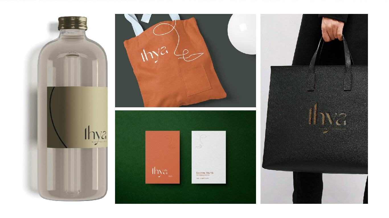
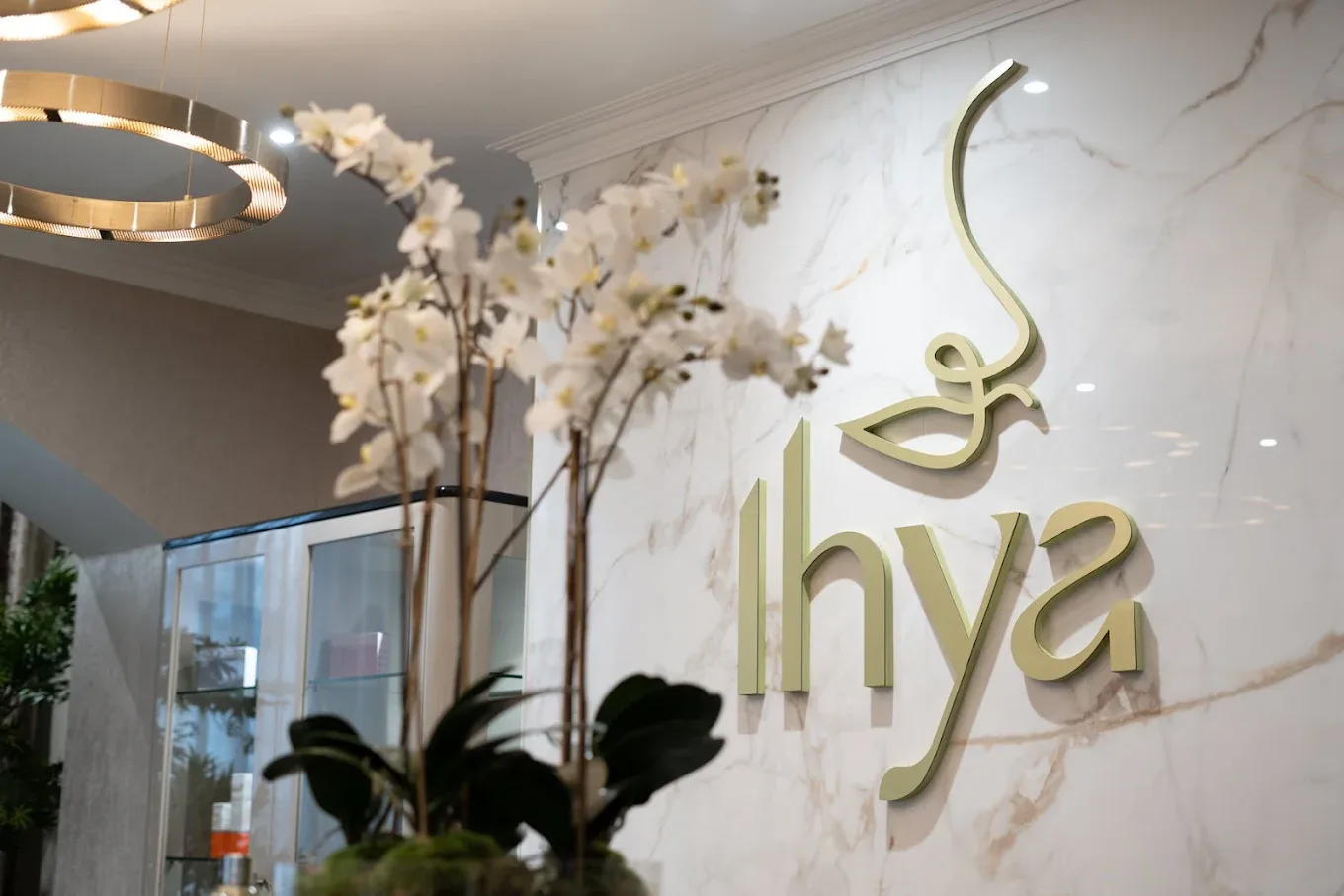
The abstract, surreal line-based icon extended that precision into the expressive register the brand also needed. A mark that suggests the fluid, continuous nature of the mind-body connection neither purely anatomical nor purely decorative, but existing in the space between the two where Ihya itself operates. The line work references the contours of the human form without illustrating them literally, and the surreal quality gives the mark a visual distinctiveness that no competitor in the Birmingham aesthetics market can claim.
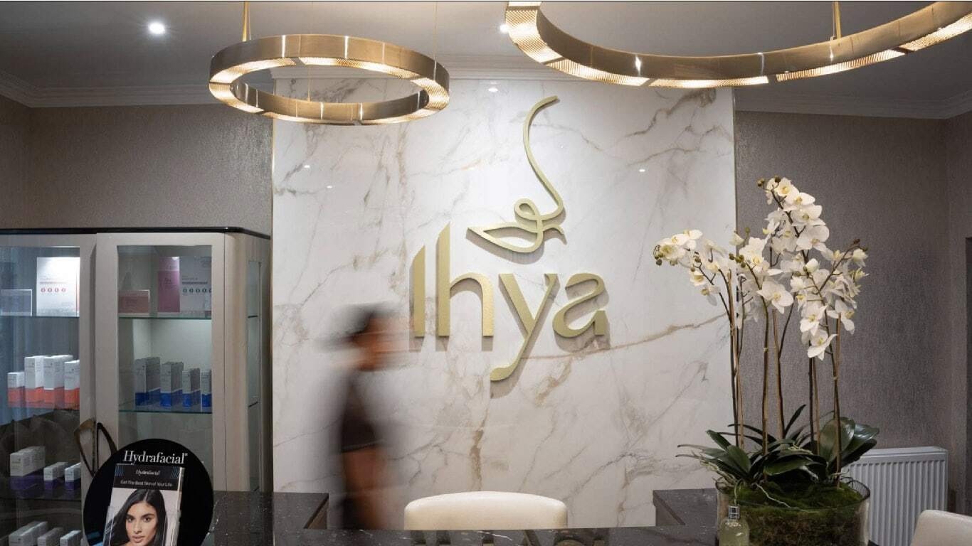
The signage system was designed to carry the brand into the physical environment of the clinic, transforming the space from a treatment facility into a genuine brand destination. The digital identity and collateral extended the same visual language across every patient touchpoint, from the first search to the post-treatment follow-up.
The Work
Brand Identity & Guidelines:
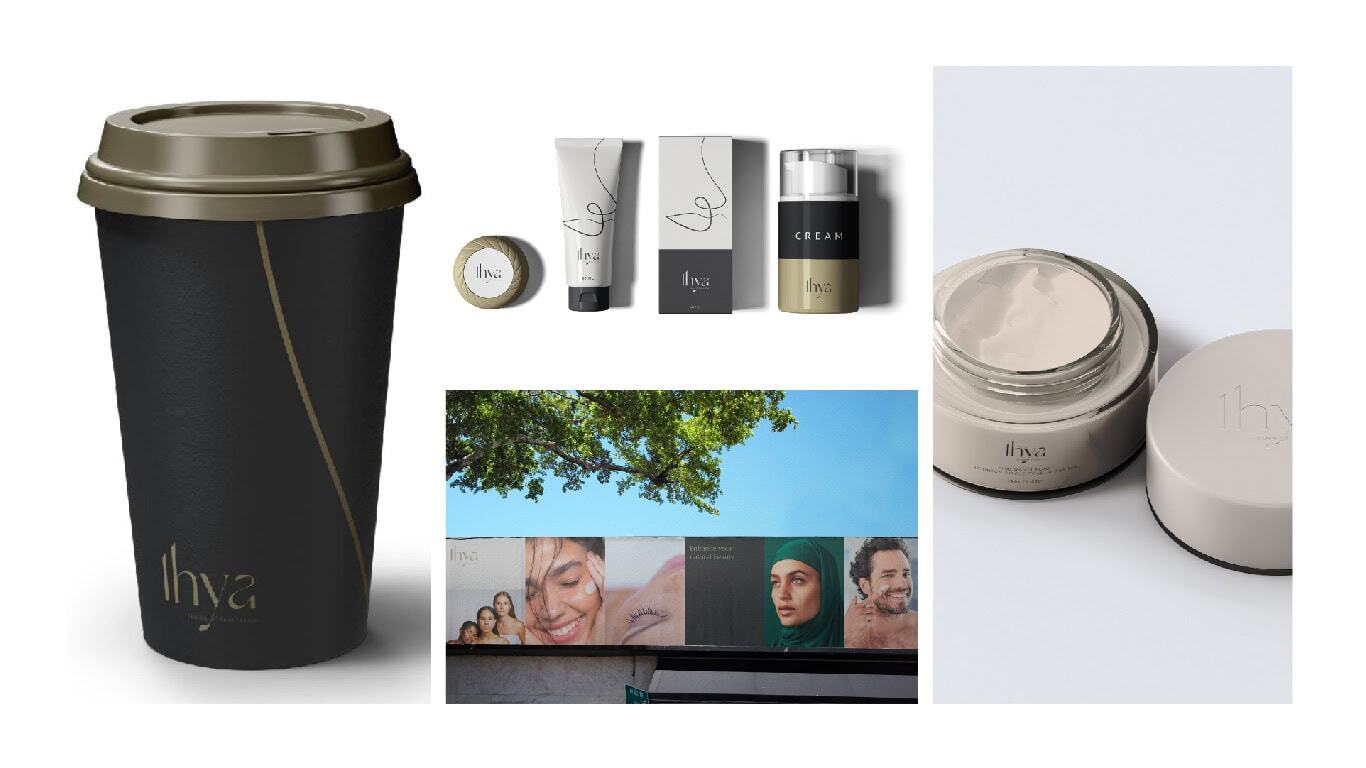
A complete visual identity for Ihya, typographic wordmark, abstract line-based iconmark, colour system, and guidelines covering every application across clinical, digital, and environmental contexts. Built to communicate trust, clinical credibility, and the depth of a holistic wellness philosophy.
Signage:
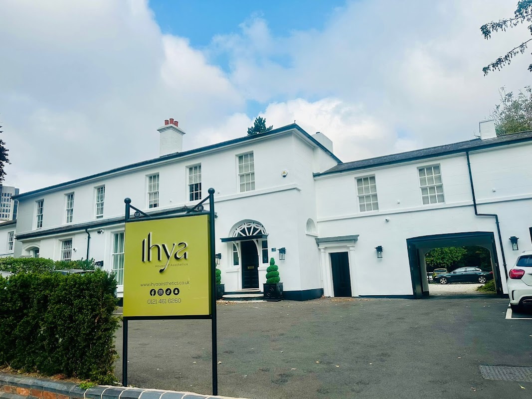
An environmental signage system that transforms the Ihya clinic into a brand destination carrying the identity through the physical space and ensuring that every patient's experience of the brand begins before they reach the treatment room.
Digital:
A digital identity built for the channels where prospective patients first encounter Ihya, communicating clinical credibility, treatment expertise, and the brand's holistic philosophy across web and social platforms in Birmingham's competitive aesthetics market.
Collateral:
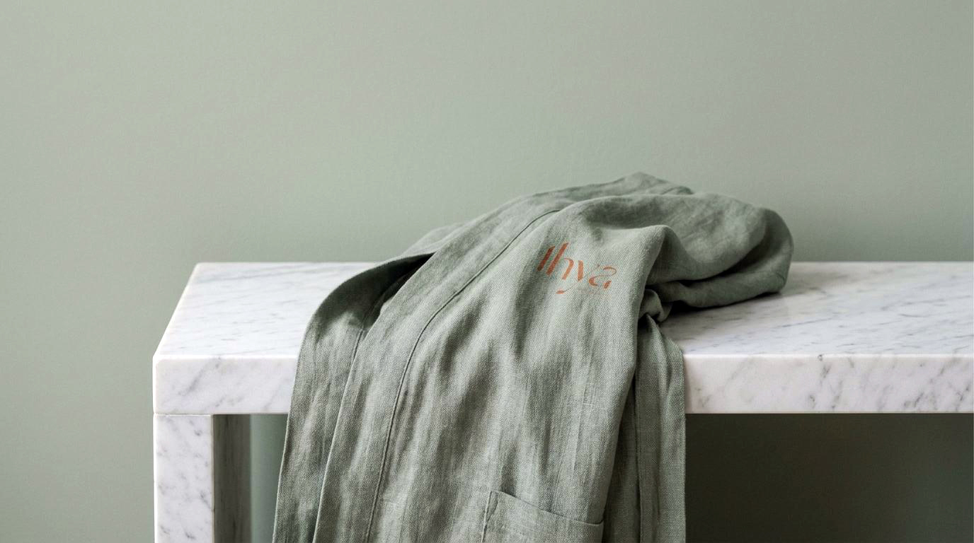
A suite of patient-facing materials, treatment information, clinic communications, and branded materials that carry the Ihya identity through every stage of the patient journey from first enquiry to ongoing care.
The Outcome:
Ihya House of Aesthetics launched with a brand identity that honours the depth of its name and the seriousness of its clinical proposition. The typographic wordmark and abstract iconmark work in precise combination, clinical authority and expressive philosophy, resolved into a single coherent visual system. In a UK aesthetics market where most brands choose between medical credibility and lifestyle aspiration, Ihya occupies a position that is genuinely its own.
When you step into Ihya, you are not walking into a clinic for a simple treatment. The brand makes sure you know that before you arrive.
Project Details:
Services: Brand Identity · Typographic Wordmark · Abstract Iconmark · Signage · Digital · Collateral
Industry: Aesthetics · Medical Beauty · Holistic Wellness
Location: Birmingham, UK
Market: UK Aesthetics · Medical Beauty · Holistic Wellness