Corporate Consultancy Brand Dubai

Unitas Integra
... is a boutique consultancy firm headquartered in Dubai, operating across a genuinely wide range of corporate and financial pillars: institutional-grade Business Process Outsourcing and offshore staff augmentation, authorised finance and compliance officer functions for DFSA and FSRA regulated businesses, credit rating gap analysis, financial modelling, business valuations, and investment advisory. The brief was to take that breadth of specialised, highly technical services and unify it under a single, coherent visual identity that reads as authoritative rather than scattered. Mike Rock Studio delivered a complete brand identity, brand guidelines, and corporate collateral system built for that exact problem.
The Challenge:
Financial advisory and regulatory compliance in the DIFC and ADGM operate to an unforgiving standard of trust and structural rigour, firms in this space are often the actual line of defence for regulated investment houses, family offices, and multinational corporations, which means their own brand credibility is being evaluated as part of every client's risk assessment.
Unitas Integra's specific challenge was internal as much as external: the firm genuinely operates two different registers of work. On one side, BPO and staff augmentation, agile, scalable, operationally efficient. On the other, authorised compliance officer functions for DFSA and FSRA regulated businesses — formal, exacting, accountable to regulators. A brand that leaned too far toward the first would read as a generic outsourcing agency; too far toward the second, and it would feel like a rigid legal compliance shop rather than a firm that also drives investment strategy. The identity needed to hold both truths at once.

The Approach:
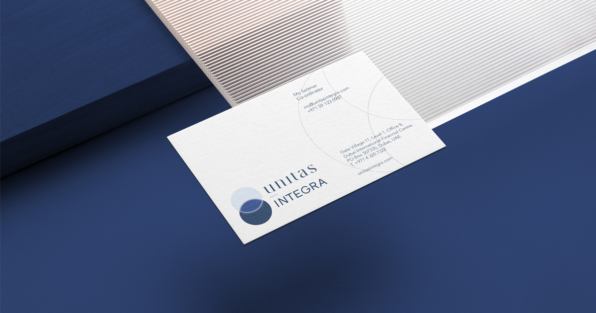
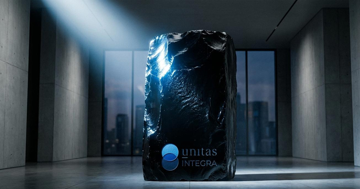
The creative direction took its cue directly from the name. Unitas - unity and Integra - integrity, wholeness, gave the brand its central idea: transparency and intersection, made literal in the mark itself. The logomark is built from two overlapping spheres: a clean, translucent glass form sitting over a deep midnight-blue base. The overlap is the whole point - it's a visual description of where offshore and onshore resources meet, where regulatory transparency and client partnership intersect, rendered as a structural relationship rather than a decorative shape.
The wordmark splits the same tension typographically. "unitas" is set in lowercase, in a sharp custom serif with an institutional underline beneath the initial letter, precision with a foundational quality. "INTEGRA" sits in clean, uppercase geometric sans-serif capitals, structural strength, deliberately contrasting register. Together they read as one name carrying two different kinds of confidence, which is an accurate reflection of what the firm actually does.
The palette, chromium silver, deep navy, clinical grey was kept disciplined and restrained, closer to the visual register of a private bank than a typical consultancy. Nothing in the system is there to decorate; everything is there to carry weight.

The Work:
Brand Identity:
A complete visual identity for Unitas Integra - the overlapping sphere logomark, dual-register typographic wordmark, and a disciplined silver-navy-grey colour system built for institutional B2B authority.
Regulatory & Advisory Collateral:
A full set of corporate materials for executive pitches and regulatory documentation - letterheads built for DFSA and FSRA filings, financial modelling template frameworks, presentation folders, and corporate stationery.
Brand Guidelines & Positioning System:
A comprehensive guidelines document governing every physical and digital application of the identity, built to hold consistency across global office environments and offshore networks as the firm scales.

The Outcome:
Unitas Integra now has a brand identity that reflects the genuine complexity of what it does rather than flattening it into a generic consultancy look. The overlapping sphere mark and dual-register wordmark give the firm a visual language specific enough to be remembered, and disciplined enough to hold its own in the DIFC and ADGM environments where its clients operate. A multi-pillar advisory firm, finally represented as one coherent thing rather than several adjacent services.

Project Details:
Services: Brand Identity Design · B2B Corporate Positioning · Regulatory Collateral · Brand Guidelines
Industry: Corporate Consultancy · Financial Advisory · Regulatory Compliance · Staff Augmentation
Location: Dubai, UAE
Market: DIFC · ADGM · Regulated Investment Houses · Family Offices · Multinational Corporations