Qatari Bakery Brand Identity
Lavas Cookies started as a small-batch baking project in Qatar oversized, heavily loaded cookies built around viral, maximalist fillings like pistachio kunafa and molten marshmallow, sold almost entirely through social media to a dedicated online following. The product was already working. What it didn't have was a brand built to last beyond the next trending post. Mike Rock Studio built a complete visual identity, packaging system, and digital strategy for a bakery that needed to turn algorithmic momentum into something permanent.
The Challenge:
The home-baking and artisanal dessert space on Instagram and TikTok moves fast and rewards almost nobody twice. Brands break out on a single viral ingredient or format, ride the trend cycle for a few months, and then disappear when the algorithm moves on to the next thing. For a bakery built on this model, the real risk was never running out of customers — it was running out of relevance the moment the trend that built the audience cooled off.
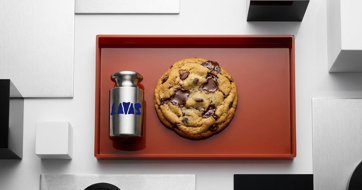
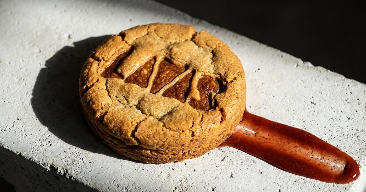
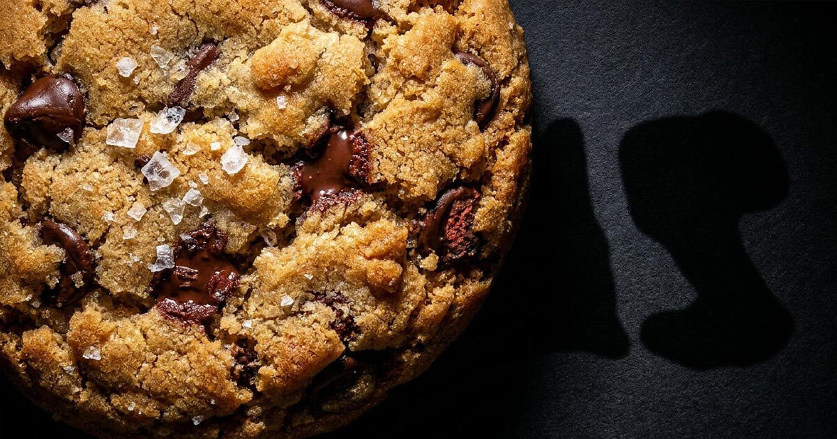
Lavas had a genuine product advantage worth protecting: the cookies are deliberately imperfect. Oversized, structurally irregular, closer to raw lava shards than uniform machine-stamped bakes. That imperfection is the appeal — but it's also a hard thing to brand, because most bakery identities default to neat, polished, and reassuringly consistent. The brief was to build an identity that captured the rugged, molten, hand-made quality of the product itself, polished enough to work on delivery packaging and merchandise, without sanding off the rough edge that makes Lavas worth following in the first place.
The Approach:
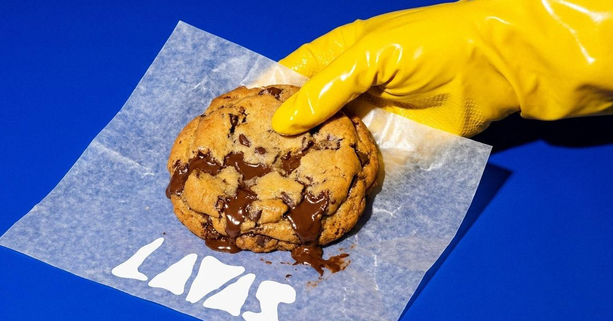
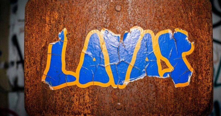
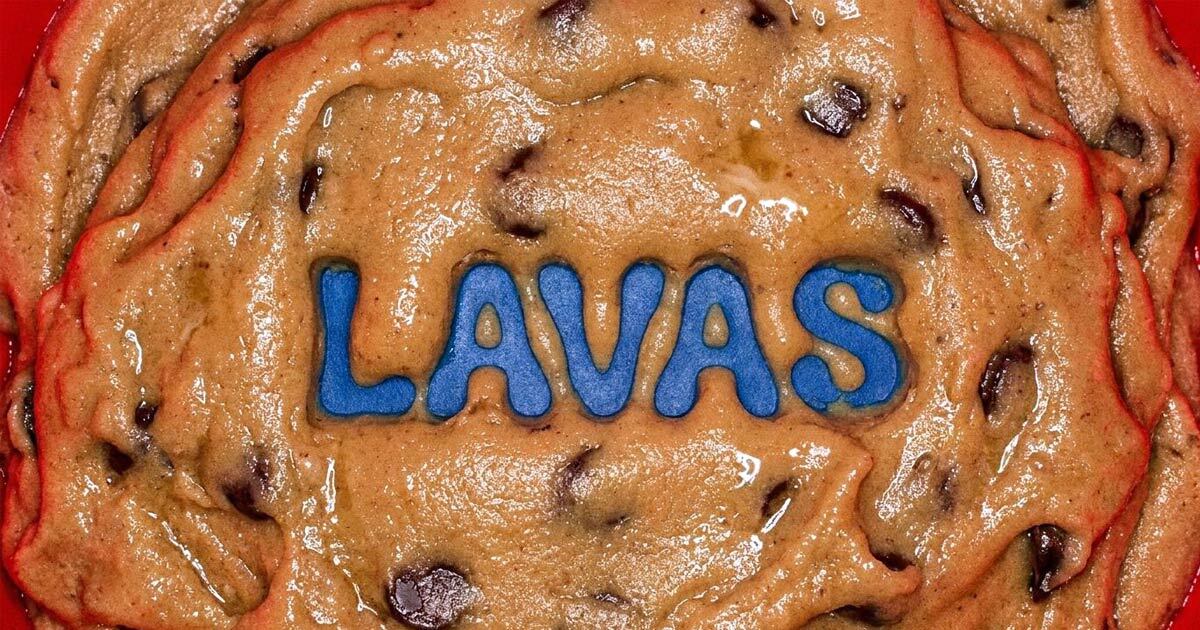
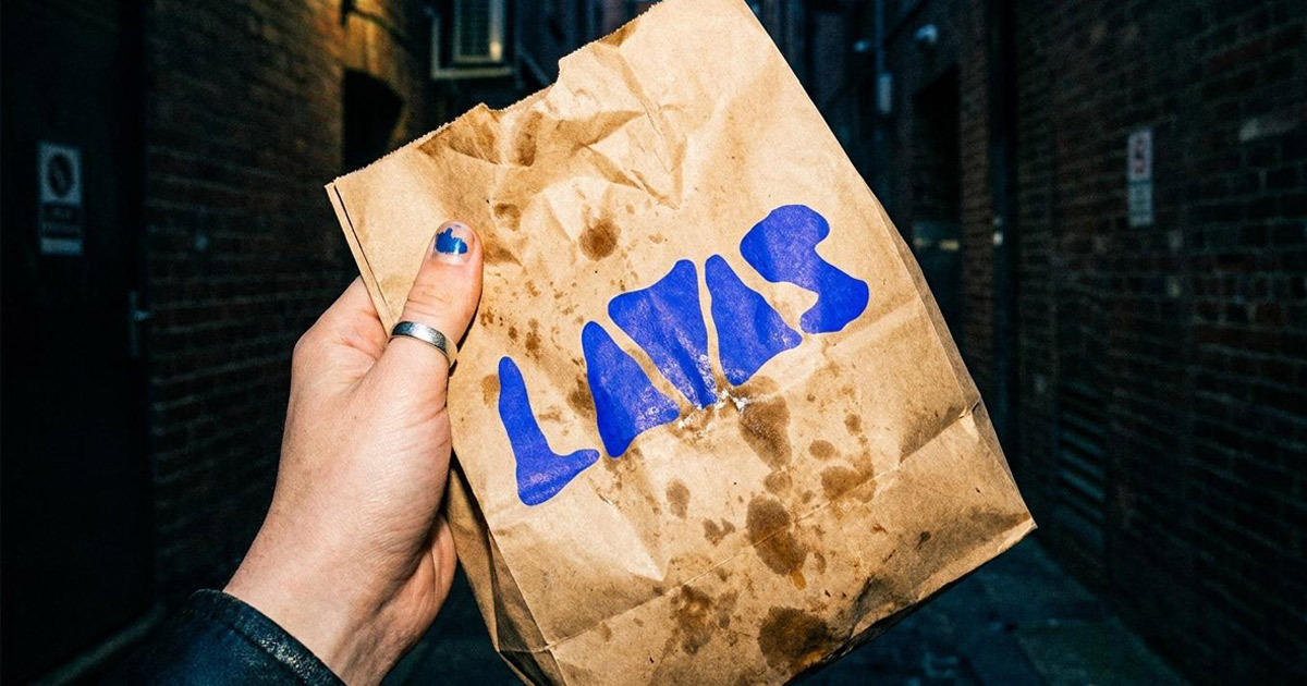
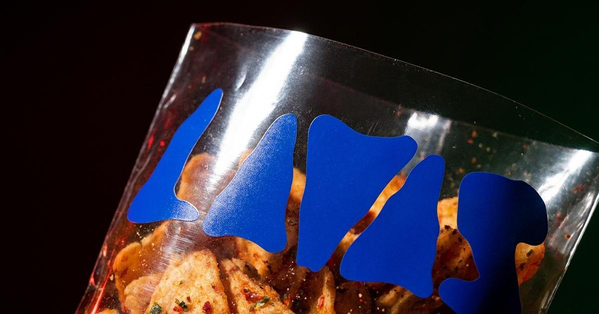
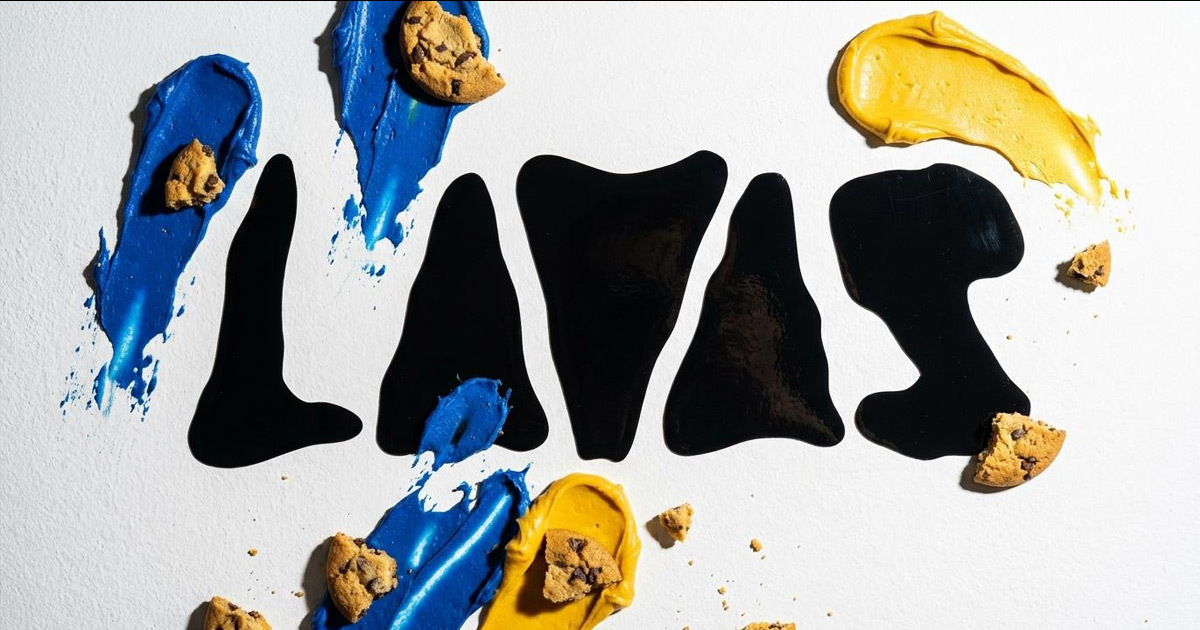
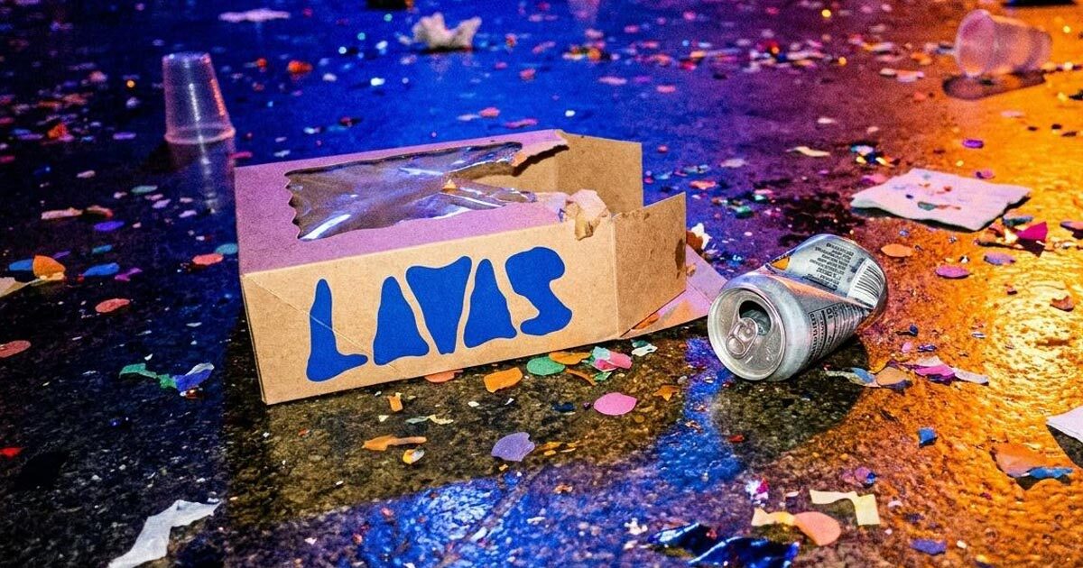
The starting point was the product's own texture. Lava doesn't pour in straight lines, and neither does the Lavas wordmark, the letterforms are built from thick, organic, irregular shapes that mimic the molten, shifting quality of the cookies themselves. It's not a literal illustration of lava; it's a typographic decision that behaves the way the product behaves, which is a more durable kind of brand consistency than matching a colour palette.
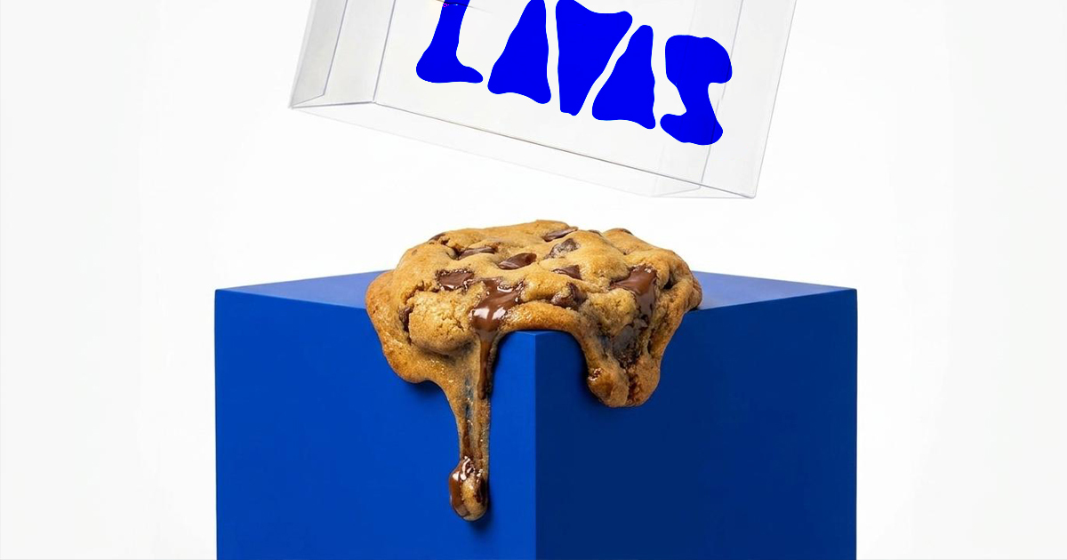
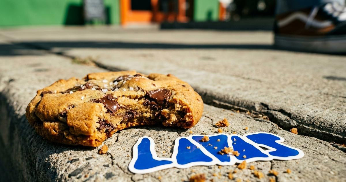
The colour strategy made a deliberate, confident choice: an intense electric cobalt blue, selected specifically because nothing about it reads as "bakery." It's the colour that stops a thumb mid-scroll on a phone screen, and it sits in sharp contrast against the warm browns, chocolates, and pistachio greens of the actual product photography which means the brand colour and the food colour never compete, they complement.
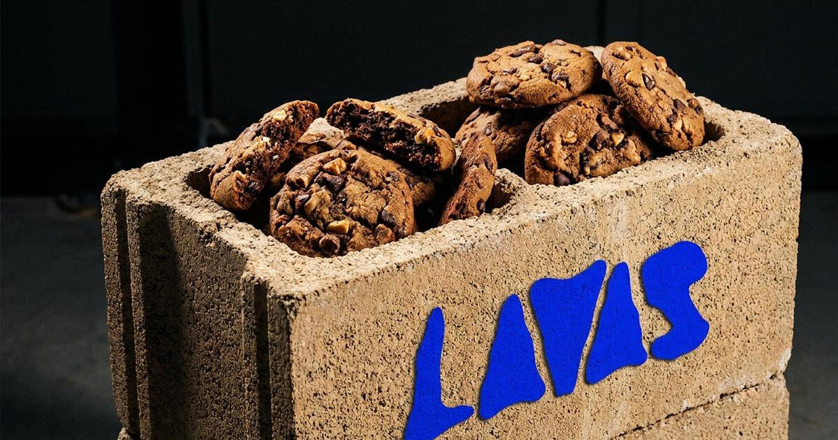
The layout language broke from conventional F&B branding restraint in favour of something closer to streetwear: oversized type, cropped frames, high-contrast photography that leans into the texture and scale of the bakes rather than tidying them up. The goal throughout was permanence without sterility an identity that could survive past the trend that launched it because it was never just illustrating the trend in the first place.
The Work:
Brand Identity:
A complete visual identity built around the organic fluid wordmark and electric cobalt blue colour system establishing a visual language distinctive enough to be recognised instantly on a phone screen, and durable enough to outlast any single viral moment.
Packaging:
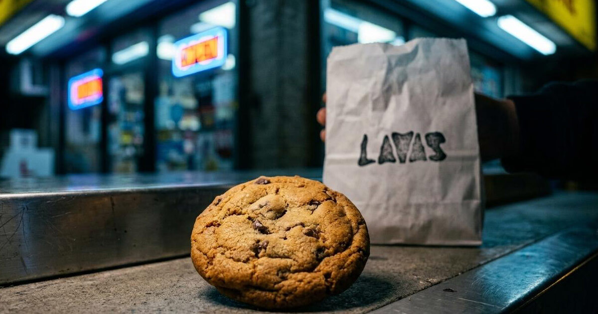
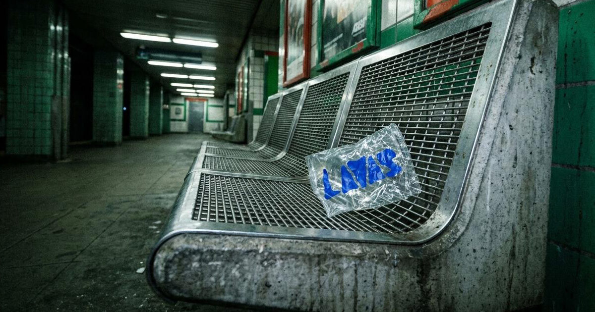
A structural packaging system engineered for fast urban delivery, kraft board boxes finished in electric blue, wax liners, and sticker seals built to protect oversized, irregular product while carrying the brand consistently from kitchen to customer.
Digital Strategy:
Content and digital guidelines covering framing, motion asset templates, and typographic styling for short-form video built for a brand whose primary discovery channel is the feed, not a storefront.
The Outcome:
Lavas now has a brand identity strong enough to carry the business past the trend cycle that launched it. The fluid wordmark and electric blue palette are distinctive enough to be recognised at a glance on a crowded feed, and the packaging and content systems give the bakery a consistent presence across every place a customer actually encounters it — phone screen, delivery box, in-person pickup. A social-media-born bakery with a visual identity built to keep working long after the algorithm has moved on to something else.
Oversized. Imperfect. Built to last past the scroll.
Project Details:
Services: Brand Identity · Packaging · Digital Strategy
Industry: Artisanal F&B · Digital-Native Bakery · Confectionery
Location: Qatar
Market: Qatar & GCC Social-First F&B