Streetwear Brand Identity
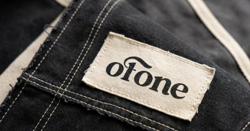
Of One Clothing, stylised as OF 1, is a technical streetwear label and creative collective based in France, built around the tension between belonging to an urban community and remaining distinctly yourself within it. Operating through a scarcity-driven retail model of limited-edition conceptual drops, the brand is engineered for a design-literate audience that reads visual language as precisely as the city reads them. Mike Rock Studio built the complete brand identity, technical garment packaging system, and digital e-commerce assets for a label that needed to feel authoritative from its first release.
The Challenge:
The global luxury streetwear market has a noise problem. Most labels in the space chase internet trends and logo repetition, producing visual identities that feel current for one season and disposable the next. For a newly formed collective exploring the relationship between urban identity and individual independence, that approach was never an option.
The conceptual challenge was specific: OF 1 needed to hold two ideas in the same visual system without either undermining the other. The collective threads that bind an urban community together. The absolute uniqueness of the individual within it. A brand that only emphasised community would read as generic streetwear; one that only emphasised individuality would feel isolated from the cultural context it was responding to. The identity needed to carry both, and to do it through industrial restraint rather than expressive loudness.

The Approach:
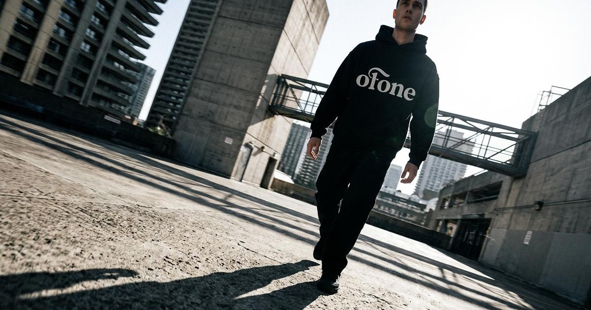
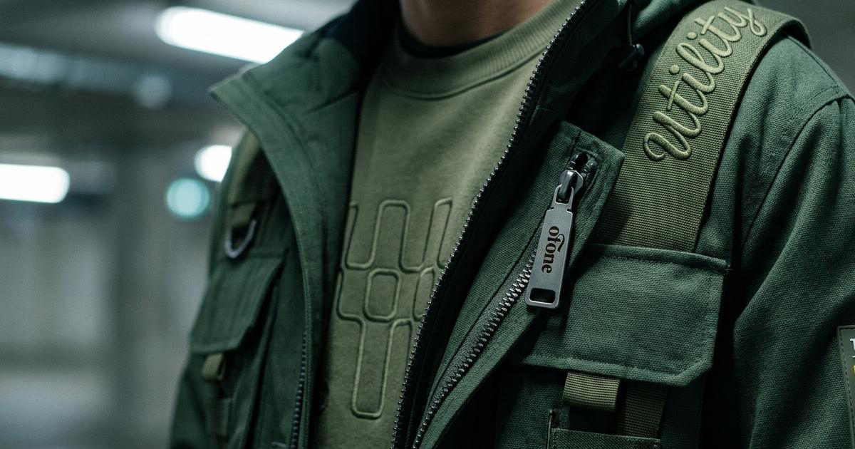
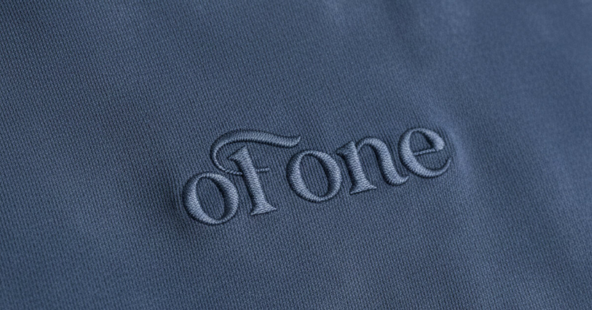
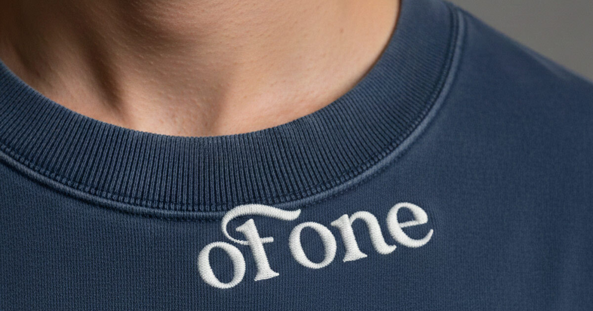
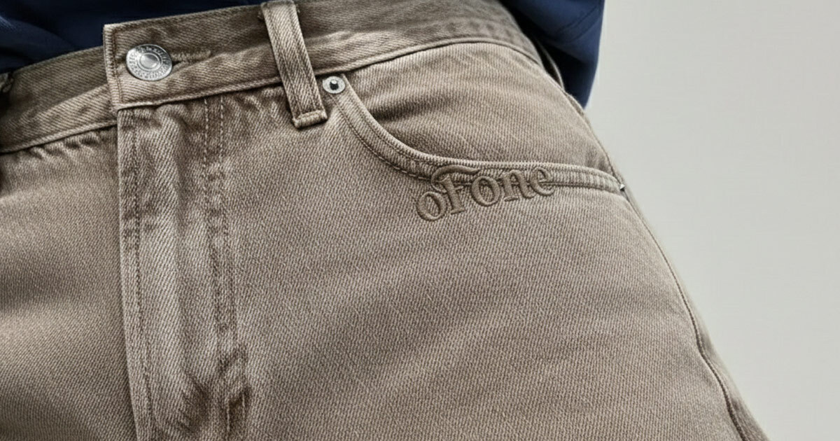
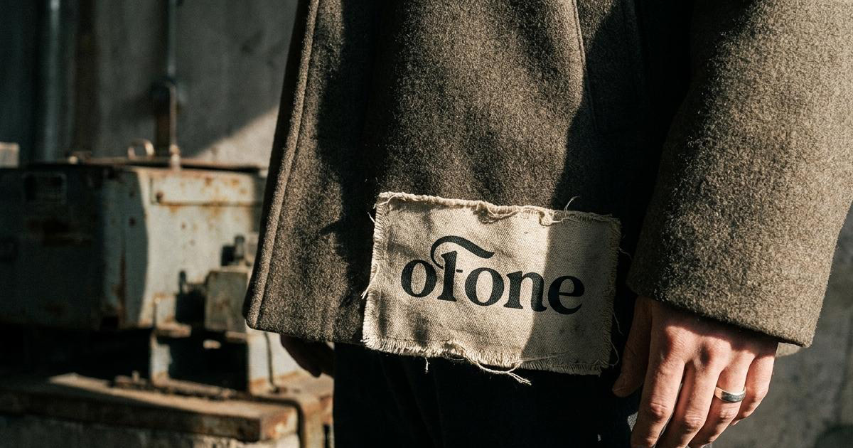
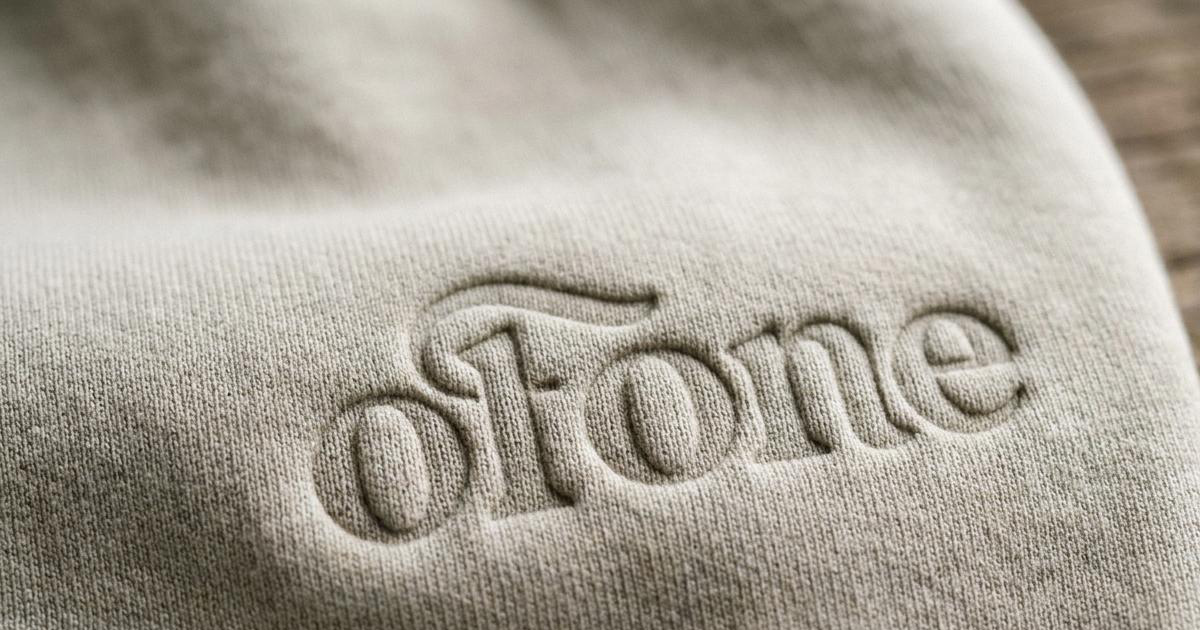
The creative direction drew directly on the architecture of the environments the brand was responding to: glass, concrete, steel, the monolithic geometry of metropolitan infrastructure. The wordmark OF ONE and its modular abbreviation OF 1 are set in a heavy geometric sans-serif with hard angles and stark tracking, reflecting the structural logic of the city rather than the softness of conventional fashion branding. The modular dual-form (full wordmark and abbreviation) gives the identity flexibility across applications from a woven neck label to a building-scale graphic without losing coherence.
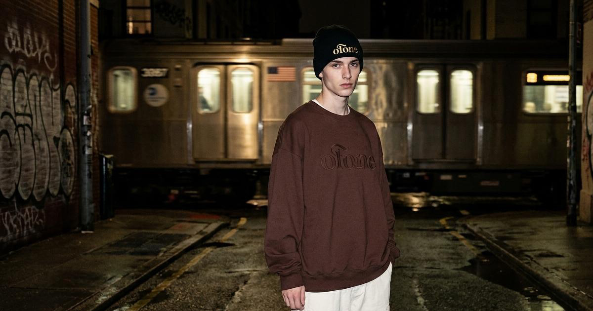
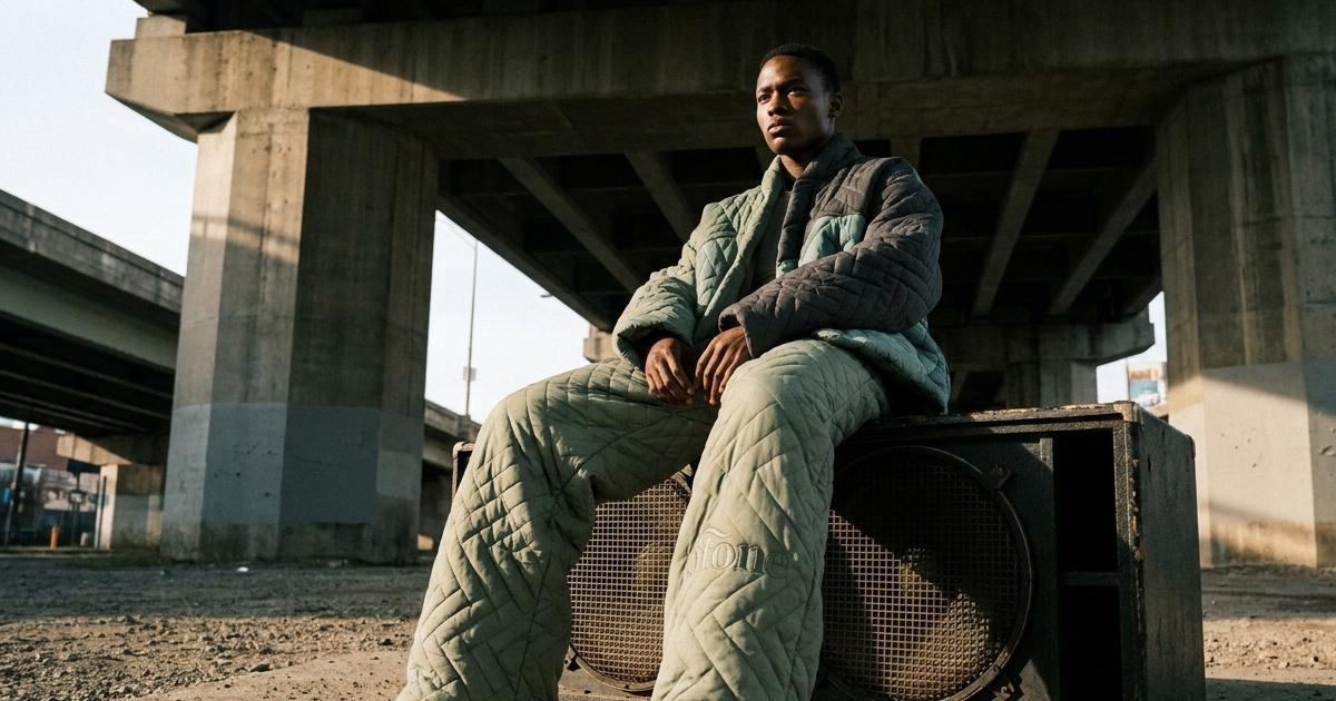
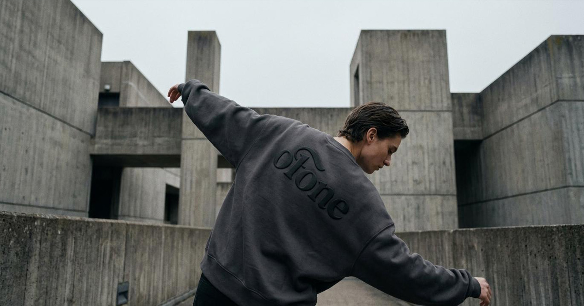
The colour system is strictly monochromatic: deep asphalt black, concrete white, industrial steel grey. That discipline creates a gallery-grade backdrop across every application, which means the textures of the garments themselves, heavy loopback cottons, technical nylon weaves, raised screen prints, are always the primary visual event. The brand identity is the frame; the product is the content.
Layout guidelines followed the same logic: vast breathing room, cropped technical framing, high-contrast street photography under stark urban light. The aesthetic is closer to an architectural lookbook than a conventional fashion catalogue, which is the right reference for a label that positions garments as objects of considered design rather than seasonal product.
The Work:
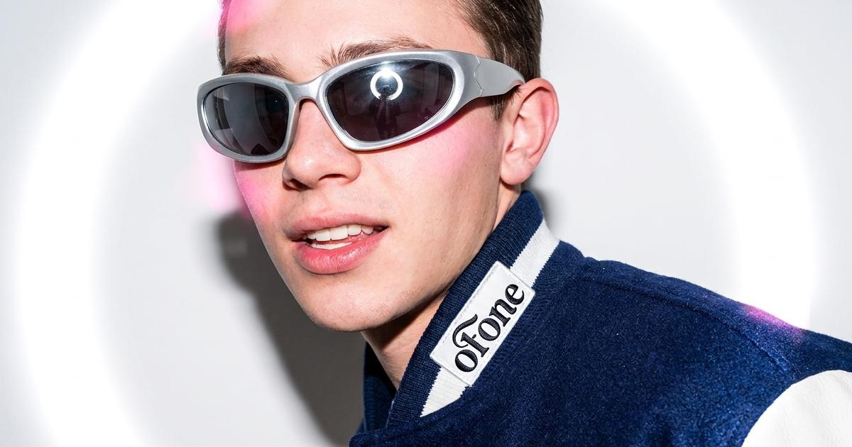
Brand Identity:
A complete visual identity built around the modular OF 1 wordmark, strict monochromatic system, and spatial layout rules built for a design-literate youth audience across global street culture.
Technical Garment Packaging:
A custom packaging system for scarcity-driven retail drops: heavy matte-black rigid presentation boxes, frosted industrial zip bags, blind-debossed product tags, and wax-sealed shipping packs. Physical materials built to match the considered quality of what is inside them.
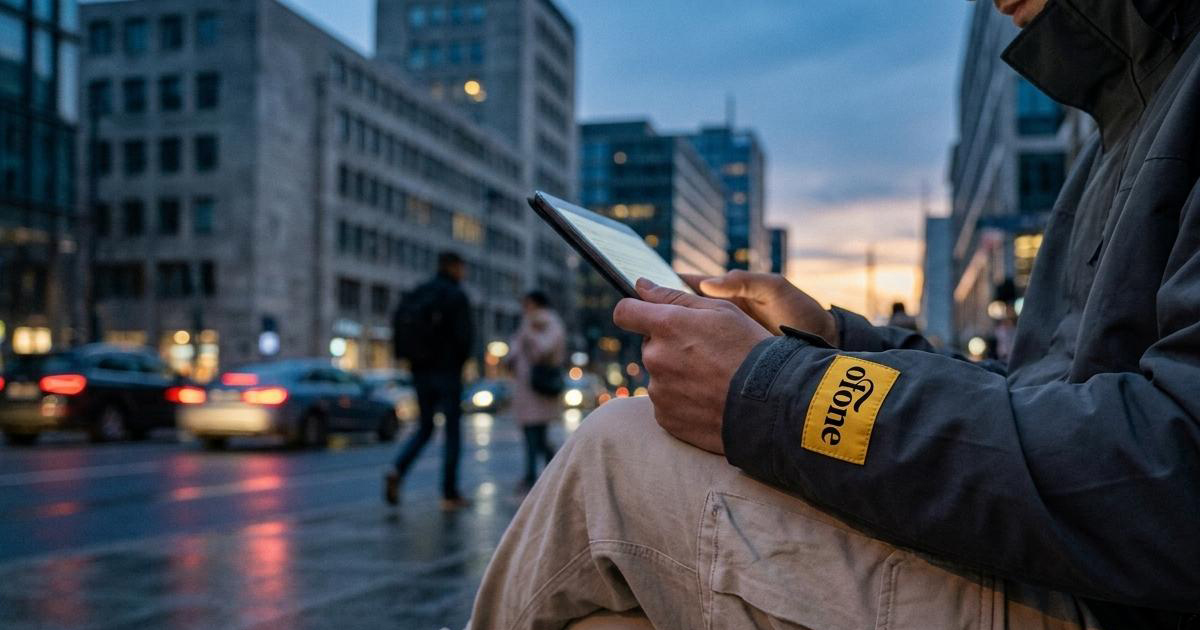
Digital E-Commerce Assets:
A suite of responsive layout templates and digital design assets for the OF 1 online boutique: gallery-style navigation, minimalist lookbook display, and streamlined purchase paths built for a digital-native consumer who expects the online experience to match the brand's visual standards.
The Outcome:
OF 1 launched with a brand identity that earns its place in the scarcity-driven streetwear market through discipline and restraint rather than volume. The monochromatic system and industrial typographic architecture give the label a visual consistency that survives drops, seasons, and platform changes without requiring constant reinvention. A collective built on the idea of individuality within the city, with a brand built on the same principle.

Project Details:
Services: Brand Identity, Technical Garment Packaging, E-Commerce UI Assets, Subculture Positioning
Industry: Luxury Streetwear, Contemporary Fashion, Technical Apparel
Location: Dubai
Market: Global Street Culture, Direct-to-Consumer Luxury Streetwear