Dubai Telecoms Brand Identity
Skystream is a new telecommunications company launching in Dubai, a B2B provider entering one of the most connected and competitive markets in the world, operating as part of the Atlas Telecom group. The brief was clear and demanding: build a brand identity from scratch that could establish Skystream as a credible, innovative, and scalable presence in the Dubai enterprise telecoms market, while communicating its relationship to the Atlas Telecom parent clearly enough to carry the group's credibility without being subsumed by it. Mike Rock Studio delivered the complete brand: identity, guidelines, and collateral for a company that needed to arrive in the market fully formed.

The Challenge
Telecommunications is a sector where trust is the primary purchase criterion particularly in the B2B and enterprise segment, where a business's connectivity infrastructure is mission-critical and the cost of choosing the wrong provider is measured in operational disruption rather than inconvenience. A new entrant in this market faces a significant credibility gap: the established players have years of proven reliability behind them, and enterprise buyers are inherently risk-averse.
Skystream's connection to Atlas Telecom was its most important initial credential — but that connection needed to be managed carefully in the brand identity. Too close to the parent and Skystream loses its own identity; too distant and the equity of the Atlas relationship is wasted. The brand also needed to communicate the three qualities most valued by enterprise telecoms buyers: innovation, scalability, and reliability qualities that are easy to claim and very difficult to make believable through visual identity alone.
Dubai's telecoms market added a further layer. The city's business community is international, technically sophisticated, and accustomed to world-class service providers. A brand that looked provisional, generic, or insufficiently considered would not earn the consideration of this audience regardless of the service behind it.

The Approach
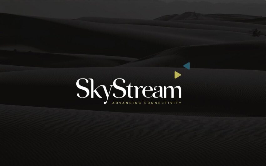
The typographic approach was the right creative decision for a B2B telecoms brand, authoritative, legible, and immediately communicating the precision and structure that enterprise buyers associate with reliable infrastructure providers. The distinctive element within that typographic framework was the icon: triangles arranged to form the letter S, the initial of Skystream's name.
The triangle is one of the most structurally efficient forms in geometry, stable, directional, and inherently scalable. Three triangles forming an S communicate precisely what the brand needed to say: that Skystream is built on solid structural foundations, that it is directional and forward-moving, and that its architecture like its services is designed to scale. The geometric precision of the mark also creates a visual link to the parent Atlas Telecom brand without requiring explicit visual similarity both brands share a design intelligence that signals group coherence to anyone looking for it.
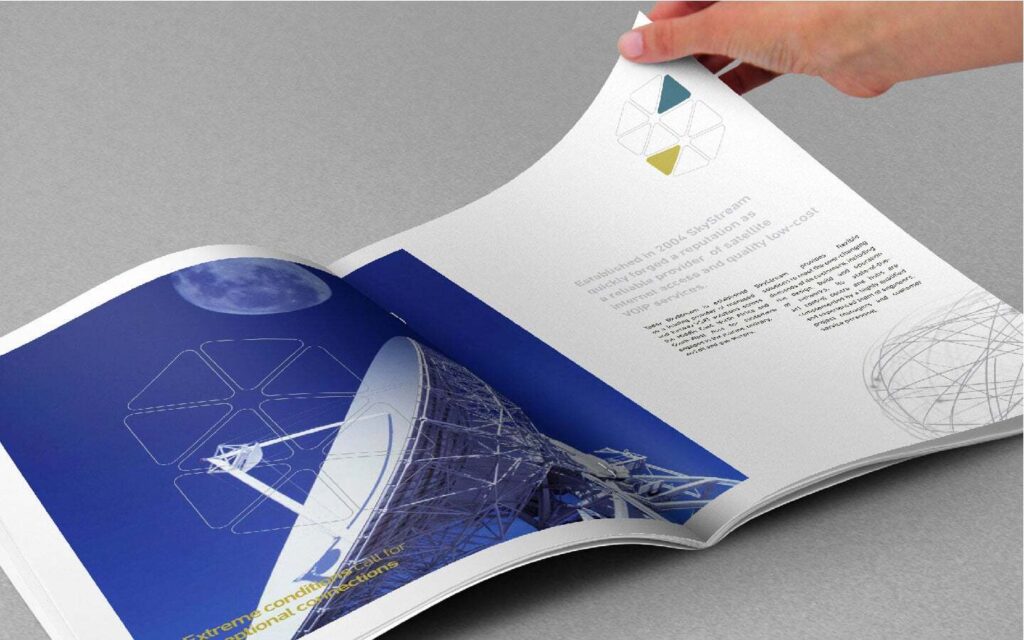
The collateral system was built for the enterprise sales environment, a context where first impressions are made across presentation decks, proposal documents, and the physical materials of a business development conversation. Every piece was developed to carry the Skystream brand into those contexts with the confidence and consistency a new market entrant needs from day one.

The Work
Brand Identity
A complete visual identity for Skystream, typographic logomark with distinctive triangular S icon, typography, colour system, and the visual language of a Dubai B2B telecoms brand built for enterprise credibility and scalable growth.

Brand Guidelines
A comprehensive guidelines system covering every application of the Skystream identity: digital, print, collateral, and environmental developed to maintain consistency as the brand grows across the Dubai and wider GCC market.
Collateral
A suite of enterprise-facing brand collateral built for Skystream's B2B sales and communications context — presentation materials, documentation, and branded assets developed for a company making its case to Dubai's most demanding business audience from launch day.

The Outcome
Skystream launched into the Dubai enterprise telecoms market with a brand identity that earned its place on arrival. The typographic mark and triangular S icon communicate scalability, structural integrity, and technological confidence, the three qualities enterprise buyers evaluate before they evaluate anything else. The collateral system carries that confidence into every client interaction. A new name in a competitive market, with a brand built to be taken seriously.


Project Details
Services: Brand Identity · Brand Guidelines · Collateral
Industry: Telecommunications · B2B · Enterprise Technology
Location: Dubai, UAE
Market: Dubai Enterprise · GCC B2B Telecoms
Parent Company: Atlas Telecom