Industrial Group Brand Identity Iraq - UAE
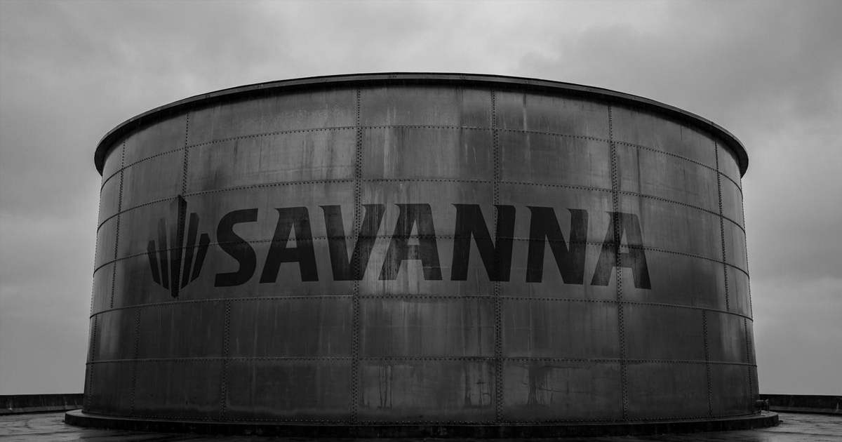
Savanna Group of Companies is a multi-sector industrial conglomerate headquartered in Baghdad, one of humanity's oldest and most storied cities with branches spanning Basra in the south, Erbil in the north, and a strategic foothold established in Dubai. Operating across heavy vehicle supply, special purpose equipment and maintenance, civil and mechanical construction, security and safety systems, oil and gas transmission, power generation and distribution, and more, Savanna is a business of genuine scale and complexity. Mike Rock Studio built the brand identity, guidelines, and collateral for a group that needed a visual identity as expansive and authoritative as its operations.
The Challenge:
Branding a diversified industrial conglomerate operating across multiple Iraqi cities and the UAE presents a specific set of challenges that most identity projects simply don't encounter. The sectors Savanna operates in oil and gas, power generation, civil construction, security systems are industries where trust, authority, and permanence are the primary signals a brand needs to communicate. These are not markets where creativity is valued for its own sake. Every visual decision needed to earn its place by contributing to a single overriding impression: that Savanna is an organisation built to last and trusted to deliver.
The geographical spread added another dimension. A brand rooted in Baghdad, a city with one of the richest cultural and historical legacies in the world operating across the whole of Iraq and into the UAE needed an identity that travelled without losing its sense of origin. The name Savanna itself carries a quality of expansiveness, of something that stretches to the horizon — the brief was to make the brand feel as broad as the territory it covers.
The Approach:
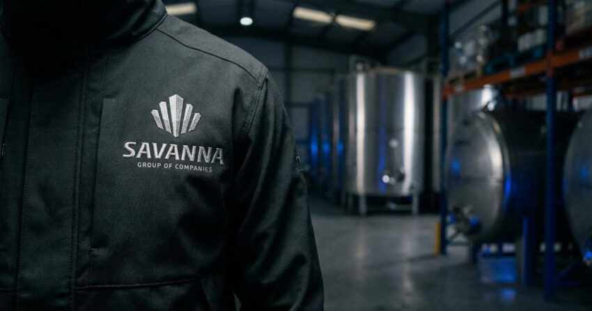
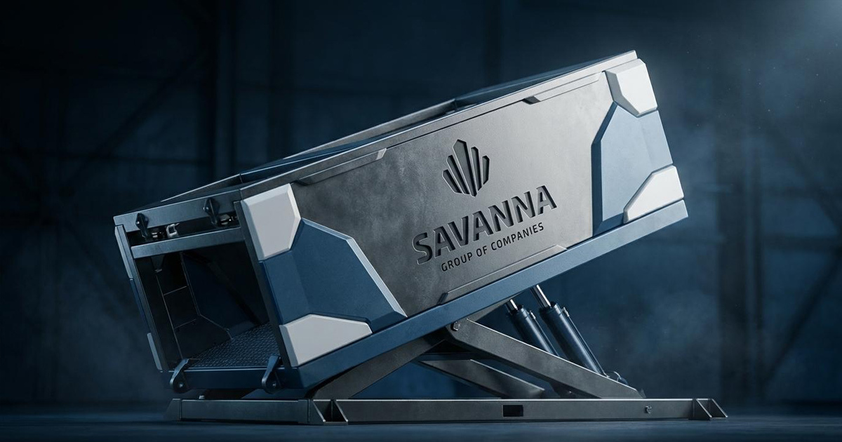
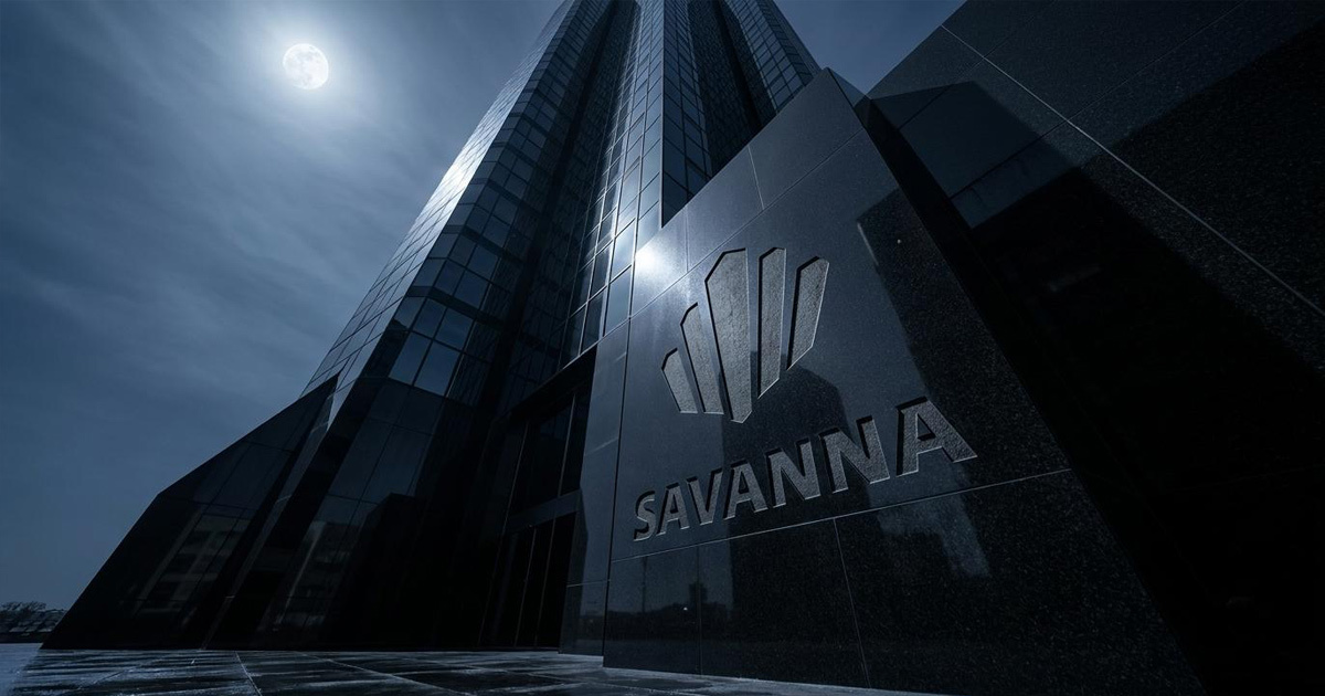
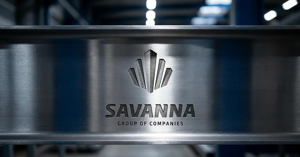
The logo, a formation of crystalline towers rising from a common base was the creative foundation everything else was built around. The mark speaks directly to Savanna's world: structures that rise, that are built with precision, that are made to withstand. The faceted, architectural quality of the mark references both the physical infrastructure Savanna builds and installs, and the ancient built heritage of the civilisation in whose city the Group was founded. It is a mark of considerable ambition, executed with the restraint that serious industrial brands demand.
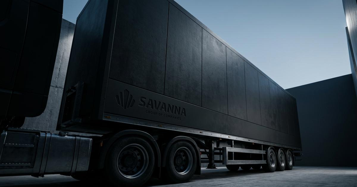
The visual language developed around the mark was built on depth, weight, and permanence. A palette anchored in the darkest end of the tonal range communicating authority without aggression, seriousness without austerity. Typography selected for its structural integrity and legibility across both digital and physical applications in demanding environments.
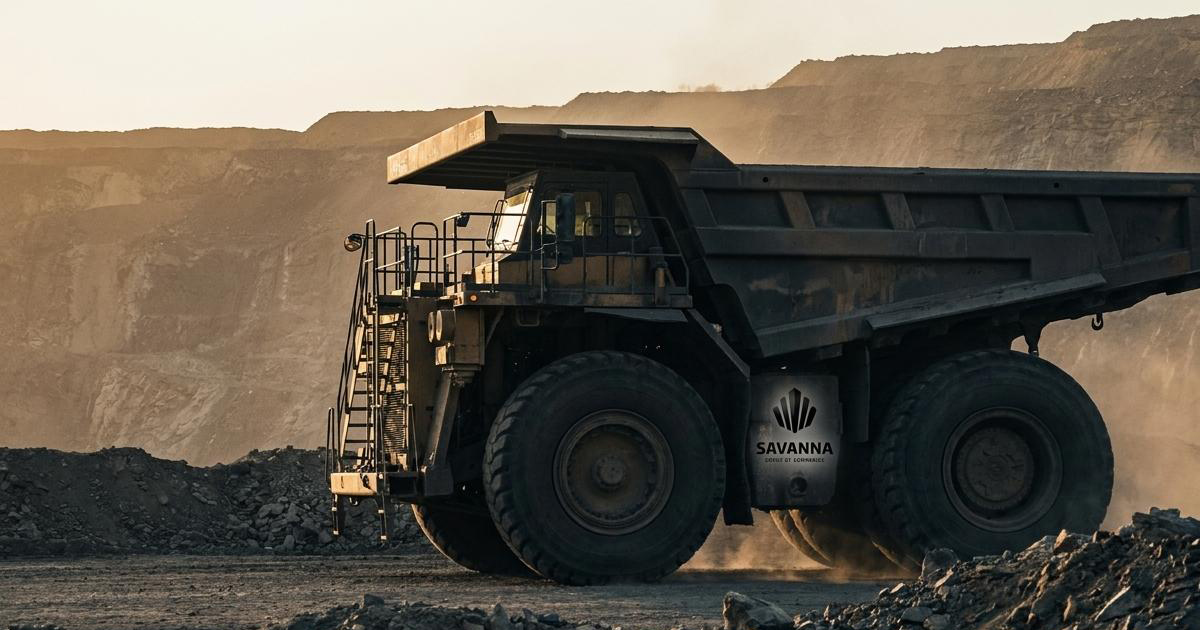
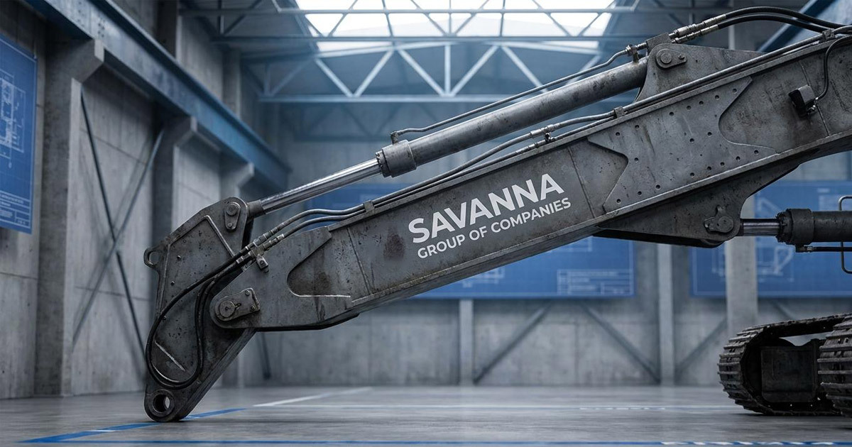
The guidelines were developed with the operational reality of a large, geographically distributed organisation in mind — a system that could be applied consistently by teams across Baghdad, Basra, Erbil, and Dubai without losing coherence or quality at any point. The collateral suite was built for the day-to-day demands of a business operating at this scale: materials that represent the Group's standards in every interaction, from a site meeting in the Iraqi south to a business development conversation in the Dubai office.
The Work:
Brand Identity:
A complete visual identity system for Savanna Group built around the crystalline tower logomark, with typography, colour, and visual language developed to communicate authority, permanence, and operational scale across the Group's diverse sectors.
Brand Guidelines:
A comprehensive guidelines document covering every application of the Savanna identity across digital, print, environmental, and operational contexts — designed for consistent use across multiple cities and divisions.
Corporate Collateral:
The full suite of corporate materials required for the Group's operations, business stationery, documentation, presentation materials, and branded assets that carry the Group's standards into every professional interaction across Iraq and the UAE.
The Outcome:
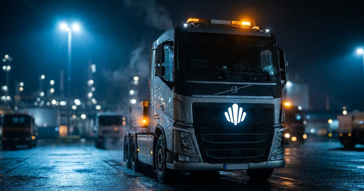
Savanna Group now carries a brand identity that reflects the scale, seriousness, and ambition of the organisation it represents. The crystalline tower mark built on depth, precision, and structural authority communicates the Group's position in the industries it serves before a word of the proposition is read. From Baghdad to Dubai, the identity travels with the same authority it was designed to carry.
A business that spans the ancient port of Basra to the trading city of Erbil, and reaches into the vital hubs of the UAE and the wider MENA region, deserves a brand built to the same specification as the infrastructure it delivers. That is what Savanna now has.
Project Details:
Services: Brand Identity · Logomark · Brand Guidelines · Corporate Collateral
Industry: Industrial Conglomerate · Oil & Gas · Power Generation · Civil Construction · Heavy Vehicles · Security Systems
Location: Baghdad · Basra · Erbil, Iraq · Dubai, UAE
Market: Iraq · UAE · MENA · Asia