French Pattisserie Brand Identity
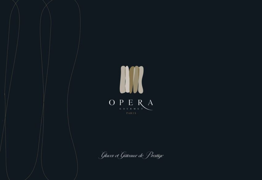
Opera Gourmet is an industrial bakery headquartered in Silicon Oasis, Dubai producing high-quality frozen cakes, pastries, macarons, choux, tarts, pies, and ice cream for hotels, restaurants, retailers, and catering operations across the UAE since 2013. The tension at the heart of the brand is also its most interesting creative opportunity: this is a business that operates at industrial scale while producing food that belongs in the finest patisserie windows. Mike Rock Studio built the complete brand identity, packaging, and collateral for a company that needed to communicate both realities simultaneously to a chef ordering for a five-star hotel kitchen and a buyer sourcing for a retail shelf.

The Challenge:
Industrial food production branding occupies an awkward creative middle ground. Lean too far into the craft and artisan aesthetic and you misrepresent the operational reality of a factory-scale producer, sophisticated HORECA buyers will see through it immediately. Lean too far into the industrial and functional and you lose the appetite appeal that makes a frozen pastry brand worth stocking. The brand needed to hold both registers convincingly: the precision and consistency of a serious production operation, and the genuine quality and craft that defines Opera Gourmet's product range.
The dual audience complicated matters further. Hotels and restaurants evaluate suppliers on reliability, specification, and the assurance of consistent quality across every delivery, their brand decision is primarily rational. Retail buyers and consumers make decisions that are much more emotionally driven, the packaging on a shelf needs to convey pleasure, quality, and the promise of something worth eating. One brand, two completely different purchasing journeys, both requiring the identity to do different work.

The Approach:
The name Opera Gourmet gave the creative direction its foundation. Opera, performance, precision, the extraordinary outcome of disciplined craft applied at the highest level. It is a name that positions the bakery not as a manufacturer but as a maker: a producer whose industrial capability is in service of a genuine commitment to quality rather than a substitute for it.
The visual language was built on that reading. A brand system that carries the elegance and considered craft of a European patisserie house — refined typography, a palette that communicates quality and appetite appeal while maintaining the clarity and professionalism that HORECA procurement demands. Nothing that feels handmade or artisan in a way that misrepresents the operation; everything that communicates that the operation exists to produce genuinely excellent food.
Packaging was the most critical creative application, the point where the brand makes its case to both audiences simultaneously. For retail, it needed to stand on a shelf and communicate quality and pleasure in a competitive frozen food environment. For HORECA, it needed to communicate specification, consistency, and the kind of professional presentation that makes a chef confident they are working with a serious supplier. The solution was a packaging system coherent enough to serve both contexts from the same visual foundation.

The Work:
Brand Identity & Guidelines:
A complete visual identity for Opera Gourmet: logomark, typography, colour system, and brand guidelines covering every application across the company's HORECA and retail operations. Built to communicate craft quality and industrial reliability in the same breath.
Packaging:
A packaging system designed to perform in both the retail shelf environment and the professional kitchen context communicating Opera Gourmet's product quality to the consumer choosing a frozen dessert and the chef evaluating a supplier.
Collateral:
A suite of brand collateral covering Opera Gourmet's sales and marketing communications: trade materials, product catalogues, and branded assets built for a business operating across Dubai's demanding HORECA and retail sectors.

The Outcome:
Opera Gourmet now has a brand identity that resolves its central challenge: it communicates the quality of a craft patisserie and the reliability of an industrial producer without contradiction. The packaging system works in a hotel kitchen and on a supermarket shelf. The identity is coherent across every touchpoint from a trade catalogue to a delivery vehicle. A Dubai food production business founded in 2013 with the brand presence it has always deserved.

Project Details:
Services: Brand Identity · Logomark · Brand Guidelines · Packaging · Collateral
Industry: Industrial Bakery · Frozen Food Production · F&B
Location: Silicon Oasis, Dubai, UAE
Market: UAE HORECA · UAE Retail · GCC Food Service

