Investment Company Brand Identity Abu Dhabi

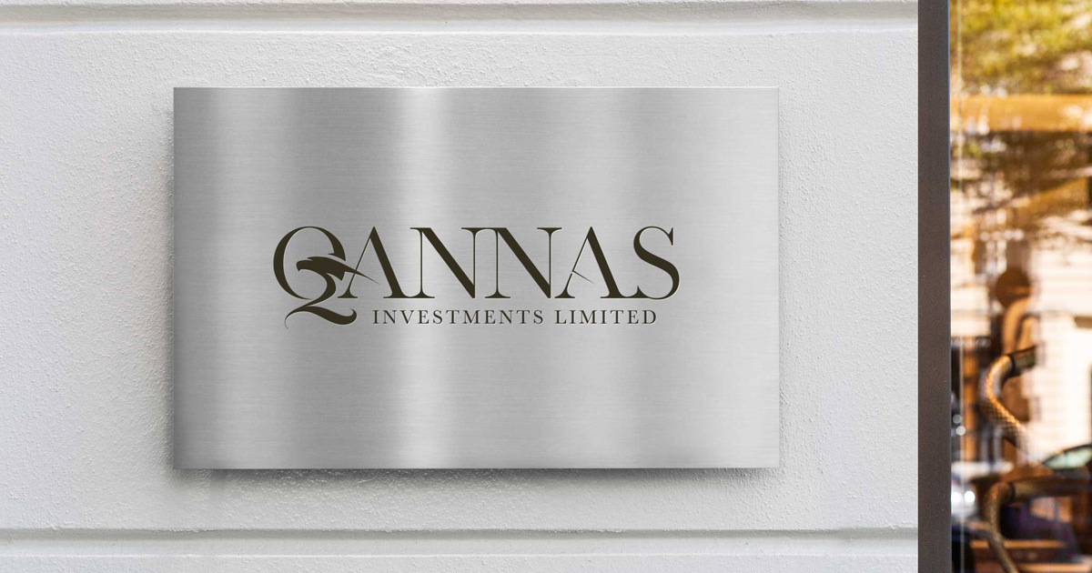
Qannas Investments is an Abu Dhabi-owned investment company with shares listed on the London Stock Exchange, an entity that operates at the intersection of Gulf capital and international financial markets. When the company was established, it needed a brand built from scratch: a complete visual identity and collateral system capable of representing a publicly listed investment vehicle to shareholders, institutional investors, and the broader financial community across both the UAE and the UK. Mike Rock Studio built that brand from the ground up, to the standard the London Stock Exchange demands.
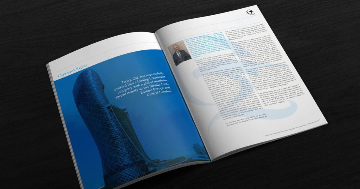
![image] [image](/uploads/annual-report-cover-for-qannas-investments-by-Mike-Rock-Studio-Dubai_2026-07-22-064528_hafz.jpg)
The Challenge
Building a brand for a publicly listed investment company from scratch is among the most demanding briefs in corporate identity design. The audience is unforgiving: institutional investors, LSE-listed shareholders, and the financial press apply a level of scrutiny to corporate presentation that few other audiences match. In this context, a brand that looks uncertain, inconsistent, or insufficiently considered does not merely fail to impress — it actively undermines confidence in the entity it represents.
Qannas faced the additional complexity of operating across two distinct financial and cultural contexts simultaneously. As an Abu Dhabi-owned entity, the brand needed to carry the credibility and regional authority of Gulf capital. As an LSE-listed company communicating to a London and international shareholder base, it needed to meet the visual and communication standards expected of a publicly traded vehicle in one of the world's most scrutinised financial markets. Neither context could be prioritised at the expense of the other.
The name Qannas derived from Arabic, carrying connotations of precision and the pursuit of a target gave the identity its direction. A brand built on that etymology needed to feel exact, deliberate, and purposeful in every detail.
The Approach
The creative strategy was built around a single imperative: authority without ostentation. Investment brands that attempt to signal wealth through visual complexity or decorative excess tend to achieve the opposite effect with sophisticated financial audiences. The most trusted names in global finance communicate through restraint, precision, and the quiet confidence of an entity that has nothing to prove.
The visual direction was developed with both the Abu Dhabi and London financial communities in mind, a brand that would be equally at home in a Gulf institutional meeting and an LSE investor communication, without requiring adjustment for either context. Typographic choices made for their authority and legibility across print and digital financial documents. A colour system developed to carry the weight of a publicly listed entity — not decorative, but considered, durable, and precise.

The collateral system was built for the operational reality of a listed investment company: the full range of materials required for shareholder communications, investor relations, and the day-to-day representation of a company that is accountable to a public market. Every piece designed to the standard that accountability demands.

The Work
Brand Identity
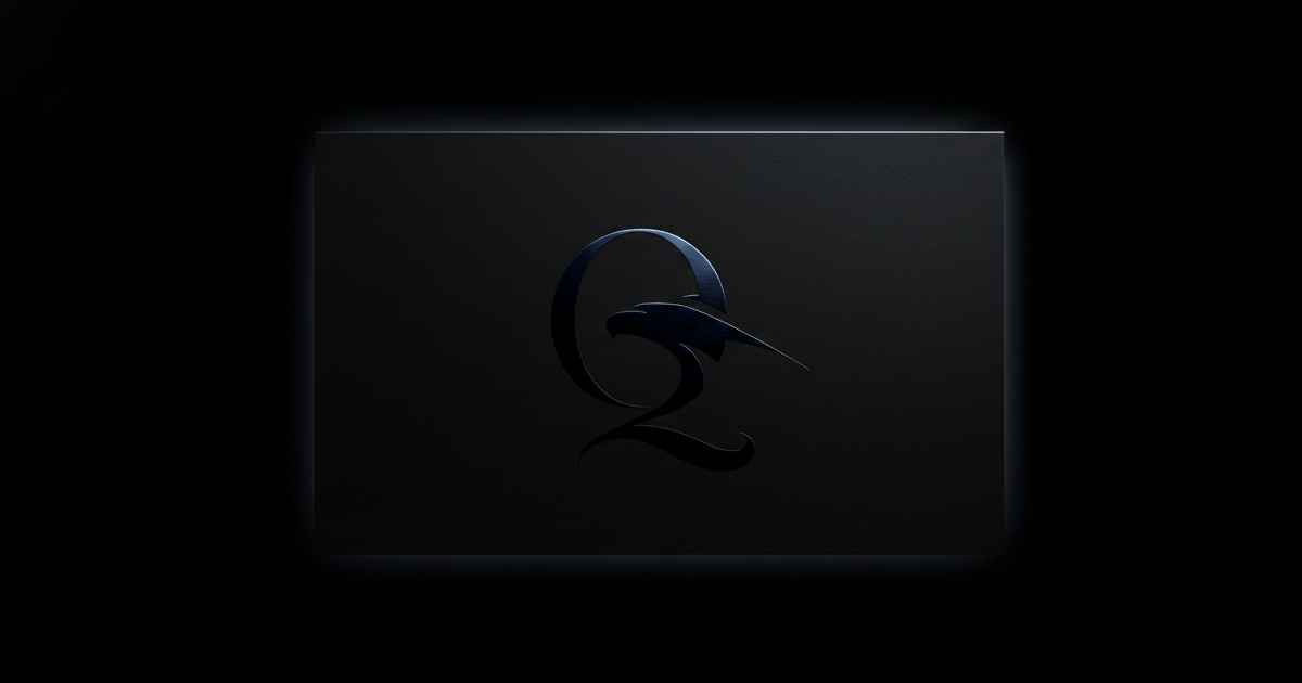
A complete visual identity for Qannas Investments: logomark, typography, colour system, and the visual language of an Abu Dhabi-owned, LSE-listed investment company. Built to communicate authority, precision, and the quiet confidence of serious institutional capital.
Brand Guidelines
A comprehensive guidelines document covering every application of the Qannas identity across investor communications, corporate documents, digital, and print ensuring consistency and quality across all touchpoints in both the UAE and UK markets.

Corporate Collateral
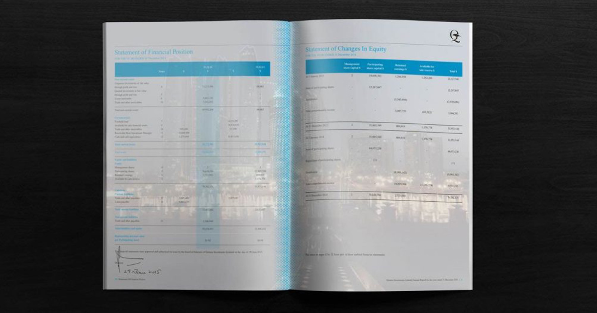
The full suite of corporate materials required for a publicly listed investment company — shareholder communications, investor relations materials, corporate stationery, and branded documentation built to the standard of an entity accountable to the London Stock Exchange.
The Outcome
Qannas Investments launched with a brand identity that represents the company with the authority and precision its name demands and its listing requires. The visual system communicates the credibility of Gulf capital alongside the standards expected of an LSE-listed entity coherently, consistently, and without compromise. A new entity in one of the world's most scrutinised investment environments, with a brand built to belong there from day one.
Project Details
Services: Brand Identity · Logomark · Brand Guidelines · Corporate Collateral · Investor Communications
Industry: Investment · Finance · Capital Markets
Location: Abu Dhabi, UAE · London, UK
Market: LSE · Gulf Institutional Investors · International Shareholders