Halal Butchery Brand
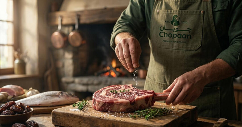
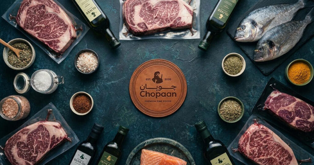
Chopaan is a premium artisanal halal butchery and gourmet grocery brand established in 2020, specialising in high-grade beef, lamb, poultry, artisanal cheeses, and imported fine foods. The name comes from the Pashto and Persian word for shepherd, carrying a cultural narrative of guardianship, natural pasture, and ancestral livestock expertise that runs through everything the brand does. Mike Rock Studio delivered a brand identity optimisation, a comprehensive luxury packaging system, and retail visual guidelines for a brand with genuine regional equity that needed a visual system equal to the quality of what it sells.

The Challenge:
Premium butchery has a branding problem in most markets. The functional aesthetic of a traditional butcher shop, however skilled the craft behind it, rarely communicates the quality of a master-butchered artisanal cut to the affluent consumer who increasingly expects transparency, ethical sourcing, and the kind of product presentation that matches what they are paying. For Chopaan, operating as a trusted provider since 2020 with a genuine cultural story behind the name, the gap between the product quality and the visual presentation was the brief.
The existing brand asset, a hand-illustrated shepherd emblem with integrated bilingual typography in Arabic and English, was a genuine strength worth building around rather than replacing. The challenge was constructing a complete packaging and retail system around that mark: one that worked across deep-freeze vacuum wraps, fresh butcher paper seals, glass spice jars, cheese sleeves, and grocery carriers without losing the coherence and quality signal at any point.

The Approach:
The creative strategy was built on a straightforward principle: honour the cultural heritage embedded in the Chopaan name through the quality and discipline of the visual system itself, rather than through nostalgic decoration.
The illustrated shepherd emblem, framed with an EST. 2020 sub-text, anchors the identity. The bilingual typographic system integrates a fluid Arabic Nastaliq script wordmark against a clean geometric English title and a tracked corporate sub-brand line, PREMIUM FINE FOODS, creating a typographic harmony that works in both language contexts without either reading as an afterthought.
The palette moves deliberately away from the predictable palette of most butchery brands. Deep juniper green and crisp ivory evoke organic pasture, natural herbs, and farm-to-table authenticity without the clinical sterility of white-on-white, or the generic warmth of kraft-and-brown that most artisanal food brands default to. Across all physical packaging, a minimalist structure with generous white space turns vacuum-sealed cuts, cheese wheels, and glass jars into considered objects rather than functional containers. Technical specification elements, aging periods, marble scores, halal origin certificates, are set with the same precision and clarity as the brand typography, treating product information as part of the premium experience rather than a regulatory requirement.

The Work
Brand Identity Optimisation:
A structural refinement of the existing bilingual logomark, perfecting the spatial balance between the shepherd emblem, Arabic calligraphy, and English typographic grid for consistent premium scaling across every format.
Artisanal Packaging System:
A complete packaging framework for fresh and frozen fine foods: blood-resistant wax butcher papers, cardboard grocery boxes, custom cheese sleeves, and blind-debossed leather-textured vacuum labels with gold-foil detailing.
Retail & E-Commerce Guidelines:
A brand manual covering spatial layout, colour distribution, and photographic art direction for both the physical boutique environment and the digital ordering platform.

The Outcome:
Chopaan has a brand identity that communicates the quality of what it sells before a customer opens the packaging. The shepherd mark and juniper-green palette give the brand a presence that is distinctly its own in the premium halal food category, and the packaging system treats every cut of meat and every wedge of cheese as something worth presenting properly. A brand built on the legacy of the shepherd, now looking the part.
Sourcing the extraordinary, wrapped in a legacy of absolute culinary trust.

Project Details:
Services: Brand Identity Optimisation, Artisanal Packaging, B2C Retail Strategy, Visual Guidelines
Industry: Gourmet F&B, Premium Halal Butchery, Luxury Grocery Retail
Location: Afghanistan
Market: Premium Halal Gastronomy, Fine Foods Retail, High-End Culinary Consumers