Healthcare Brand Identity UK
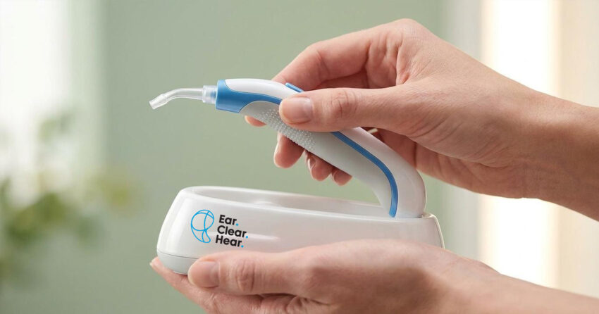
Ear Clear Hear is a UK-based ear health service specialising in micro-suction ear wax removal, a professional, safe, and effective procedure delivered in the comfort of a client's own home. The brief was as clear as the service proposition: create a brand identity that stood out in a healthcare category dominated by visual sameness, communicated genuine professionalism and trust, and did both through a vibrant, refreshing identity that made ear health feel approachable rather than clinical. Mike Rock Studio built the brand for a healthcare company that understood the value of looking different in a field that had forgotten it was allowed to.

The Challenge:
Healthcare branding in the UK occupies a narrow visual corridor. Blues, whites, the occasional green, palettes chosen for their associations with cleanliness and clinical credibility, applied so uniformly across the sector that they have ceased to communicate either quality convincingly. For a patient choosing a home healthcare service, the visual landscape offers almost no meaningful differentiation. One ear health provider looks like the next, and trust the primary purchase criterion ends up being built through other means: reviews, word of mouth, price.
Ear Clear Hear's proposition was genuinely distinctive. A mobile micro-suction service delivered at home: no clinic visit, no waiting room, a professional clinician at your door — was a more convenient and less intimidating experience than the category norm. The brand needed to reflect that distinctiveness: approachable enough to remove the anxiety that medical services can create, professional enough to build the trust that a home healthcare visit demands, and visually different enough from every competitor to be immediately memorable.

The Approach:
The creative decision was a deliberate break from category convention. The healthcare sector's visual conservatism is understandable - clinical environments carry genuine associations of cleanliness, safety, and professional credibility but it is not the only visual language that communicates those qualities. Ear Clear Hear's home service model was already doing something different from the rest of the category. The brand needed to follow that lead.
A vibrant colour palette, refreshing, energetic, and warm was chosen precisely because it was unexpected in this context. Not at the expense of professionalism, but as a reframing of it: a brand that communicates confidence and competence through its willingness to be itself rather than through imitation of the clinical aesthetic everyone else was using. The identity was clean in its construction and corporate in its quality, a simple, considered mark that carried genuine authority while the palette gave it the distinctiveness and memorability the brief called for.
The tone was built around the service's genuine advantage: natural ear care, delivered professionally, in the comfort of your own home. Accessible, reassuring, and precise healthcare language without the anxiety that clinical language can create.
The Work:
Brand Identity:
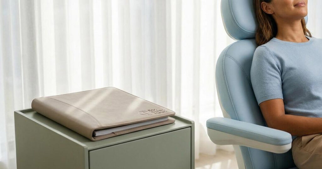
A complete visual identity for Ear Clear Hear, logomark, vibrant colour palette, typography, and the corporate identity of a UK home healthcare brand that chose to stand out in a category defined by visual conformity. Simple, refreshing, and built to be remembered.


The Outcome:
Ear Clear Hear launched with a brand identity that did what the brief asked, stood out from every other ear health provider in the UK market while communicating the professionalism and trustworthiness a home healthcare service demands. The vibrant palette made the brand immediately recognisable; the considered corporate identity gave it the credibility to match. A healthcare brand that proved you don't have to look like a clinic to be trusted as one.


Project Details:
Services: Brand Identity · Logomark · Corporate Identity
Industry: Healthcare · Home Health Services · Ear Care
Location: United Kingdom
Market: UK Home Healthcare · Consumer Health Services

