London Interior Design Logo Redesign
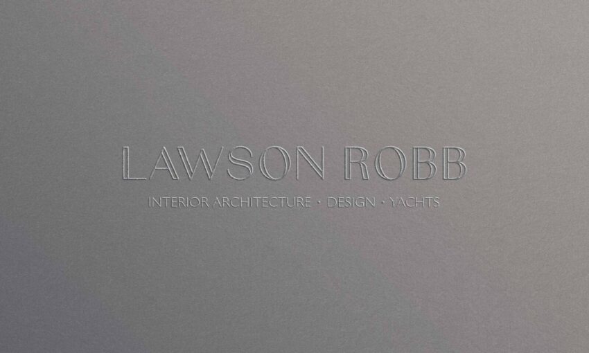
Lawson Robb is an award-winning interior architecture, interior design, and yacht design studio based in London, internationally recognised for creating work of genuine couture quality. When they approached Mike Rock Studio, the brief was straightforward but demanding: the brand needed to catch up with the work. A studio operating at this level, with this reputation, deserved an identity that communicated it without saying a word.
The Challenge:
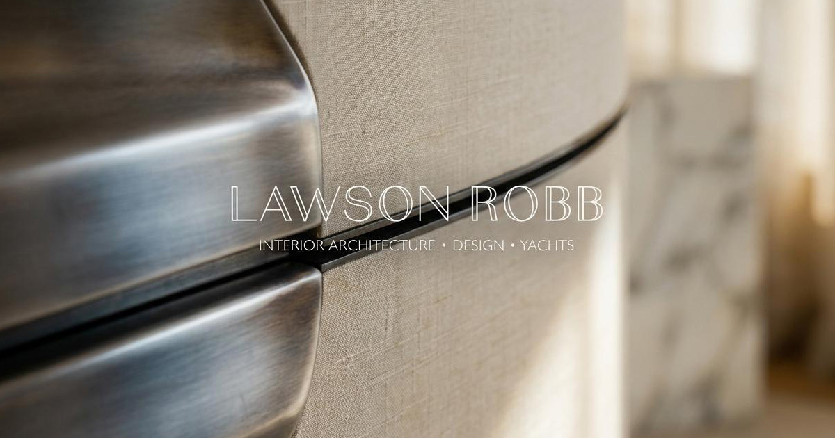
There's a particular kind of problem that only successful studios encounter, the work outgrows the brand. Lawson Robb had built an exceptional reputation across interior architecture, residential design, and yacht interiors, with a client roster and a portfolio that placed them firmly among the best in their field internationally. But the visual identity they were carrying into those conversations didn't reflect that standing.
For a studio whose entire proposition is the quality of what they make and how things look, a brand that undersells you isn't a minor inconvenience, it's a contradiction. The identity needed to be resolved.
The Approach:
The starting point was understanding what Lawson Robb actually is not what the brief said, but what the work says. Couture is the right word: each project is bespoke, considered, and executed to a standard that most studios don't operate at. The identity needed to carry that quality signal without announcing it.
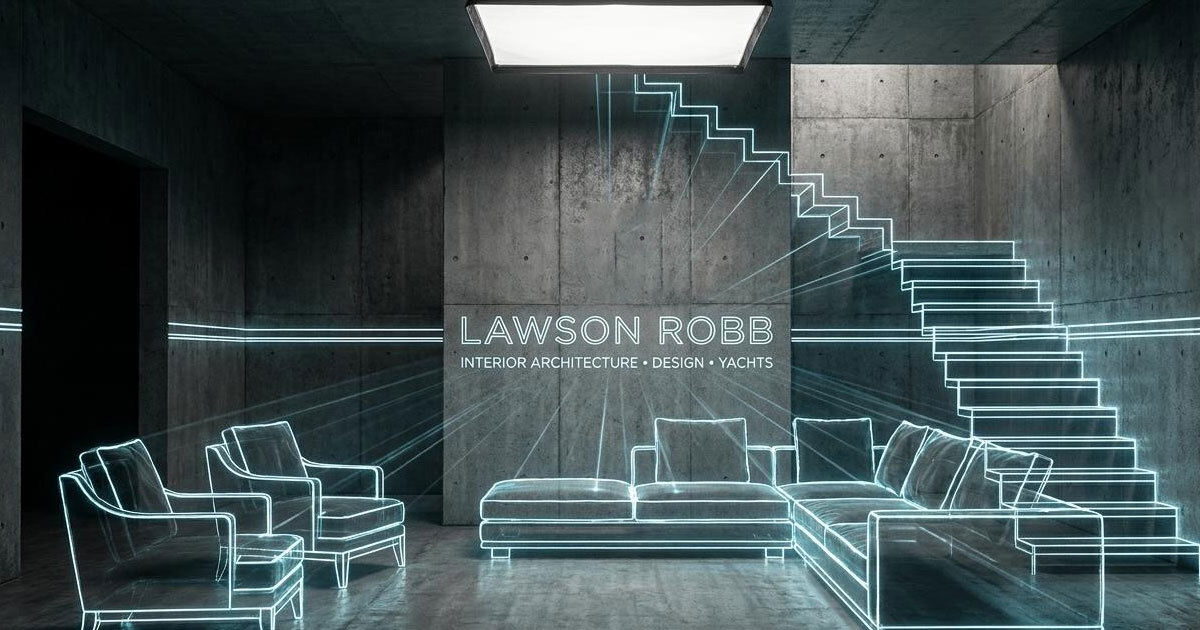
The logo refresh focused on refinement rather than reinvention. Lawson Robb had equity in their name, the task was not to replace what existed but to elevate it. The result is a mark that is quieter, more assured, and more consistent with the environments they design: spaces where restraint is a deliberate luxury, not an absence of ambition.
The Work:
Logo Redesign & Refresh:
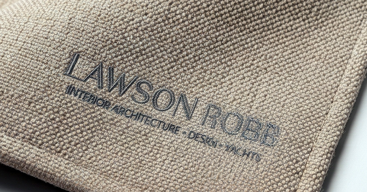
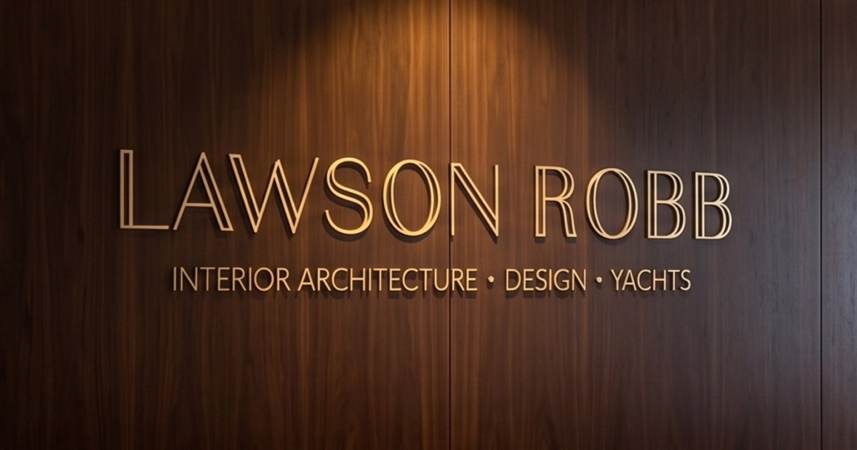
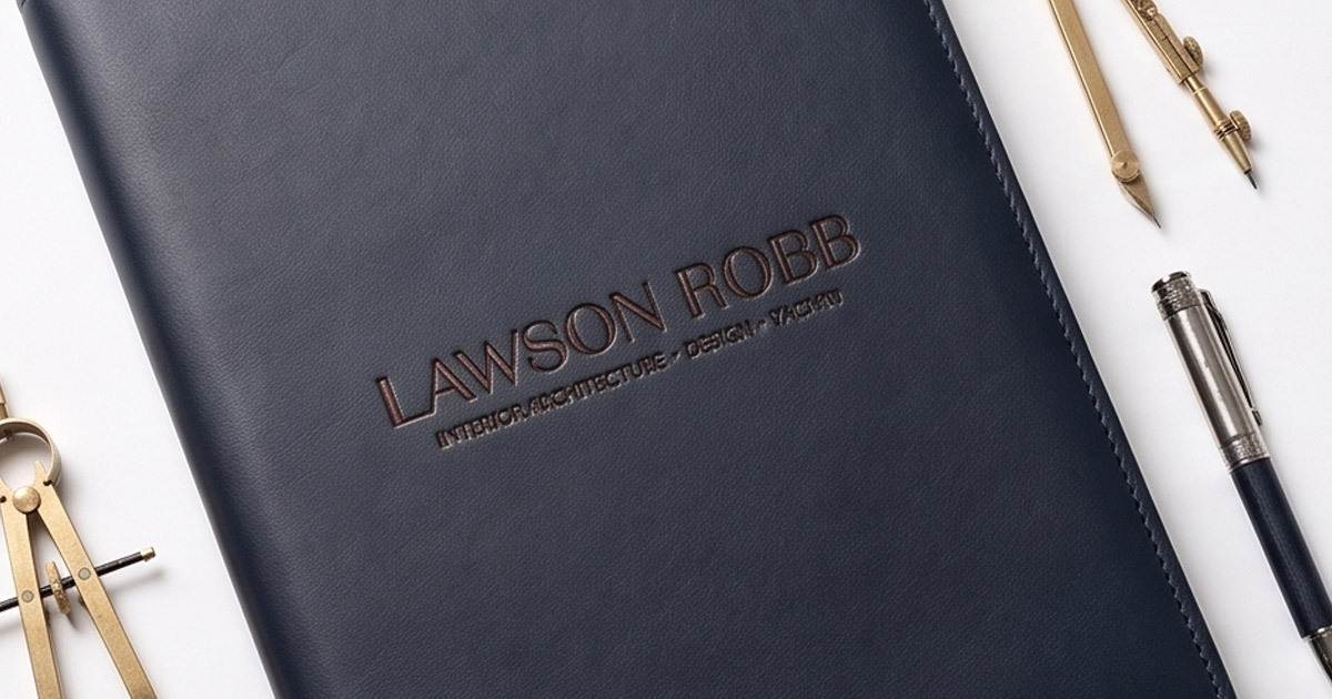
A refined logomark and wordmark that carries the authority the studio has earned, considered letterforms, precise spacing, and a visual weight that holds its own on everything from a superyacht specification document to a Chelsea showroom fascia.
Identity Application:
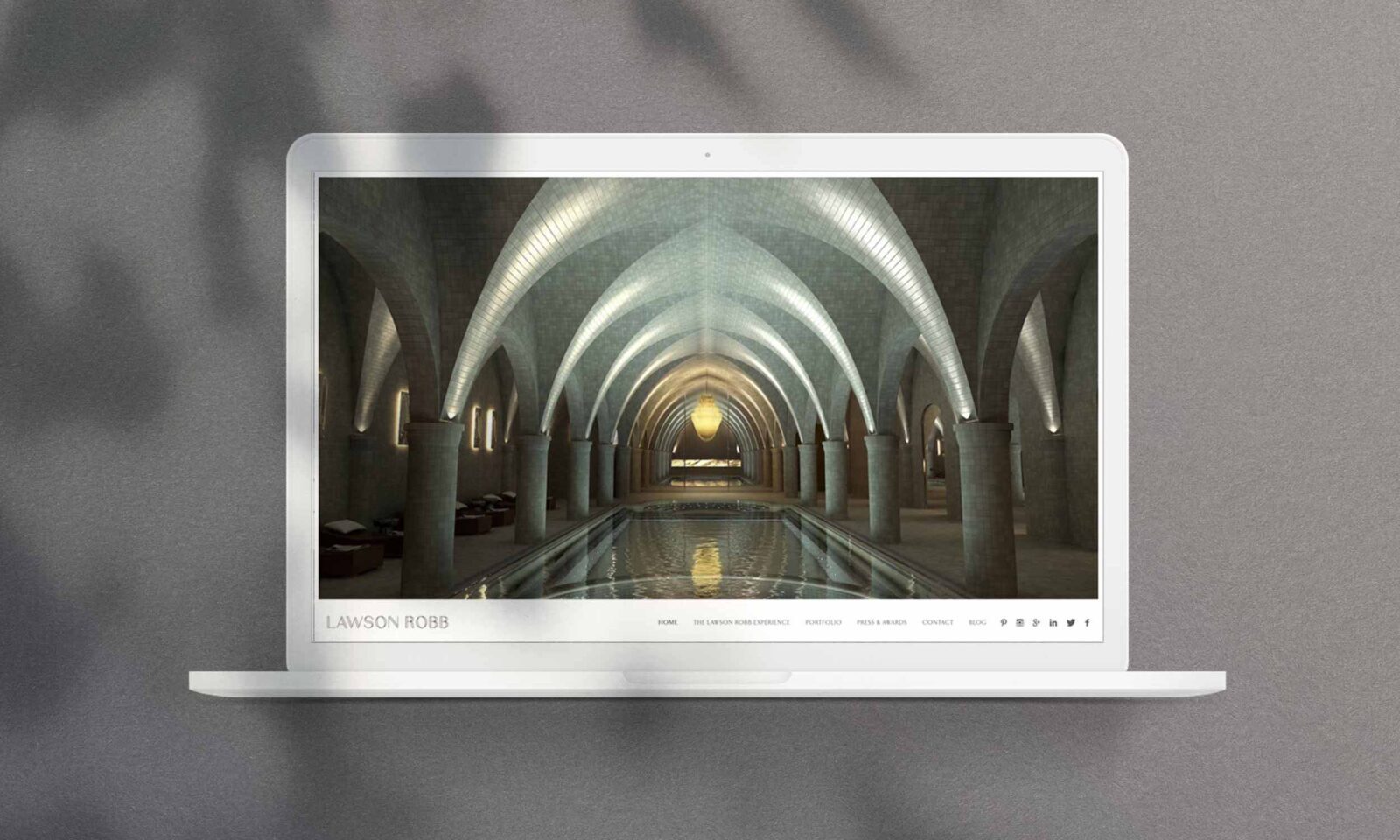
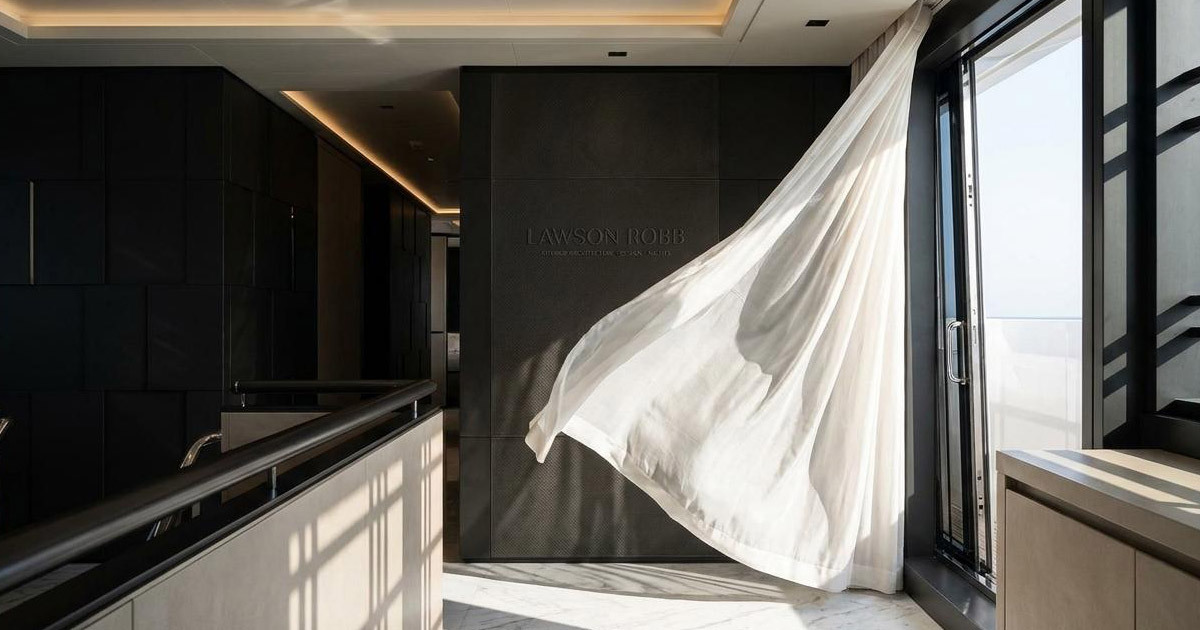
The refreshed identity applied across the key touchpoints where Lawson Robb makes its first impression, ensuring consistency across digital, print, and environmental contexts.
---
The Outcome:
Lawson Robb now has a visual identity that walks into a room the way their work does — with quiet confidence and no need to explain itself. The refresh resolved the gap between reputation and presentation, giving the studio a brand that reflects the calibre of clients they work with and the environments they create.
Project Details:
Services: Logo Redesign · Brand Identity · Identity Application
Industry: Interior Architecture · Interior Design · Yacht Design
Location: London, UK
Market: UK · Europe · International High-Net-Worth