Luxury Island Brand Identity Maldives
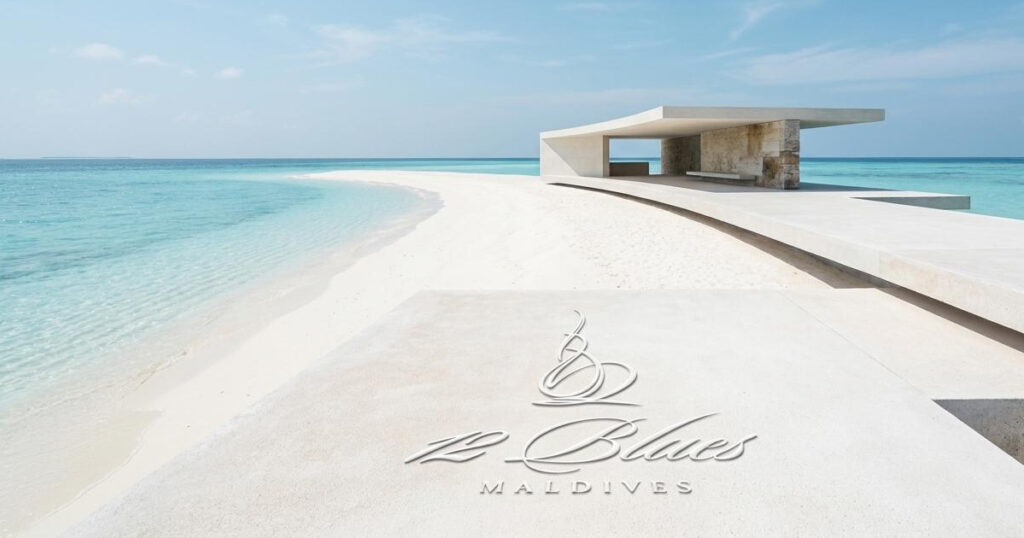
12Blues is a ten-acre private island in the Maldives archipelago — ninety miles north of Malé, thirty-five minutes by seaplane, and unlike anything else in the global luxury property market. On 11 October 2011, the President of the Republic of Maldives, Mohamed Nasheed, attended the groundbreaking of 12Blues, confirming the government's formal support for foreign investment in the islands. The significance of that moment was precise: 12Blues was the world's first hotel residences offered for sale by the government of the Maldives, a genuinely unprecedented proposition in one of the world's most coveted island destinations. Mike Rock Studio built the brand from scratch: identity, collateral, art direction, and print for a project that had no existing category to belong to.

The Challenge:
There is no established template for branding the world's first of anything. 12Blues entered a luxury property market where the established players, private island resorts, branded residences, ultra-luxury hospitality groups had decades of visual language, distribution, and reputation behind them. A new entrant at this level, offering something that had genuinely never been offered before, faced a double challenge: communicating the unprecedented nature of the proposition while earning the immediate trust and credibility of an audience, ultra high-net-worth individuals who had seen every luxury claim imaginable and remained sceptical of all of them.
The Maldives itself added creative complexity. The islands carry one of the most instantly recognisable visual associations in the world, turquoise water, white sand, overwater bungalows and the luxury hospitality brands that have built their identity in that environment have largely converged on the same visual language. 12Blues needed to be unmistakably of its place while being nothing like what already existed there.
The government endorsement and the presidential groundbreaking was the most significant credibility asset the brand possessed. The identity needed to carry the authority of that endorsement without losing the warmth and exclusivity that ultra high-net-worth buyers expect of a private island residence.
The Approach:
The name was the beginning of everything. 12Blues - twelve distinct shades of blue, the spectrum of the Indian Ocean as light moves through it at different depths, different times of day, different distances from the shore. It is a name that contains the island's entire visual world: the specific, irreplaceable beauty of the Maldivian ocean in all its variation. The brand was built to honour that name not by illustrating it, but by carrying its quality of specificity and depth into every element of the identity.
The creative direction was built on restraint and precision, the visual language of a brand that knows exactly what it is and has nothing to prove. Ultra high-net-worth audiences respond to confidence expressed through what a brand chooses not to do as much as what it does. A private island residence that announces itself with restraint communicates a different kind of exclusivity to one that shouts its credentials and for 12Blues, the product itself was the credential. The brand's job was to be worthy of it.
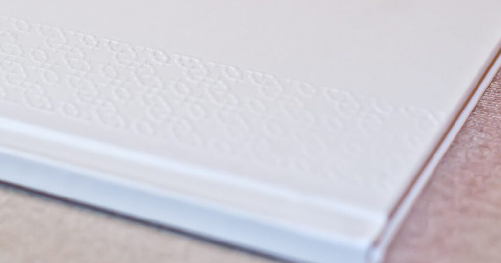
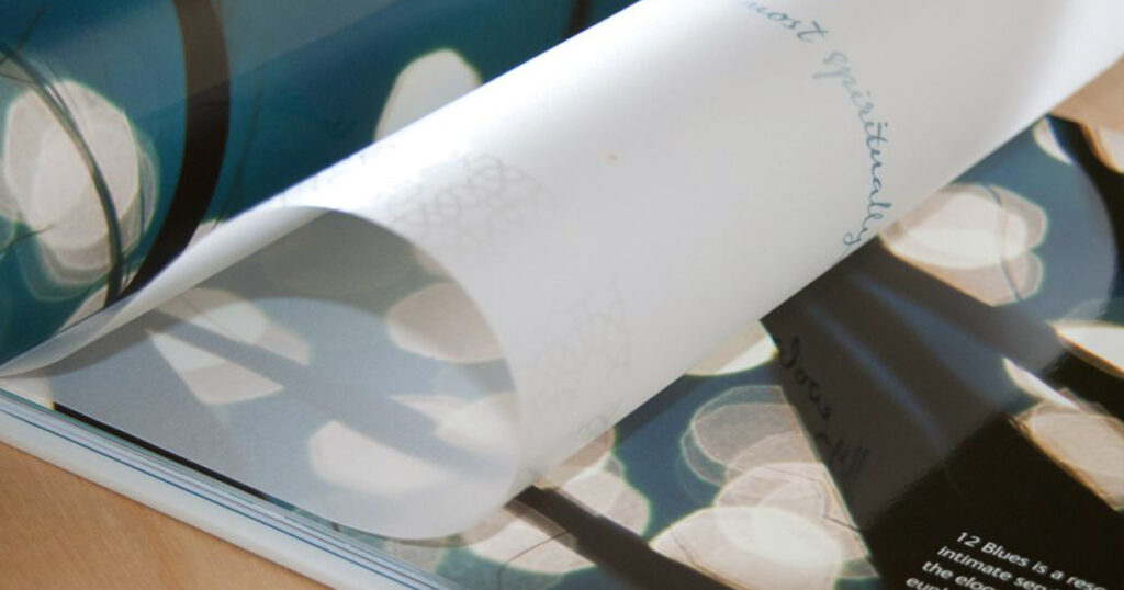
The art direction established the visual world of the island before construction was complete, creating the imagery and sensory language that would place 12Blues in the imagination of potential buyers as a fully realised place rather than a development prospect. Print collateral at the level of quality demanded by this audience: materials that communicated, through their production values, the standard of the residences they described.

The Work
Brand Identity:
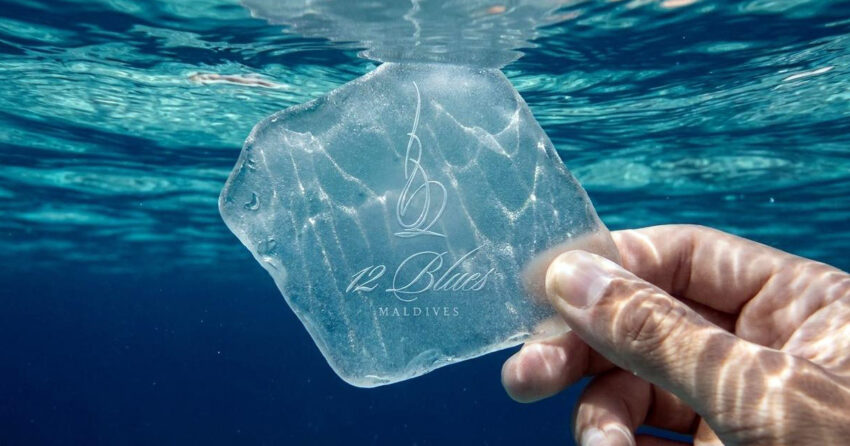
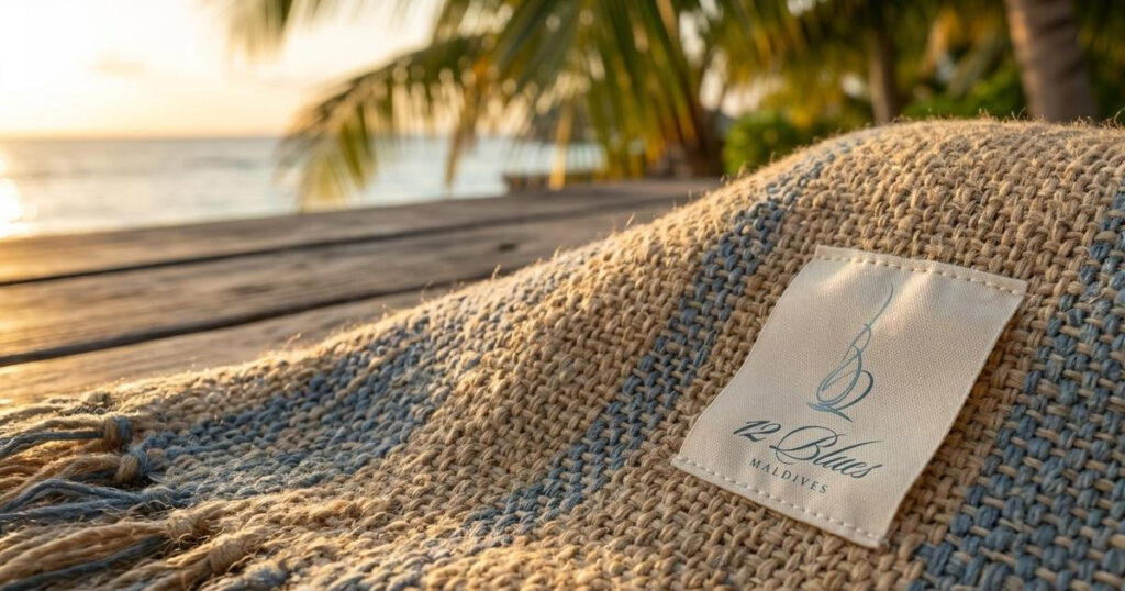
A complete visual identity for 12Blues: logomark, typography, colour system drawn from the spectrum of the Maldivian ocean, and the visual language of the world's first government-sanctioned Maldives hotel residence. Built for an audience that has everything — and knows the difference.
Art Direction:
Visual art direction establishing the world of 12Blues before the island was built the imagery, atmosphere, and sensory language that placed the residences in the imagination of ultra high-net-worth buyers as a fully realised destination rather than a development prospect.
Brand Collateral & Print:
A suite of print collateral produced to the standard demanded by a luxury property proposition at this level, materials whose production quality communicates the standard of the residences they present, in the hands of the world's most discerning buyers.
The Outcome
12Blues launched with a brand identity that placed it in a category of one because that is precisely what it was. The world's first hotel residences offered for sale by the government of the Maldives, on a private island ninety miles north of Malé, with a presidential groundbreaking and a brand built to the standard of the proposition it represented. The identity, art direction, and collateral gave 12Blues a presence in the global ultra-luxury property market from day one, worthy of the island, worthy of the moment, and worthy of the audience.
Project Details
Services: Brand Identity · Logomark · Art Direction · Brand Collateral · Print
Industry: Ultra-Luxury Real Estate · Private Island · Hospitality Residences
Location: Maldives
Market: Global UHNW · International Luxury Real Estate · Luxury Hospitality Investment
Website: 12blues.com