Investment Holding Brand Identity UAE

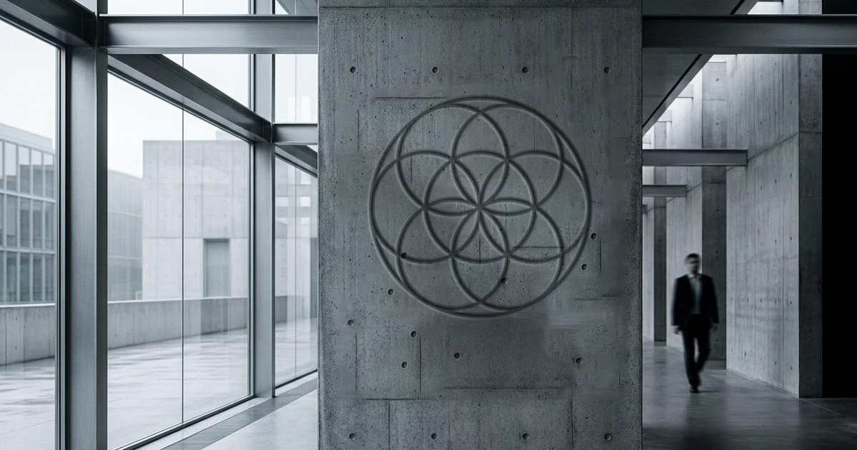
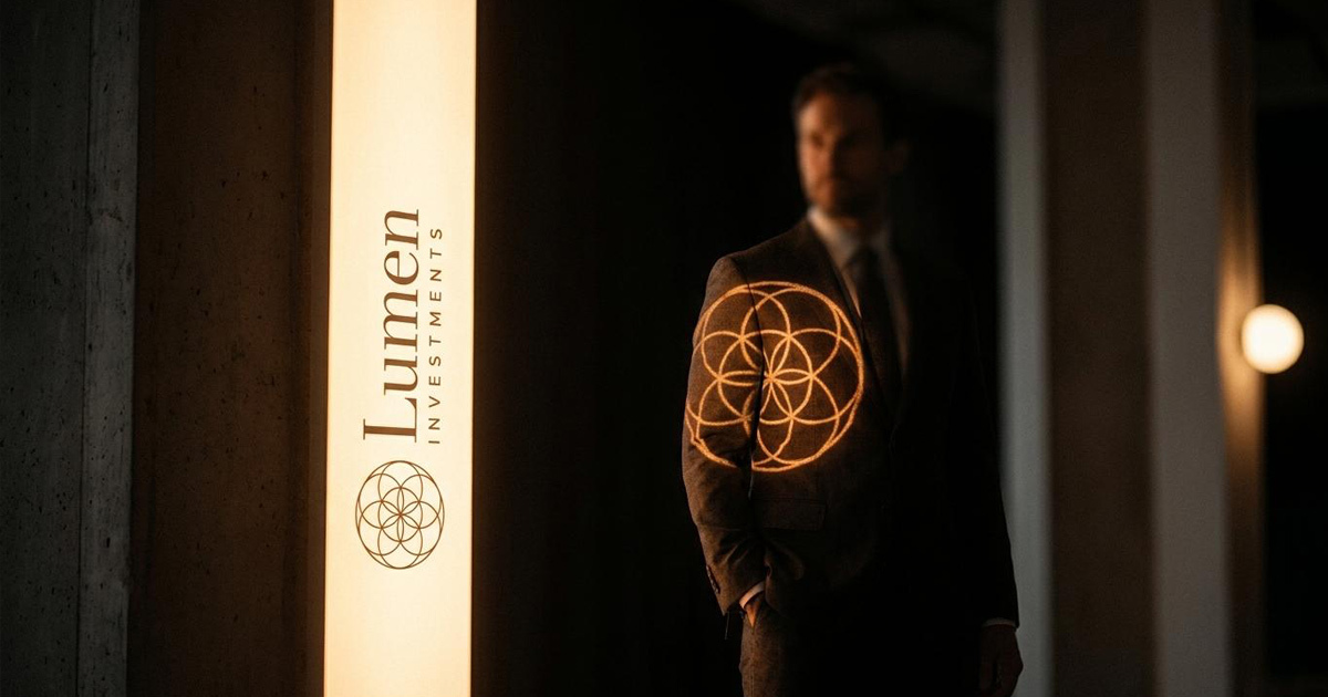
Lumen Investments is a UAE-based diversified investment holding company, a business whose value to its partners and stakeholders rests on three qualities that are difficult to demonstrate and essential to earn: durability, transparency, and trustworthiness. When Mike Rock Studio was commissioned to build the Lumen brand identity, the brief called for something deeper than aesthetic preference, a visual foundation as structurally sound as the investment philosophy it represented. The solution was the Seed of Life: a sacred geometric pattern whose seven interlocking circles have represented creation, process, and methodological progression across human cultures for millennia. For an investment company built on procedure and discipline, it was the most honest possible foundation.
The Challenge:
Investment holding companies occupy a specific and demanding position in the brand landscape. Their clients: partners, co-investors, portfolio companies, and institutional relationships — are sophisticated audiences who evaluate every signal of credibility, stability, and integrity before committing capital or trust. In the UAE, where the investment landscape is both competitive and internationally connected, a new or repositioning investment brand faces the challenge of communicating those qualities convincingly in a market that has seen a great many firms make the same claims.
Lumen's name - light, illumination, clarity gave the brand its directional signal. But a name alone does not build trust with the audiences that matter most in investment. The visual identity needed to carry that signal through every touchpoint: a typeface designed to communicate precision, an iconography system built on the same geometric logic as the master mark, and guidelines comprehensive enough to ensure consistency across the full range of investor communications, corporate materials, and digital presence.
The Seed of Life concept needed to be executed with enough sophistication that it read as a considered creative decision to a financially literate UAE audience not as decoration, but as the structural analogy for how Lumen operates.
The Approach:
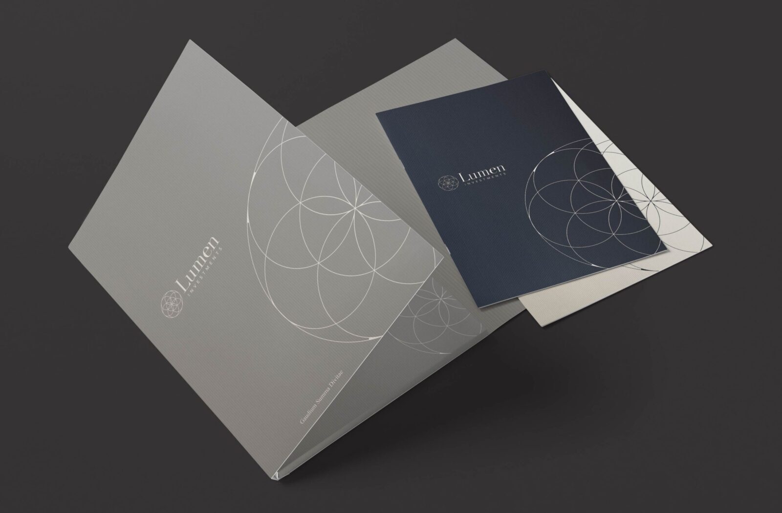
The Seed of Life — seven circles, each intersecting with the next, each stage emerging from the foundation of what preceded it is one of the most universally recognised geometric patterns in human visual culture. Its meaning is consistent across traditions and geographies: creation through process, complexity built from disciplined repetition, the emergence of something greater than any single component. For a diversified investment holding company whose competitive advantage is the rigour and methodology of its approach, the pattern is not a visual metaphor. It is an accurate description.
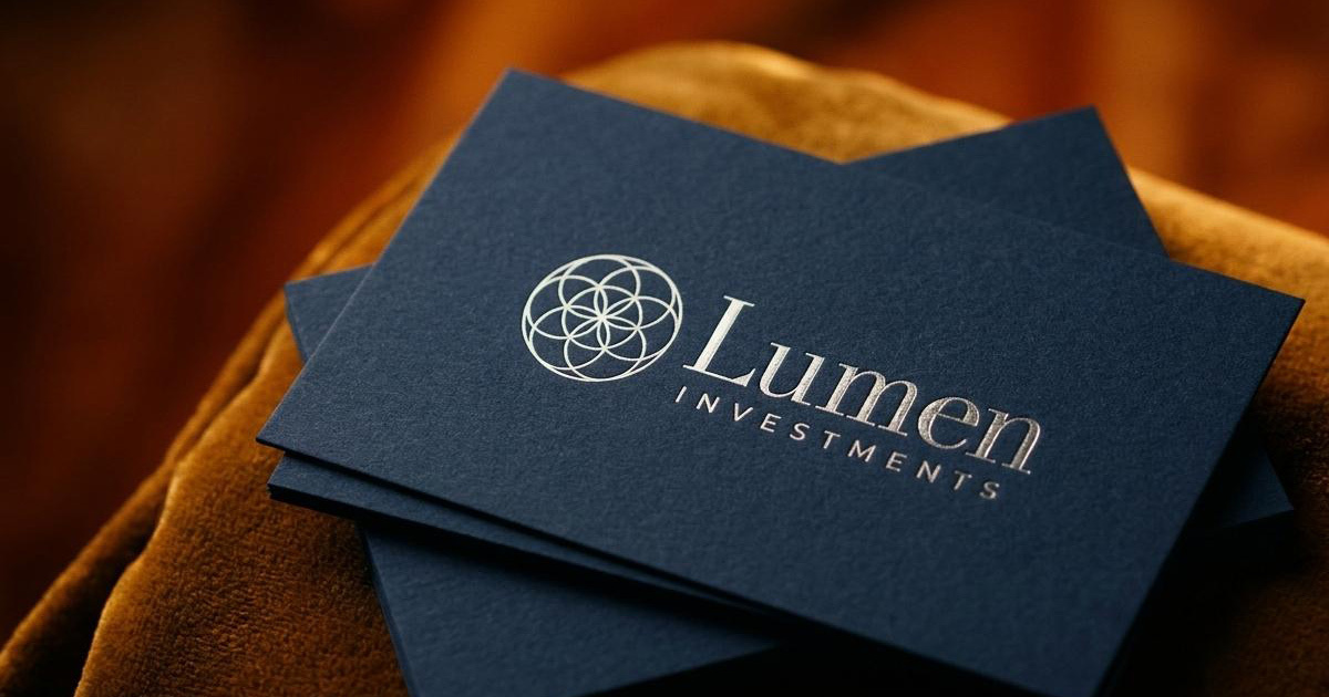
The name Lumen - light added a second layer of meaning to the geometric foundation. The Seed of Life, rendered with the luminosity appropriate to a brand named for light, communicates both the structural discipline of the investment process and the clarity of purpose that Lumen brings to its holdings. The two ideas, rigour and illumination, resolve into a single mark.
The custom typeface was designed to carry that precision into the typographic layer of the identity giving Lumen a letterform system that is entirely its own, unreplicable by competitors, and built on the same geometric logic as the iconmark. The iconography system extended the Seed of Life geometry across the full range of visual communications, ensuring that the brand's methodological commitment is visible at every scale and in every context.
The Work:
Brand Identity:
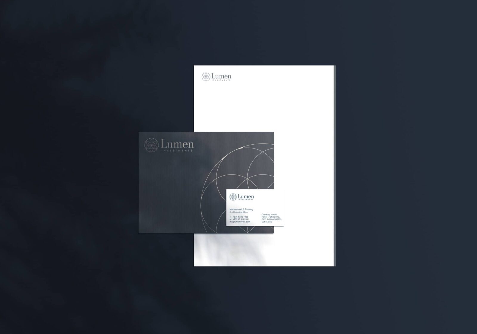
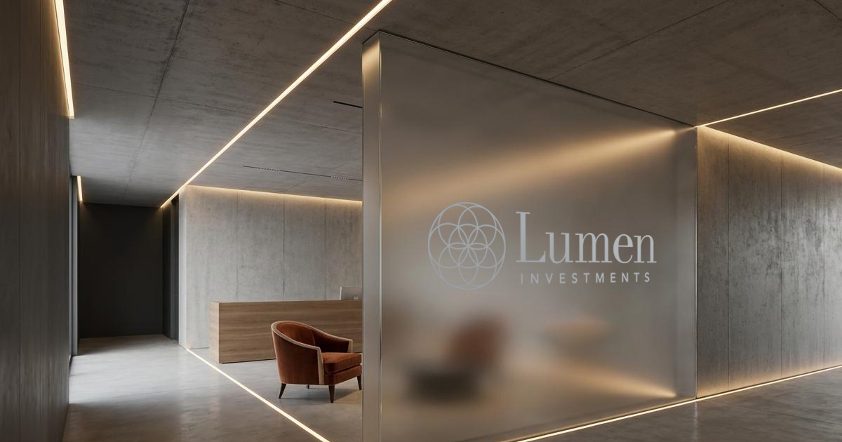
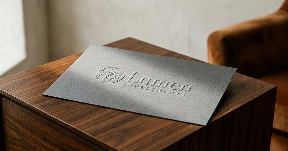
A complete visual identity for Lumen Investments: logomark derived from the Seed of Life, colour system developed around the luminosity of the brand name, and the visual language of a UAE diversified investment holding company built on durability, transparency, and trust.
Custom Typeface Design:
A bespoke typeface designed exclusively for Lumen carrying the precision and geometric discipline of the master mark into the typographic layer of the identity. A typographic asset that belongs entirely to the brand.
Iconography System:
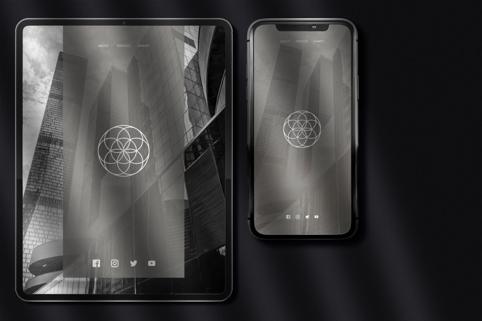
A cohesive iconography system developed on the Seed of Life geometric logic ensuring visual consistency across Lumen's investor communications, corporate materials, and digital presence.
Brand Guidelines:
A comprehensive guidelines document covering every application of the Lumen identity developed for a UAE investment holding company requiring the same standard of visual precision across every stakeholder touchpoint.
The Outcome
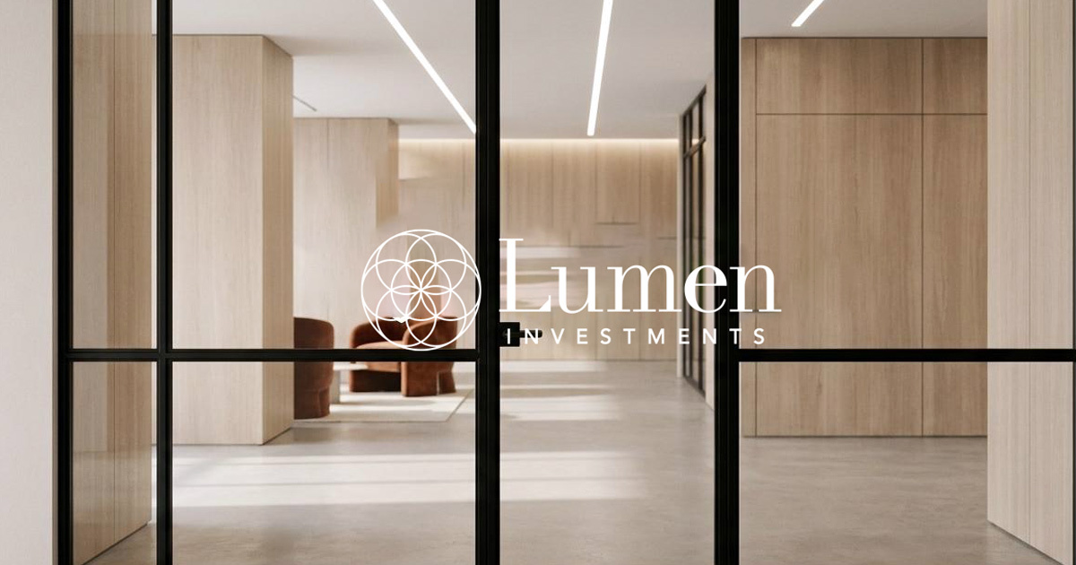
Lumen Investments has a brand identity that communicates the qualities its name promises: light, clarity, and the structural confidence of a company that operates with genuine methodological discipline. The Seed of Life mark, the custom typeface, and the iconography system work together as a complete visual system coherent, considered, and built to earn the trust of the audiences that matter most in UAE investment.
Durability, transparency, trustworthiness. Not as claims. As the geometry of the brand itself.
Project Details:
Services: Brand Identity · Custom Typeface · Iconography · Brand Guidelines
Industry: Investment · Finance · Holding Company
Location: UAE
Market: UAE Investment · GCC Capital Markets · Institutional Partners