Luxury Fragrance Brand Identity Doha
House of Falak is a luxury fragrance brand built on a philosophy that is both ancient and entirely contemporary: that scent is elemental, that the most powerful perfumes speak in the language of the natural world, and that true luxury is what remains when everything unnecessary has been removed. Falak - sky in Arabic gave the brand its name and its direction: expansive, celestial, rooted in the arabesque tradition while looking uncompromisingly forward. Mike Rock Studio built everything: brand identity, packaging, art direction, and digital for a fragrance house that set out to take its place among the world's finest from day one.
The Challenge:
The global luxury fragrance market is one of the most demanding creative territories a brand can enter. The established houses many with decades or centuries of heritage, occupy their positions through the accumulated weight of history, distribution, and cultural resonance that no new entrant can manufacture. A new luxury fragrance brand does not compete on heritage. It competes on vision on the clarity and conviction of what it is and what it believes about scent, beauty, and the people it is made for.
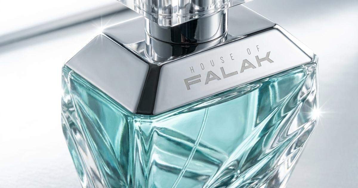
House of Falak's positioning, arabesque minimalism, clean and unisex scents, natural elements, skin-enhancing rather than scene-setting, placed it precisely at the intersection of two significant movements in global fragrance: the rise of niche and artisan perfumery, and the growing appetite among luxury consumers for restraint over spectacle. The challenge was building a brand identity, packaging system, and visual world that communicated that positioning with the authority and sensory richness the category demands without falling into the visual conventions that define it.
The brand also needed to carry a specific cultural intelligence. Falak is an Arabic name rooted in an arabesque tradition with its own visual language, its own relationship to beauty, craft, and ornamentation. The brand needed to honour that heritage — not as decoration, but as the genuine foundation of a contemporary luxury proposition with global reach.
The Approach:
The creative philosophy was arrived at through the brand name itself. Falak — sky. Something vast, permanent, and present above every landscape on earth. The sky is the one thing every human being shares regardless of geography, culture, or language. For a fragrance brand making clean, unisex scents rooted in natural elements, that universality was the most honest possible foundation.
The arabesque minimalism brief was resolved not by choosing between its two words but by holding both. Arabesque — the intricate geometric and organic patterning of the Islamic artistic tradition — is itself a form of minimalism: complex systems that resolve into extraordinary simplicity. The visual language drew on that principle, finding in the precision of arabesque geometry a contemporary idiom that was neither pastiche nor abandonment of its roots.
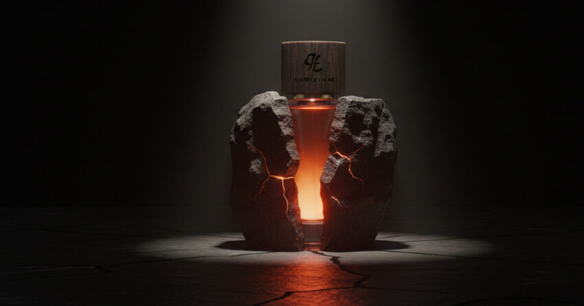
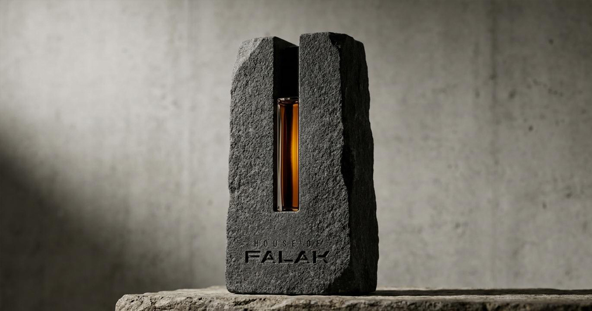
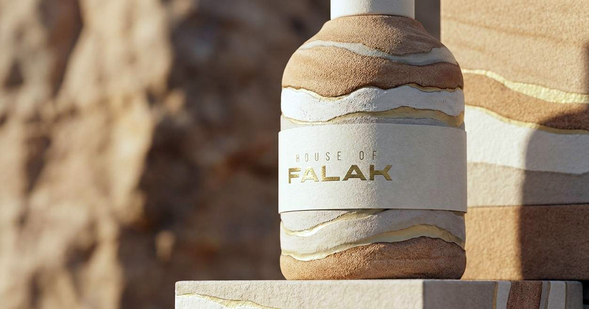
The packaging became the most important creative statement of the brand. The stone-carved bottle — a perfume vial held within a hand-cut block of raw stone, with the House of Falak name embossed into the rock face — communicates in a single object everything the brand believes: that the most precious things emerge from the earth, that luxury is earned through material honesty rather than surface ornament, and that the relationship between the natural and the refined is where the most interesting things happen. It is packaging that functions as sculpture.
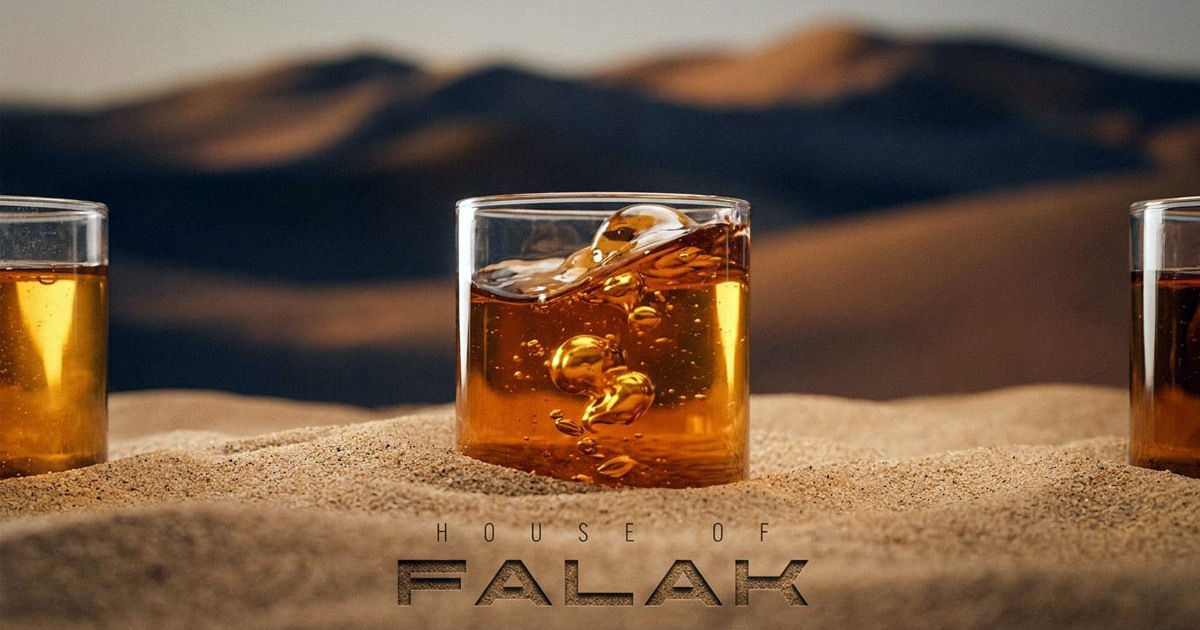
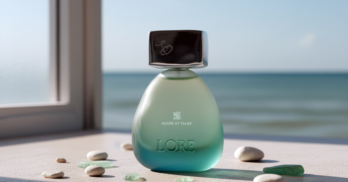
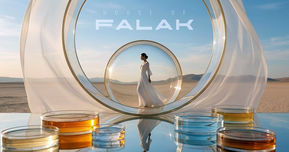
The art direction extended that visual philosophy across two further concepts — Elements and Gaïe — each exploring a different facet of the House of Falak world: the first, the translucent beauty of fragrance compounds in their raw state, framed within architectural glass structures in an open desert landscape; the second, a figure in white standing in absolute stillness against a salt flat horizon, the brand name anchoring the image with the same quiet authority. Together, the three visual concepts constitute a complete world — coherent, singular, and unlike anything else in the global fragrance market.
The Work:
Brand Identity & Guidelines:
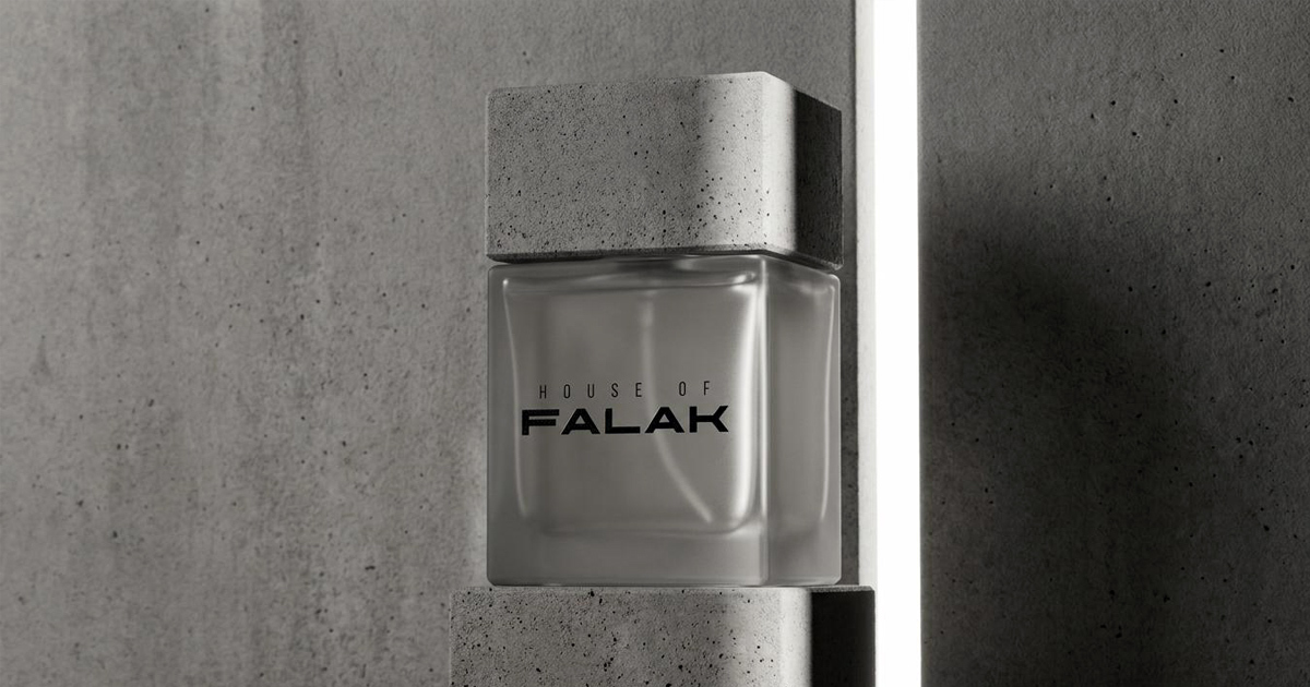
A complete visual identity for House of Falak: wordmark, typography, colour system, and the visual language of a global arabesque minimalist fragrance brand. Precise, restrained, and rooted in a genuine creative philosophy.
Packaging:
The stone-carved bottle: a perfume vial housed within a hand-cut block of raw stone, embossed with the House of Falak name. Packaging conceived as sculpture, an object that communicates the brand's values before it is opened, and remains worth keeping long after the fragrance is gone.
Art Direction:
Three distinct visual concepts: Earth, Elements, and Gaïe each exploring a different dimension of the House of Falak world. Campaign imagery that establishes the brand's visual language with the confidence of a house that has always known what it is.
Digital:
A digital identity and presence built to introduce House of Falak to the global luxury fragrance market where discovery is increasingly social and the visual standard is set by the world's most celebrated maisons.

The Outcome:
House of Falak enters the global luxury fragrance market with a brand identity, packaging system, and visual world that require no explanation and no apology. The stone bottle is an object of genuine beauty. The art direction establishes a visual world that is entirely the brand's own. The identity carries the precision and cultural intelligence that a brand named for the sky and rooted in the arabesque tradition - deserves.
This is the most complete creative statement in the Mike Rock Studio portfolio. A brand built from nothing, to a standard that belongs in the company of the world's finest fragrance houses.
Project Details:
Services: Brand Identity · Wordmark · Brand Guidelines · Packaging Design · Art Direction · Digital
Industry: Luxury Fragrance · Beauty · Niche Perfumery
Location: Dubai, UAE
Market: Global Luxury Fragrance · GCC · International Niche Perfumery