London Bespoke Kitchen Brand Identity

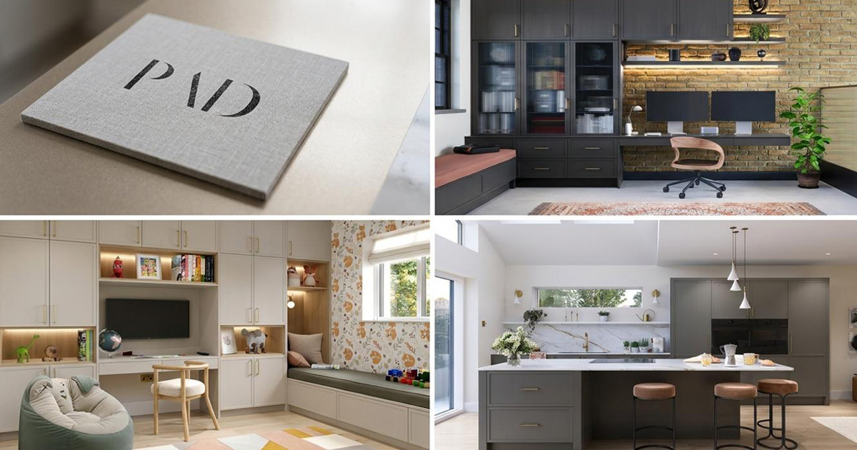
PAD - Property and Development, is a family-owned interior design practice based in London, specialising in bespoke kitchens and the joinery that completes them. Operating since 2016 across Greater London and the Home Counties, they approach every project as designers first, the kitchen is the outcome of a process that begins with understanding how a family actually lives. Their philosophy is distilled into three words: Let's Build Once. A commitment to quality, function, and longevity that runs through everything they do. Mike Rock Studio was commissioned to create a simple, memorable typographic wordmark worthy of that standard.
The Challenge
PAD occupies a precise and considered position in the London kitchen design market not a retailer, not a contractor, but a design practice. That distinction matters enormously to the clients they want to attract: homeowners who understand that a kitchen is an architectural decision, not a product choice, and who are prepared to invest accordingly.
The challenge was representing that positioning in a single wordmark. A mark that needed to feel as considered as the spaces PAD designs nothing superfluous, nothing decorative for its own sake, nothing that would date. A typographic solution that could carry the weight of a practice built on the principle that great design should last.
The Approach
The brief was clear: simple and memorable. In practice, those two qualities are the hardest to achieve simultaneously — particularly for a wordmark, where every decision about letterform, weight, spacing, and proportion is immediately visible and immediately consequential.
The starting point was PAD's own philosophy. *Let's Build Once* is not just a tagline — it's an architectural principle applied to every decision the practice makes. A wordmark built on the same principle would use nothing it didn't need, carry no decoration that didn't earn its place, and be as legible and resolved in ten years as it is today.
The typographic direction prioritised refinement over distinction — the kind of mark that communicates authority through restraint rather than through novelty. Letterforms selected for their proportion and permanence. Spacing considered as carefully as the letters themselves. A wordmark that feels as though it has always existed, which is the highest compliment a piece of considered typography can receive.
The Work
Typographic Wordmark
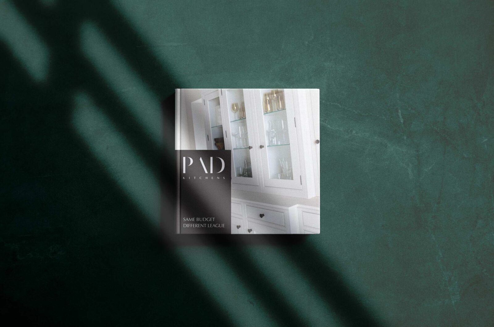
A clean, resolved PAD wordmark built on considered letterform selection, precise spacing, and proportions that hold at every scale. Simple enough to be immediately memorable. Refined enough to represent a practice that has spent years perfecting its process down to the finest detail.
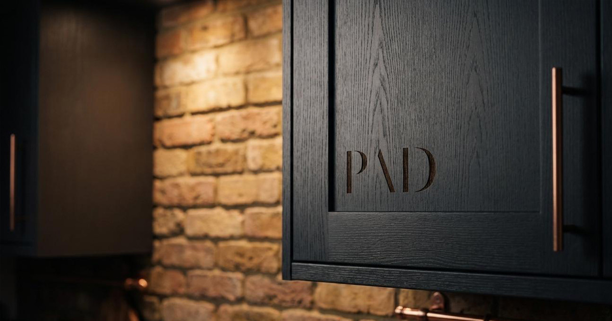
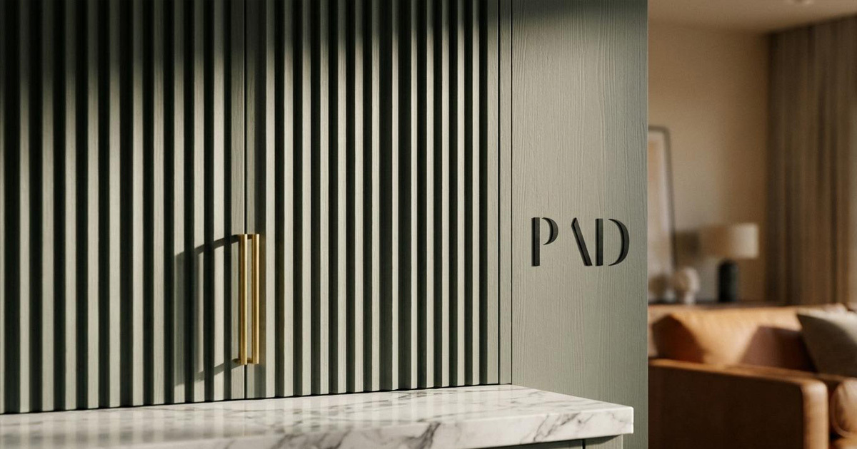
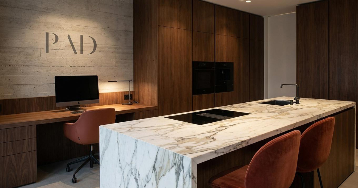
Identity Application
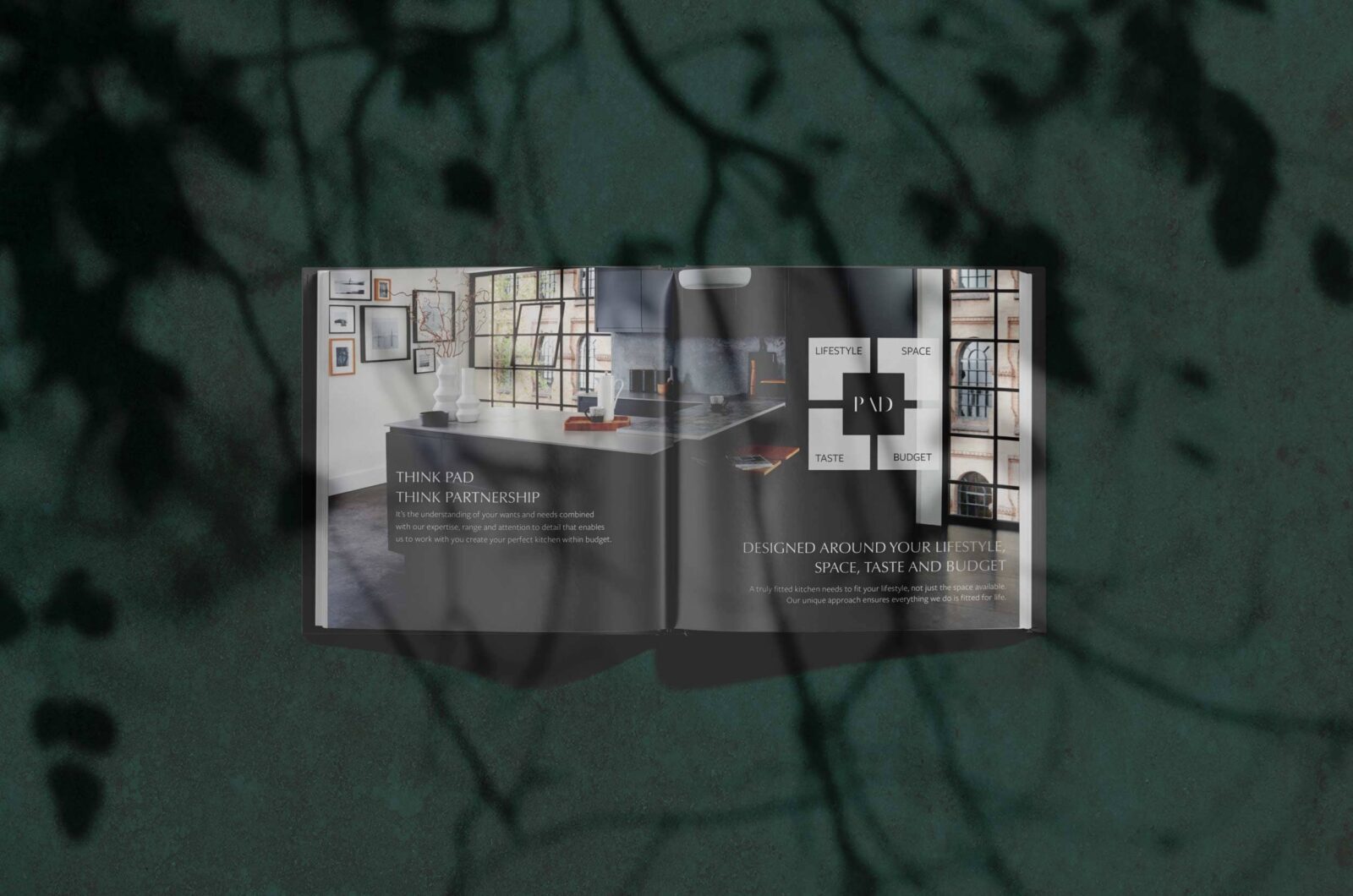
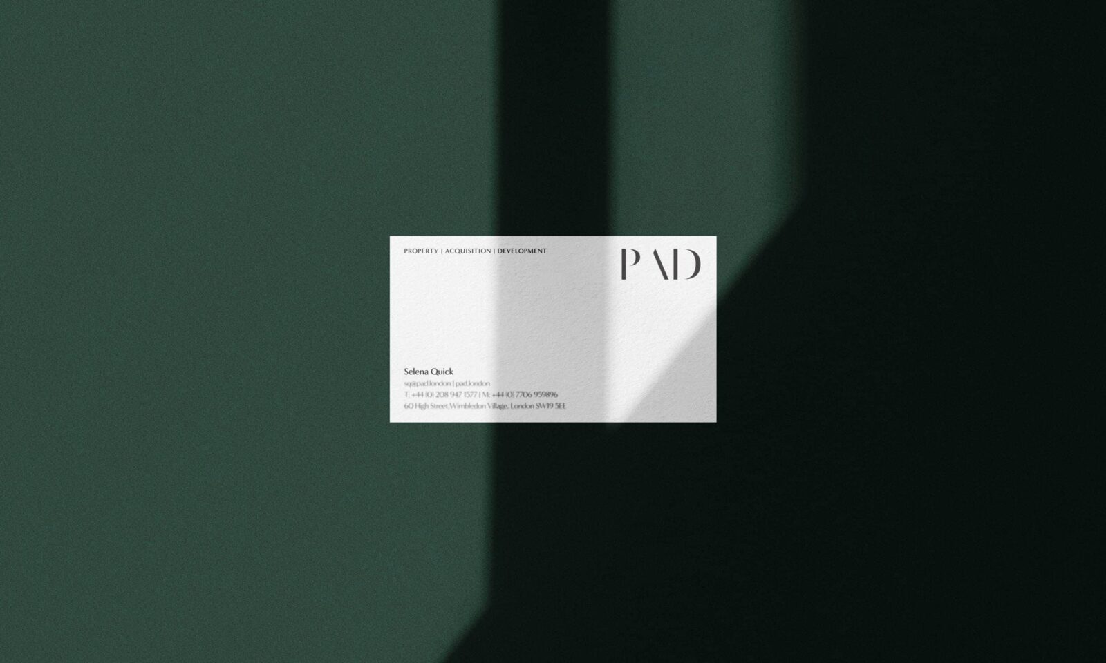
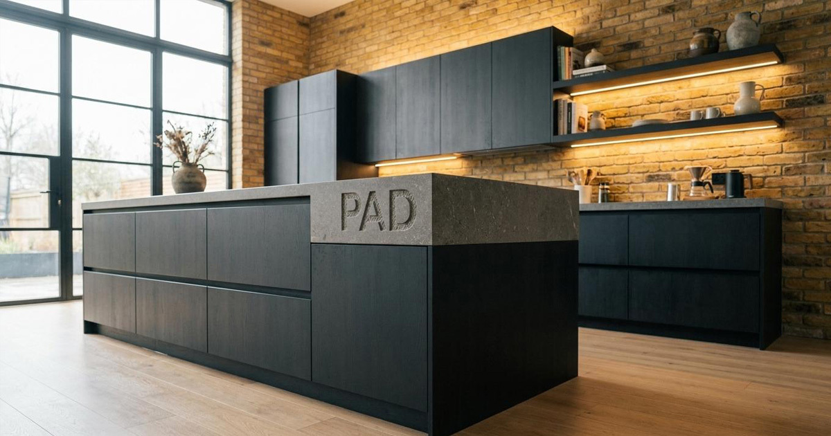
The wordmark applied across PAD's key touchpoints ensuring consistency and coherence across digital, print, and environmental contexts, from a website header to a site hoarding in the Home Counties.
The Outcome
PAD now has a wordmark that reflects the practice it represents — one that prioritises function, rewards attention, and is built to last. The mark carries the authority of a design practice that has been operating with genuine conviction since 2016, without needing to announce it. Like the best kitchen design, it simply works.
*Great design works hard, is timeless, and well suited to the way you want to live.* PAD's own philosophy. The wordmark was built to the same specification.
Project Details
Services: Typographic Wordmark · Brand Identity · Identity Application
Industry: Interior Design · Bespoke Kitchens · Joinery
Location: Greater London & Home Counties, UK
Market: London Residential · High-End Home Design