Luxury Real Estate Brand Identity India - Palace Gardens
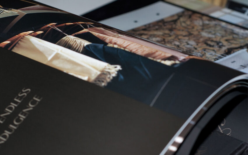
Hirco is a real estate company with an ambitious development in Chennai, Palace Gardens, a residential address in Oragadam designed to offer tranquillity, beauty, and the kind of living experience that makes the city feel distant even when you are at its heart. The challenge Mike Rock Studio was brought in to solve was both a branding problem and a perception problem: Oragadam is one of Chennai's most significant logistics and industrial corridors, and the association that name carried was precisely the opposite of the peaceful, prestigious residential destination Palace Gardens was designed to be. Mike Rock Studio built the complete brand identity, website, advertising, and collateral for both Hirco as a company and Palace Gardens as its flagship project.



The Challenge:
Location perception is one of the most difficult problems in property marketing. Palace Gardens was a genuinely compelling residential proposition: tranquil, beautifully conceived, and offering a quality of living that the Chennai market was ready for. But Oragadam's reputation as a logistics and industrial hub meant that the area's name, in the minds of potential buyers, carried associations of factories and freight rather than gardens and peace. That association needed to be overcome before the development's genuine qualities could be heard.
The dual brief added complexity. Hirco as a parent company needed a brand identity that communicated the credibility and ambition of a real estate developer operating at this scale. Palace Gardens as a project brand needed its own visual identity, one distinct enough to carry the development's specific character and desirability, while remaining coherently connected to the Hirco parent. Two brands, one creative system, two very different audiences and emotional registers.

The Approach:
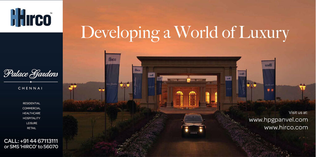
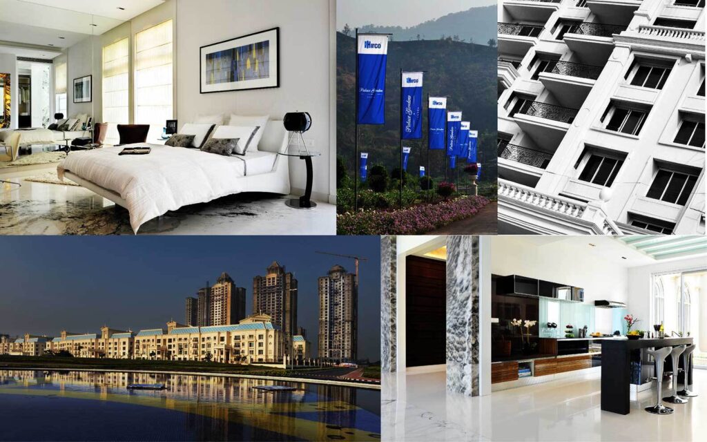
The Palace Gardens name was the creative starting point and the most important asset the development possessed. A palace is a statement of arrival, of aspiration fulfilled. Gardens are the antidote to the urban: breathing space, natural beauty, the particular quality of green within a city. The brand was built to honour both words fully, to make Palace Gardens feel, in every piece of communication, like the destination it was designed to be rather than the location it happened to occupy.
The strategy was to lead with the destination and let the location follow. Rather than addressing the Oragadam perception challenge directly which would have amplified it, the brand was built to make Palace Gardens so compelling in its own right that the location became secondary to the experience. Every visual and verbal decision communicated arrival, tranquillity, and the specific pleasure of a residential address that earns its name.
The Hirco parent brand was developed in parallel — authoritative, considered, and carrying the credibility of a developer whose flagship project was Palace Gardens. The two identities were designed to work in hierarchy: Hirco as the trusted developer behind the vision, Palace Gardens as the vision itself.
The website, advertising, and collateral were built to serve the high-net-worth residential buyer at every stage of their decision journey from first awareness through to the emotional commitment of a purchase at this level.



The Work:
Brand Identity: Hirco
A complete visual identity for Hirco as a real estate developer, communicating the credibility, ambition, and considered approach of a company whose flagship project is Palace Gardens.
Brand Identity: Palace Gardens
A distinct project brand for Palace Gardens, visual identity, typography, colour system, and the brand language of a premium Chennai residential address. Built to communicate tranquillity, prestige, and desirability in a location that required those qualities to be felt before they could be believed.
Advertising:
A campaign developed to introduce Palace Gardens to its target audience placing the destination in the imagination of potential buyers and overcoming the location perception challenge through the quality and consistency of the brand experience.
Collateral & Guidelines:
A complete suite of print collateral and brand guidelines covering every touchpoint of the Palace Gardens buyer journey from the first piece of marketing material to the documentation supporting a completed sale.

The Outcome:
Palace Gardens launched with a brand identity that made the destination feel real and desirable before a single show home was open. The perception challenge, Oragadam's industrial associations was addressed not by arguing against it but by making Palace Gardens so compelling in its own right that the argument became unnecessary. A Chennai residential development with a brand built to the standard of the address it promised.


Project Details:
Services: Brand Identity · Website · Advertising · Collateral · Brand Guidelines
Industry: Real Estate · Luxury Residential · Property Development
Location: Chennai, India — Oragadam
Market: Chennai High-Net-Worth Residential · Indian Luxury Property

