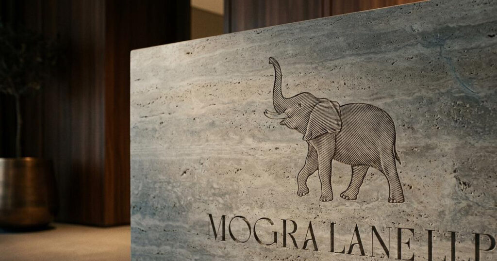
Luxury Villa Brand Identity Goa
Mogra Lane LLP is a real estate development firm headquartered in Panaji, Goa, operating alongside its consumer-facing brand Mogra Life. The firm specialises in high-end residential construction and ultra-luxury villa developments across North Goa including the custom-crafted Mogra Villas in Anjuna and the heritage-steeped Château Series in Aldona and Colvale building residences that hold contemporary luxury and Goan-European architectural heritage in the same hand. The brief was a visual identity and collateral system that matched the scale and craft of the developments themselves. Mike Rock Studio refined the brand architecture and built a complete collateral system positioning Mogra Lane within India's luxury second-home market.
The Challenge:
Goa's luxury real estate market has shifted. Buyers from Mumbai, Delhi, and international markets aren't looking for standard modern condominiums anymore they want privacy, architectural character, and a genuine connection to Goan culture rather than a generic luxury aesthetic dropped into a coastal location. For Mogra Lane, that meant standing apart from the mass-scale commercial developers who tend to flatten regional character in pursuit of a more easily replicated formula.
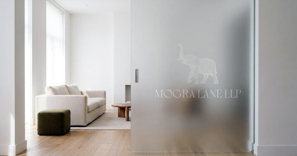
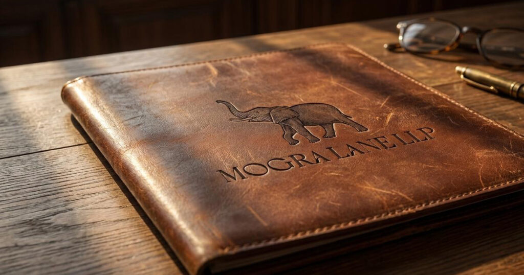
The firm's existing visual asset, a hand-etched elephant illustration paired with a classical serif wordmark featuring distinctive ligature detail was a genuine strength worth building around. The harder problem was making one identity work across two very different physical registers: light, organic, and effortlessly coastal for the sun-drenched villas of Anjuna, and stately, historically grounded for the paddy-field vistas and classical archways of the Aldona châteaus. A brand that only worked for one register would misrepresent the other.
The Approach:
The strategy positioned Mogra Lane as more than a construction firm, a custodian of heritage and slow, considered architecture, with the elephant emblem at its centre as a long-standing symbol of wisdom and quiet permanence. The palette was built from the place itself: deep espresso, sun-bleached ivory, and rich terracotta, echoing the laterite soils and natural stone textures of North Goa rather than importing a generic luxury colour story.

The typography leaned into the rhythm of the existing serif wordmark: generous letter-spacing, editorial grids carried consistently across every physical and digital touchpoint. For the property portfolios and villa lookbooks, the pagination was treated like a design publication rather than a sales brochure: atmospheric architectural renderings set against close material studies, timber grain, hand-cut stone, interior collaborations giving buyers who think of real estate as a collectible investment exactly the kind of intimate, gallery-style experience that audience responds to.

The Work:
Brand Identity System:
A refinement and expansion of the existing Mogra Lane identity preserving the hand-etched elephant illustration while building a disciplined brand architecture that unifies the corporate entity with the client-facing Mogra Life villa developments.
Brand Applications:
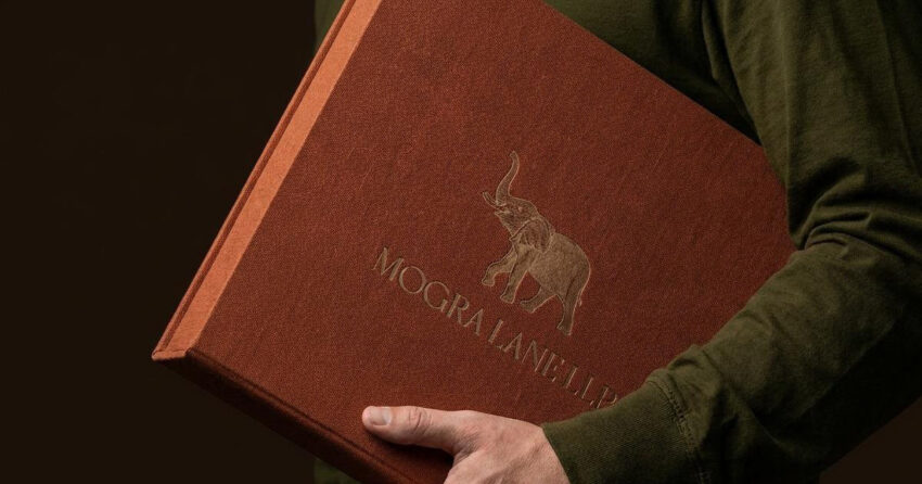
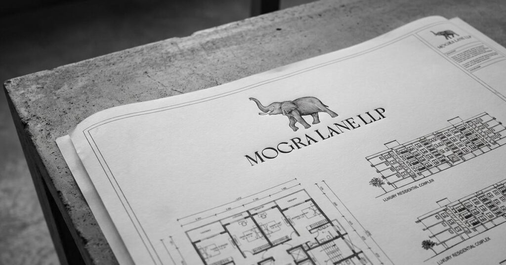
A system of physical touchpoints built for on-site client viewings, custom-bound architectural blueprint folders, embossed cotton-paper site maps, branded stone specimen boxes, and minimalist brass property signage.

The Outcome:
Mogra Lane now has a brand identity that scales across the full range of what it builds, as comfortable representing a sun-drenched Anjuna villa as it is a heritage Aldona château. The elephant emblem and serif wordmark carry the firm's existing equity forward, while the warm, Goa-rooted palette and editorial-grade collateral give Mogra Lane a presence that matches how its buyers actually evaluate luxury property: as a considered, almost collectible decision rather than a transaction.

Project Details
Services: Brand Identity · Heritage Positioning · Brand Applications · Property Collateral
Industry: Luxury Real Estate · Residential Development · Hospitality-Adjacent Property
Location: Panaji, Goa, India
Market: India Luxury Second-Home Market · Mumbai & Delhi HNW Buyers · International Buyers