MarTech Brand Identity UK
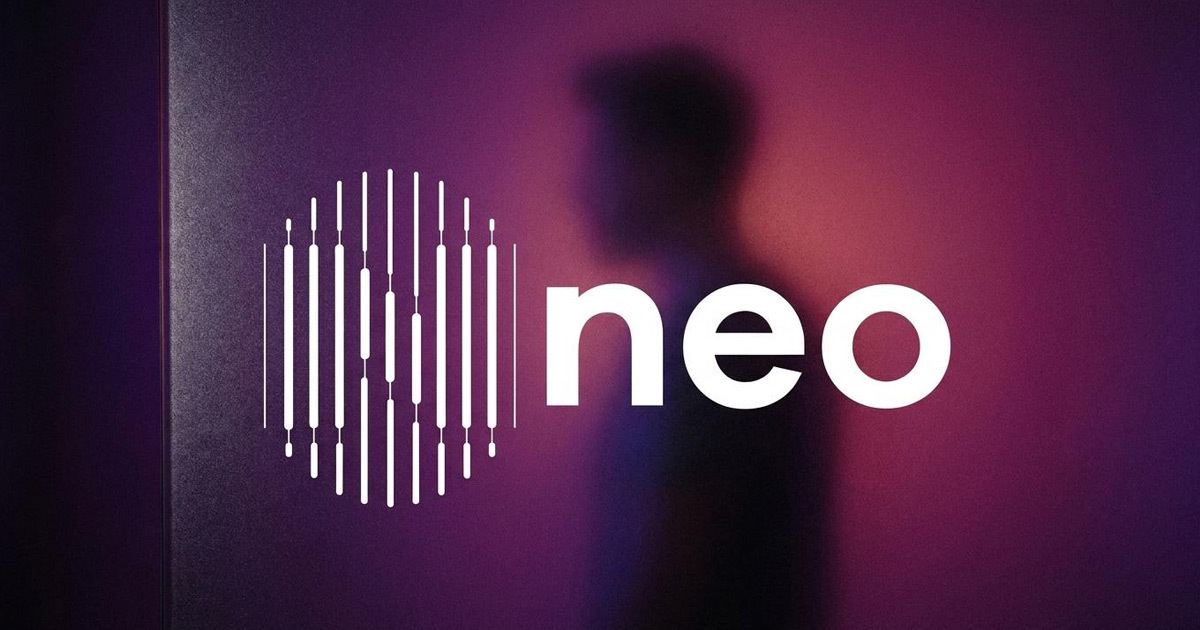
Neo is a real-time data analysis platform built for marketing teams who need to move faster than their competitors. Powered by DATP (datp.co.uk), it integrates live insights from social media, websites, and applications into a single, actionable view enabling marketing teams to make informed decisions in the moment rather than after the fact. The proposition is precise: less time spent on data, more time spent on strategy. Mike Rock Studio was commissioned to build the brand identity and guidelines for a UK MarTech product entering a crowded and competitive digital intelligence market.

The Challenge:
The MarTech and SaaS brand landscape is one of the most visually saturated in the technology sector. Data platforms, analytics tools, and marketing intelligence software compete for attention in a market where the visual conventions gradients, abstract geometric marks, cool blue palettes, claims about insight and intelligence have become so widely adopted as to be almost meaningless as differentiators. For a product as genuinely capable as Neo, the risk was disappearing into the visual noise of a category that had standardised its own aesthetic.
The brief required a brand that communicated the precision and real-time responsiveness of the product, a platform where speed, clarity, and the immediate translation of data into action are the core value propositions while establishing a visual identity distinctive enough to be remembered in a market full of near-identical competitors. The corporate identity also needed to function as brand tools for the DATP business a system coherent enough to serve both the Neo product and the parent company's communications.
The Approach:
The name Neo - new, fresh, the next thing gave the creative direction its starting point. In a data and marketing context, Neo carries an additional reading: not just new, but the necessary evolution of how marketing decisions are made. The brand needed to feel like it belonged to the future without the visual clichés that most technology brands reach for when they want to signal forward momentum.
The visual direction was built on clarity and precision, the qualities that define what Neo actually does. A data platform that delivers real-time insights needs a brand identity that communicates immediately and without ambiguity: clean in its construction, authoritative in its typography, and distinctive enough in its mark to be recognisable at every scale from a browser favicon to a conference presentation.
The guidelines were developed to serve Neo as a product brand and DATP as its parent,a system flexible enough to serve both contexts while maintaining visual coherence across the full range of marketing, digital, and corporate applications the UK tech market demands.
The Work:
Brand Identity:
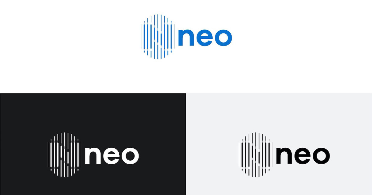
A complete visual identity for Neo: logomark, typography, colour system, and the visual language of a UK MarTech brand built on the values of precision, speed, and real-time intelligence. Distinctive in a saturated market, coherent across every application.
Brand Guidelines:
A comprehensive guidelines system covering Neo's brand applications across digital, marketing, and corporate contexts — built to serve both the Neo product brand and the DATP parent company with the same visual coherence.
The Outcome:
Neo launched with a brand identity that communicates its core proposition clearly and confidently — real-time intelligence, precision-driven marketing, the competitive advantage of knowing what's happening as it happens. The visual system is built to stand out in a MarTech market where most brands look identical, and to scale consistently as the platform grows across the UK and beyond.
As the Neo team put it: the brand was designed by Mike Rock — a seasoned expert whose influence ensures a seamless integration of functionality and aesthetics, embodying a brand that stands out in the competitive digital landscape.

Project Details:
Services: Brand Identity · Logomark · Brand Guidelines
Industry: MarTech · SaaS · Data Analytics · Digital Marketing
Location: United Kingdom
Market: UK Tech · SaaS · Digital Marketing