Qatari Luxury Chocolate Brand
Kaafe Chocolatier is a Qatari luxury chocolate brand founded in 2011 by a Qatari chocolate connoisseur with a precise and considered vision: to produce premium handmade Belgian chocolates that carry the flavours of Qatari culture and heritage. From truffles and dipped fruits to seasonal limited editions, wedding collections, and corporate gift programmes, Kaafe operates across the full range of premium chocolate and confectionery — selling online and directly to clients who value both the quality of the product and the cultural authenticity behind it. Mike Rock Studio was commissioned to refresh the brand identity and build the complete system, packaging, digital, and collateral for a chocolatier that had been building its reputation since 2011 and deserved a brand that matched it.
The Challenge:
A luxury chocolatier refresh presents a specific creative challenge: the existing brand has equity, clients who recognise it, trust it, and associate it with a product they love. A refresh that moves too far from what exists risks alienating that loyal audience; one that changes too little fails to communicate the evolution the brand needs to make. The brief demanded a refined, elevated identity that honoured twelve years of reputation while presenting Kaafe with the visual authority of a luxury brand ready for the GCC premium gifting market.
The Qatari heritage dimension added a layer of specific creative responsibility. Kaafe's flavours are rooted in Qatari culture, the brand's authenticity is genuine, not performed. The visual identity needed to carry that cultural specificity with the same honesty as the product itself, communicating a brand that is of Qatar rather than simply located there.
The product range's breadth from everyday truffles to bespoke wedding collections and corporate gift programmes required a visual system versatile enough to serve every occasion and format, from a single chocolate box to a seasonal limited-edition series, without losing the coherence and luxury positioning that defines the brand.
The Approach:
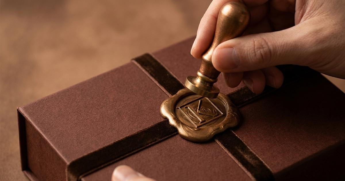
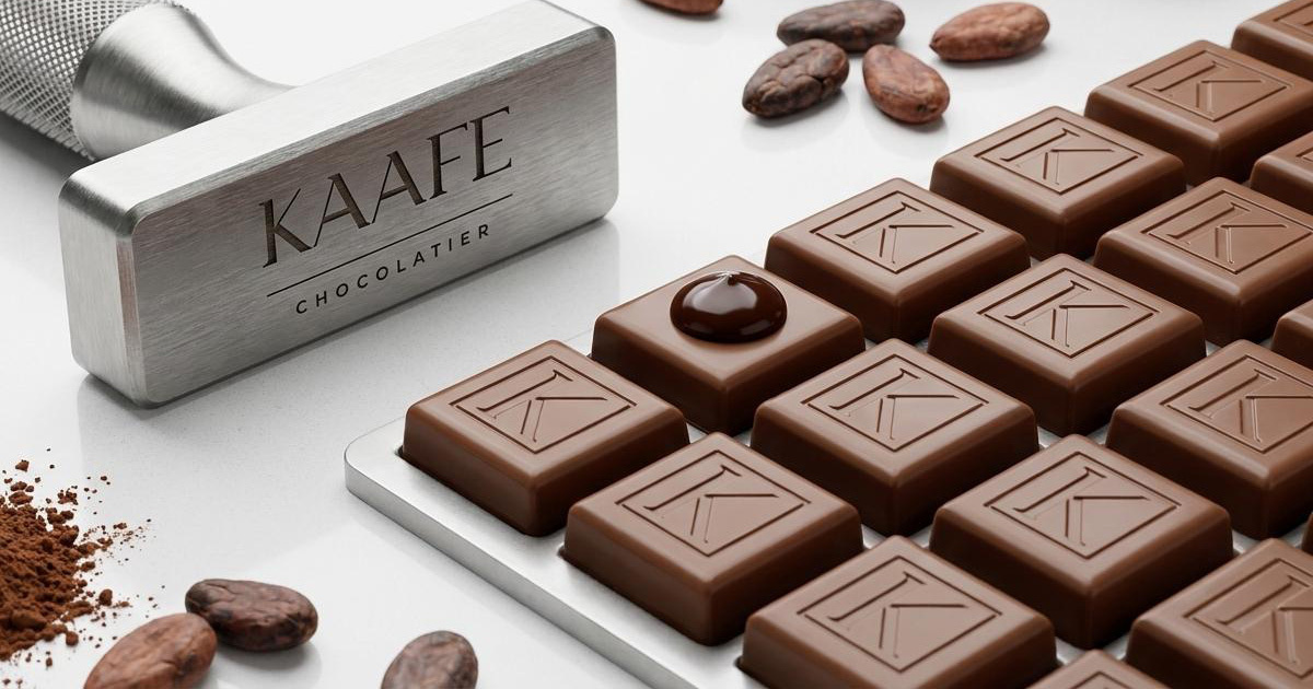
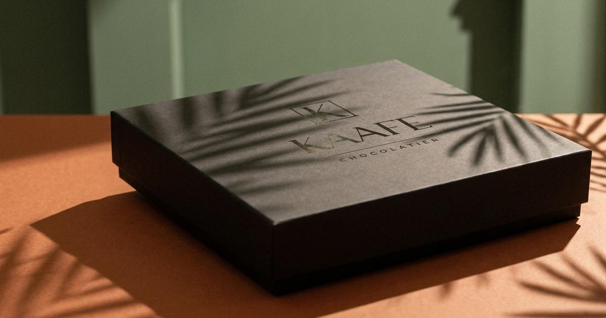
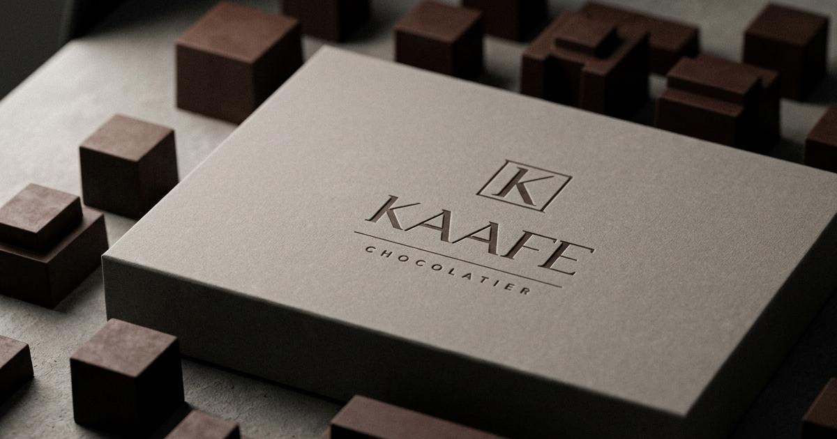
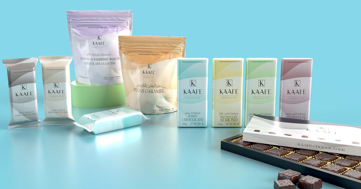
The mark: a serif K monogram within a precise square frame, set above the KAAFE wordmark with CHOCOLATIER in refined spaced capitals below — is the creative foundation of everything. It is a mark of considered restraint: the square provides structure and authority, the K within it communicates the brand's initial with quiet confidence, and the typographic hierarchy below carries the full name and category with the elegance of a European maison. The deep chocolate brown, a single, specific tone rather than a generic dark gives the identity its immediate sensory connection to the product.
The refresh built on that foundation, elevating every element without replacing what had already earned its place. The packaging system was developed to serve Kaafe's full product range from everyday purchase to special occasion gifting with a coherent visual language that communicates luxury at every price point. Seasonal and limited-edition packaging was designed within the same system, giving Kaafe the flexibility to celebrate major occasions and events with visual distinctiveness while remaining unmistakably itself.
The digital identity and collateral extended the same visual intelligence into the online channels and direct client communications through which Kaafe sells its products carrying the brand's warmth, heritage, and luxury positioning into every interaction.
The Work:
Brand Identity Refresh:
An elevated refresh of the Kaafe Chocolatier identity — refined logomark, deep chocolate brown colour system, typography hierarchy, and brand language that honours twelve years of Qatari heritage while presenting the brand with the authority of a GCC luxury chocolatier.
Packaging:
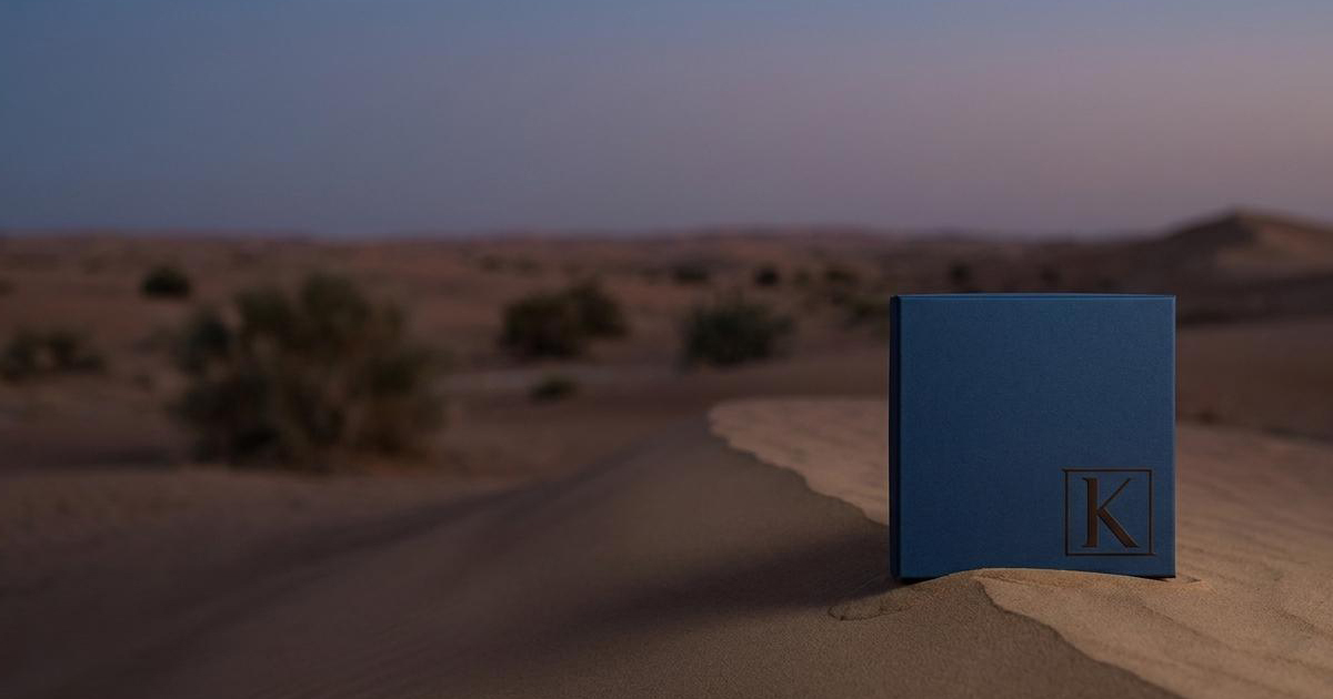
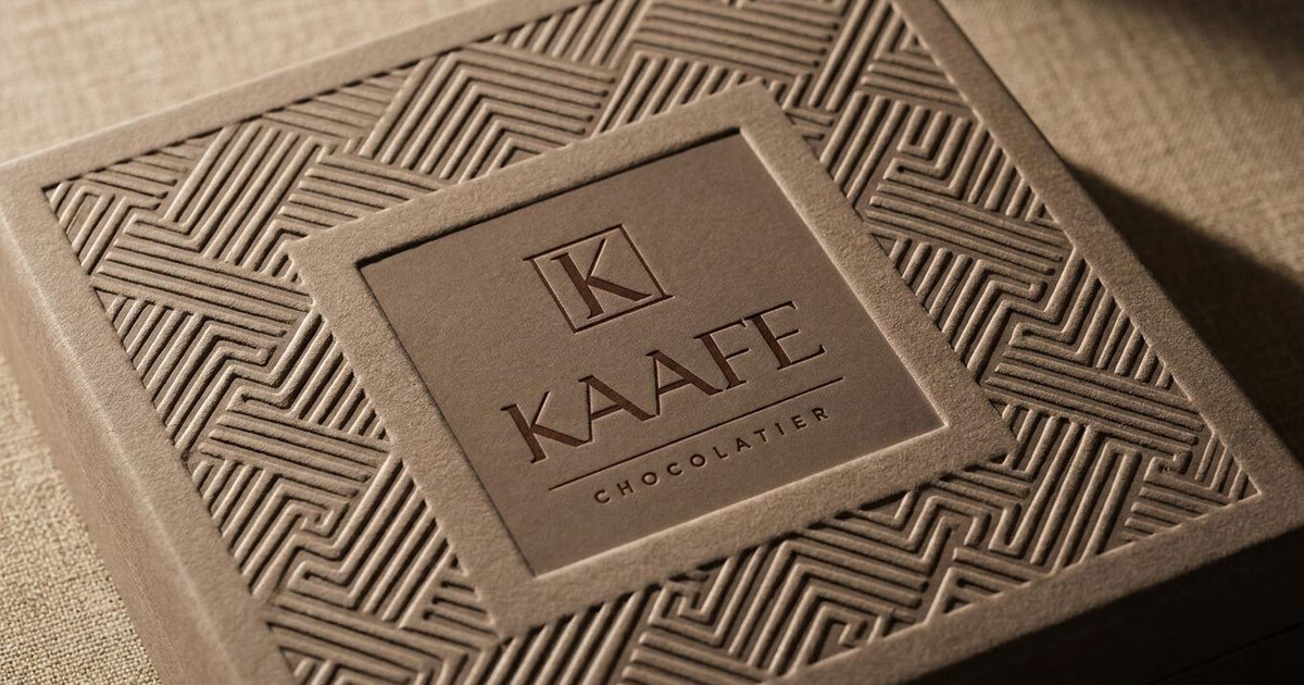
A packaging system designed for the full range of Kaafe's products — everyday chocolates, truffles, gift boxes, wedding collections, and seasonal limited editions. Coherent across every format, luxurious at every occasion, and built to be as beautiful as what it contains.
Digital:
A digital identity and online presence built for the channels through which Kaafe's audience discovers, orders, and gifts — communicating the brand's cultural heritage, product quality, and luxury positioning to Qatar and the wider GCC market.
Collateral:
A suite of brand collateral covering Kaafe's corporate gift programme and direct client communications — materials that carry the brand's standards into every professional and personal interaction.
The Outcome:
Kaafe Chocolatier emerged from the refresh with a brand identity that does justice to twelve years of genuine craft and cultural authenticity. The refined mark, the considered packaging system, and the coherent visual language across digital and collateral give the brand the presence its product deserves — in Qatar's luxury gifting market, across the GCC, and in the hands of every client who receives a Kaafe box as a corporate gift, a wedding favour, or a personal indulgence.
A Qatari chocolate connoisseur's twelve-year vision. Finally, a brand to match it.
Project Details:
Services: Brand Identity Refresh · Logomark · Brand Guidelines · Packaging · Digital · Collateral
Industry: Luxury Confectionery · Premium Gifting · Food & Beverage
Location: Qatar
Market: Qatar Luxury · GCC Premium Gifting · Corporate Gifts