Coffee Brand Identity Saudi Arabia

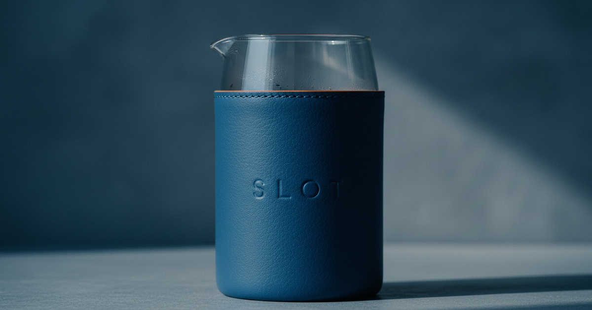
Slot KSA is a specialty coffee café launching in Saudi Arabia with a clear and considered mission: to provide the best coffee, food, and drinks experience in the Kingdom — and to let every element of the brand reflect that commitment. From the quality of the coffee to the coherence of the visual identity, Slot believes that no detail is beneath consideration. Mike Rock Studio worked directly with the Slot team to build a complete brand identity, packaging, and digital system for a café launch that knew exactly what it wanted to be.
The Challenge
Launching a single café in Saudi Arabia's fast-moving specialty coffee market is a high-stakes creative brief. The KSA coffee scene — particularly in Riyadh — has developed rapidly, with consumers who are visually literate, quality-conscious, and acutely sensitive to the gap between a brand that performs quality and one that embodies it. A new café has one opportunity to make its first impression, and that impression is formed before the first cup is poured.
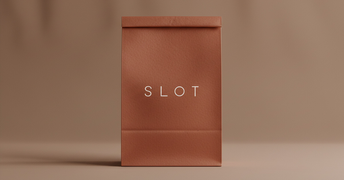
Slot's ambition was clear from the outset: to stand out through restraint. In a market where many coffee brands reach for maximalism, illustration, and expressive colour to announce themselves, Slot's instinct was the opposite — clean lines, geometric precision, a custom wordmark built on a unique typeface that could be immediately recognised without being decorative. The challenge was executing that minimalist vision with enough confidence and craft that it communicated genuine quality rather than simply the absence of complexity.
The Approach
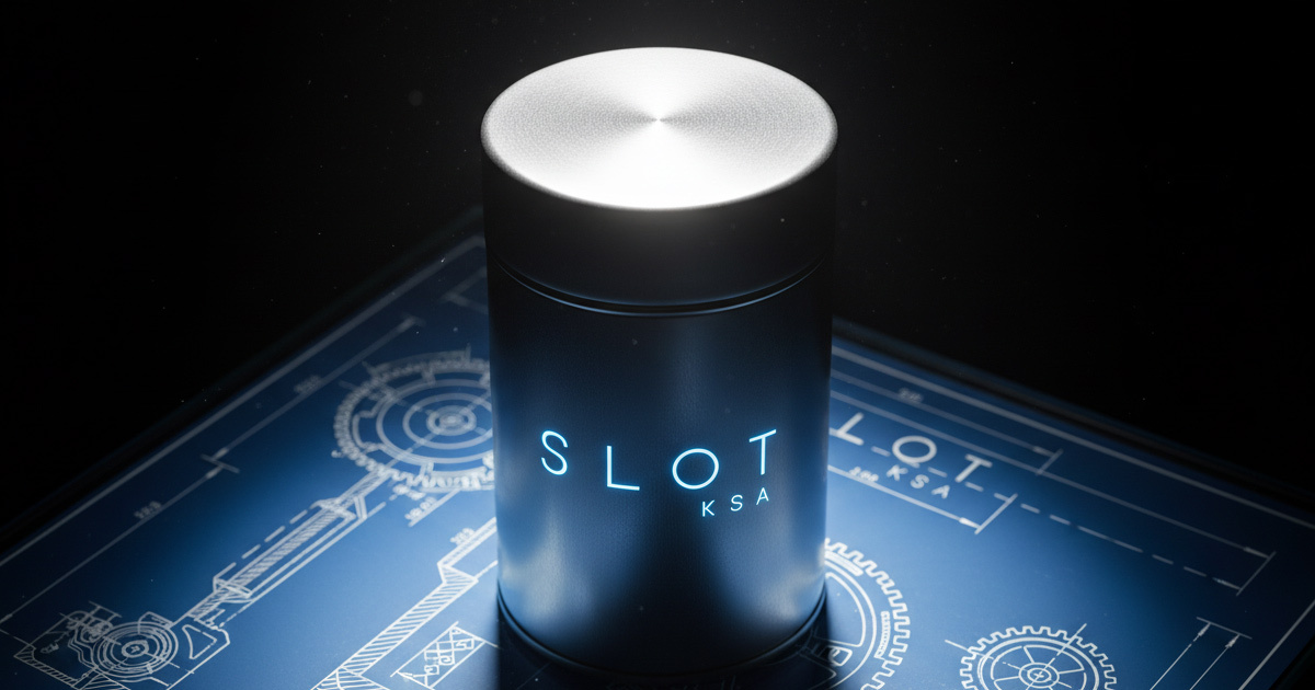
The creative strategy aligned completely with Slot's own vision. Minimalism in brand design is frequently misunderstood as simplicity — as though removing elements is easier than adding them. The opposite is true. A brand system built on clean lines and geometric precision has nowhere to hide; every decision about proportion, spacing, weight, and application is immediately visible and immediately consequential.

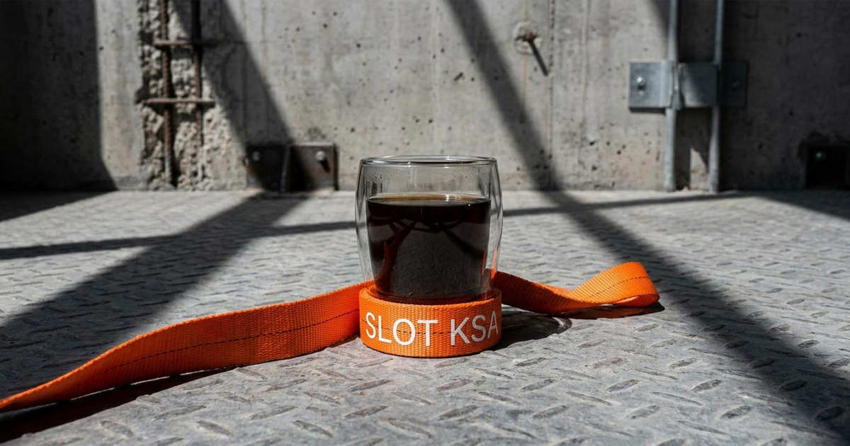
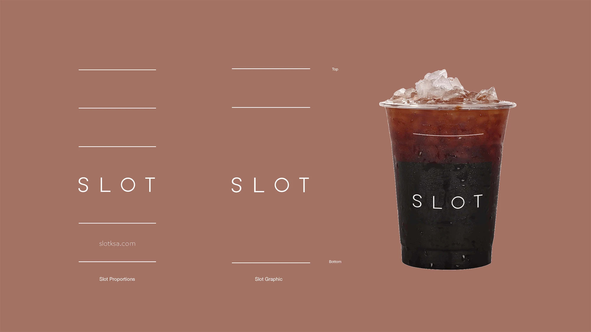
The custom wordmark was the foundation. Uppercase characters of a bespoke typeface — designed to give Slot its own typographic voice while remaining legible and versatile across every application from a cup sleeve to a digital screen. The wordmark needed to work at café scale — on signage, on packaging, in-store — and at screen scale across Slot's digital and social presence, without losing its character at either end of that range.
The packaging and digital systems were built on the same geometric logic as the wordmark — a visual language that is cohesive, instantly recognisable, and carries the brand's commitment to quality into every physical and digital interaction a customer has with Slot.
The Work
Brand Identity & Custom Wordmark
A complete visual identity system anchored by a custom uppercase wordmark — a bespoke typeface designed to give Slot a distinctive typographic voice that stands out while remaining clean, consistent, and unmistakably itself.
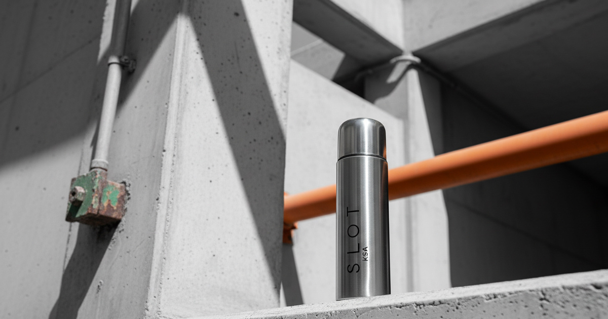
Packaging
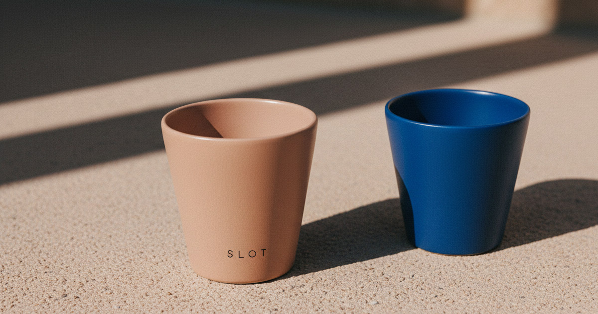
Coffee packaging and café materials designed on the same geometric system as the identity — carrying the brand's precision and quality commitment into every cup, bag, and take-away interaction.
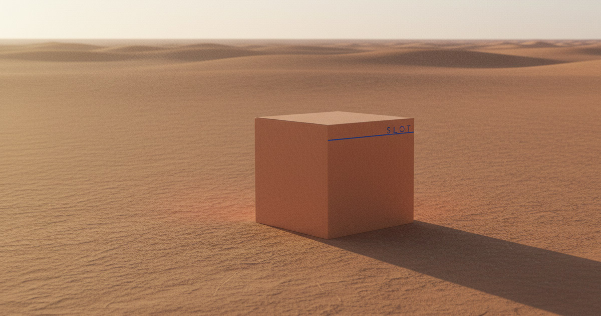
Digital Identity
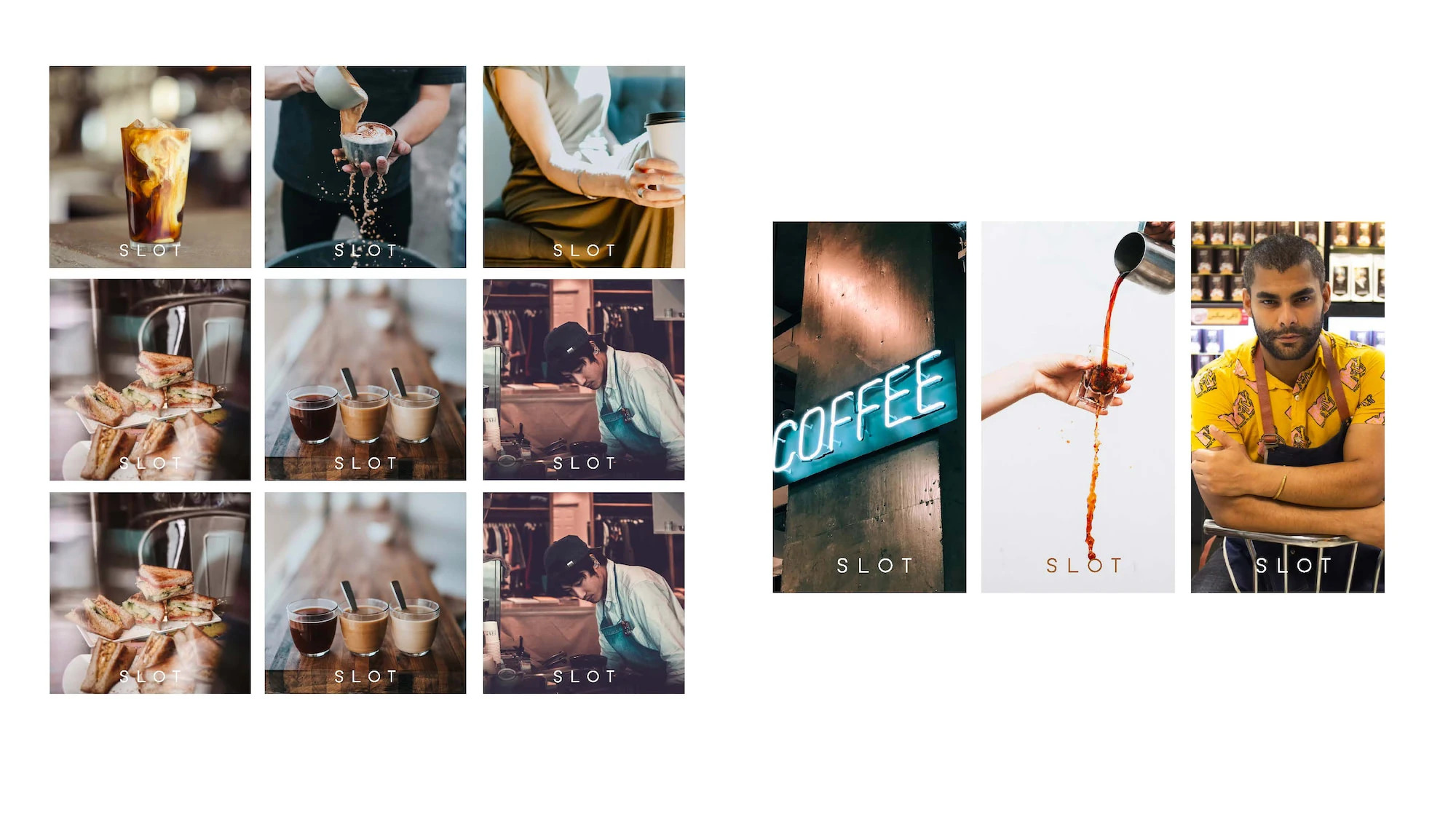
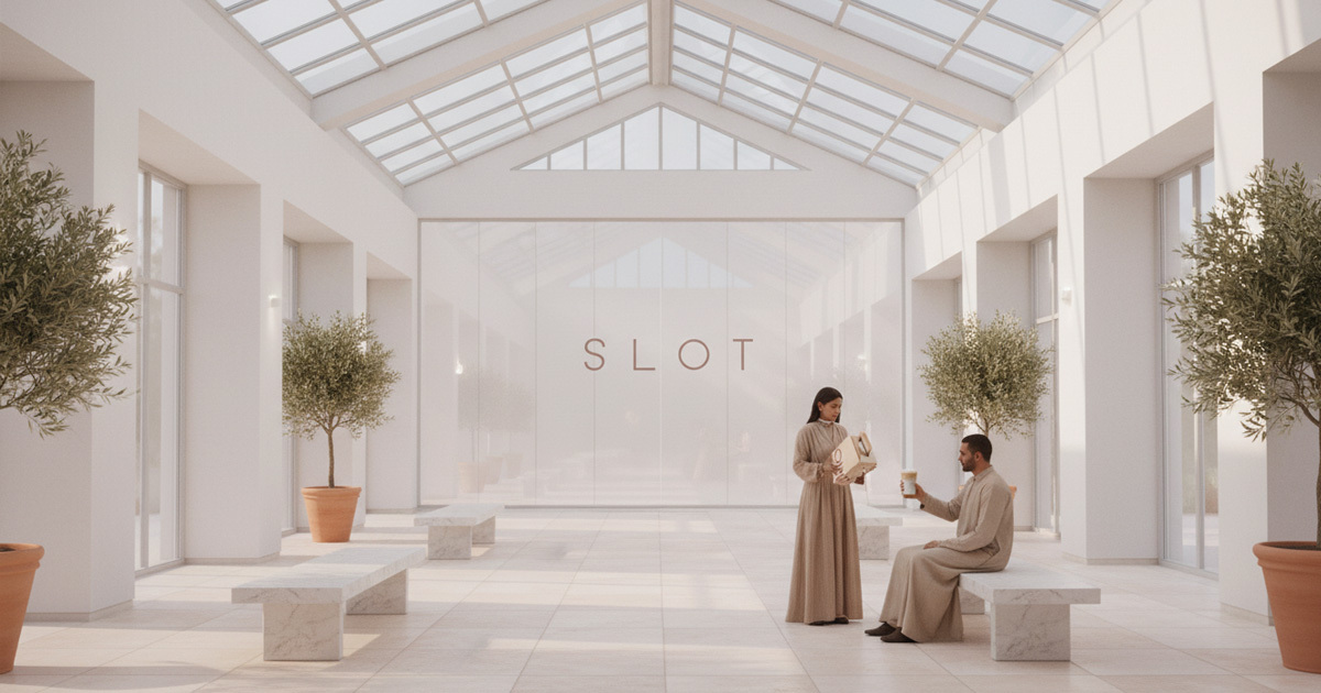
A digital and social media presence built to introduce Slot to the KSA market — where coffee discovery is social-first and the visual standard among the café audience is exceptionally high. The identity performs with the same confidence on a phone screen as it does on a café wall.
The Outcome
Slot launched with a brand identity that does exactly what the brief asked: it stands out through restraint. The custom wordmark, the geometric visual language, and the consistent application across packaging and digital give the café a presence that communicates quality before anyone has tasted the coffee. In a market that rewards genuine craft and punishes the performance of it, Slot looks like what it is.
As the Slot team put it: *"We work hard with Mike Rock to create a cohesive and consistent visual identity that reflects the quality and attention to detail that we put into every cup of coffee we serve."*
Project Details
Services: Brand Identity · Custom Wordmark · Brand Guidelines · Packaging · Digital
Industry: Specialty Coffee · Food & Beverage · Café
Location: Saudi Arabia
Market: KSA Specialty Coffee · GCC F&B
Instagram: @slot.ksa