Minimalist Streetwear Brand Identity
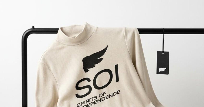
Spirits of Independence - SOI is a minimalist streetwear label built on a single conviction: that individuality doesn't need to shout. Derived from the phrase Spirits of Independence, the brand embraces restraint over excess, a visual identity that feels timeless and self-assured without leaning on the trend-driven aesthetics that define most of the category. Mike Rock Studio developed the complete branding and visual identity for SOI, building a monochromatic, highly reduced design system that sits between contemporary streetwear, modern luxury, and editorial minimalism.
The Challenge:
Streetwear branding has become visually loud almost by default, oversized graphics, maximalist logos, short-lived trend cycles that most labels chase because the alternative feels riskier. The harder problem, and the one most emerging labels never solve, is building an identity that feels distinctive without becoming performative or visually disposable a season later.
For SOI, the brief was the opposite of the category norm. The brand needed to feel stripped back and emotionally controlled, confidence built through minimalism rather than noise while working seamlessly across garments, labels, packaging, digital media, editorial campaigns, and social content. The goal was never to dominate attention instantly. It was to build a brand world that rewards a second look, and earns desirability through what it leaves out rather than what it adds.

The Approach:
The creative direction centred on a single idea: minimal independence. A visual system built on clarity, balance, and absence where what's removed carries as much meaning as what remains.
The SOI wordmark was refined until it felt architectural and spacious, letting the typography itself become the primary identity asset rather than a vehicle for a separate symbol or graphic. The monochromatic palette reinforces that timelessness, leaving texture, silhouette, and composition to carry the visual storytelling instead of colour. The wider brand language draws on modern editorial fashion systems and Japanese-influenced minimalism, negative space, quiet luxury, understated precision rather than the obvious symbolism most streetwear brands reach for.
The result communicates attitude through proportion and pacing rather than graphics, which positions SOI somewhere more interesting than a conventional streetwear label: moving naturally between fashion, culture, and art direction. Spirits of Independence remains the emotional core throughout self-expression without performance, individuality without excess.

The Work:
Brand Identity:
A minimalist visual identity system including logo design, typography, monochromatic direction, and scalable brand assets built to work across every surface from a garment tag to a billboard without losing its restraint.

Fashion Art Direction:
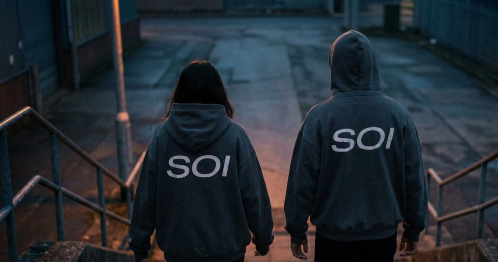
A visual world built on editorial fashion imagery, architectural composition, and contemporary cultural minimalism, establishing how SOI looks and feels across campaigns, not just on the logo.
Packaging & Garment Branding:
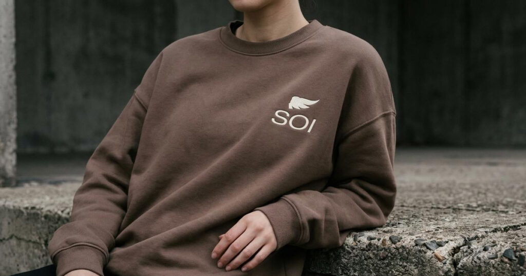
Clean, understated applications across garment tags, labels, packaging, and lookbooks, every touchpoint built on the same principle of restraint as the wordmark itself.
Digital Presence:
A refined social and digital identity built to maintain consistency across campaigns, e-commerce, and the brand's wider cultural storytelling.

The Outcome:
SOI launched with a visual identity that feels contemporary and controlled without relying on visual excess — positioning the brand at the intersection of minimalist fashion, modern streetwear, and quiet luxury. By choosing restraint over noise, SOI built a fashion identity with a stronger sense of permanence than most of its category: one designed to outlast the trend cycle rather than chase it.

Project Details
Services: Brand Identity · Logomark · Art Direction · Brand Collateral · Fashion Positioning
Industry: Streetwear · Fashion · Contemporary Lifestyle
Market: Global Streetwear & Fashion