Luxury Swimwear Brand Italy
David is a heritage swimwear and resort wear label with a seventy-year legacy in elegant, expertly engineered swimsuits, bikinis, and relaxed apparel built on genuine material innovation, including premium polyamide fabrics designed for quick drying, precise thickness, and fade resistance. The brief was to evolve the brand's visual identity for contemporary high-end resort markets: Dubai, Saint-Tropez, Miami without losing the multigenerational European credibility the house has spent seven decades earning. Mike Rock Studio refined the identity, built a luxury packaging system, and developed a retail and digital design language that lets seven decades of craftsmanship hold its own against a much younger field of fast-fashion competitors.
Luxury resort and swimwear is a relentlessly seasonal, visually crowded category and heritage brands in it face a genuine tension. Stay too close to tradition and the brand starts to look dated next to digital-native boutique startups that move fast and look louder. Chase the trend cycle too hard and seventy years of craft credibility gets diluted into something indistinguishable from a brand with no history at all.
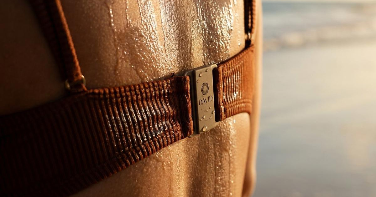
David's actual differentiator is real engineering: removable cups, considered brief fits, fabrics that resist fading season after season. The challenge was presenting that functional mastery as a luxury asset rather than a technical spec sheet and making sure the brand language held together at every scale, from a woven garment label and a metal hardware closure to a flagship boutique storefront and an e-commerce homepage. Seven decades of charm and practicality needed to read as unmistakably David at every single touchpoint.
The Approach:
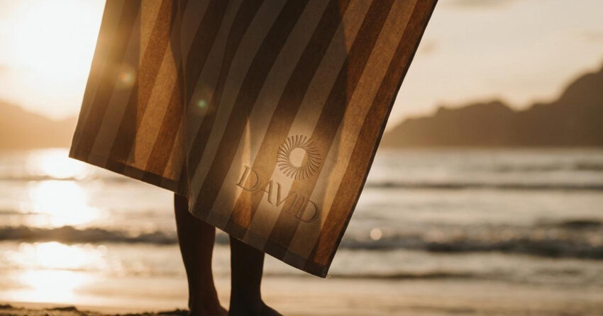
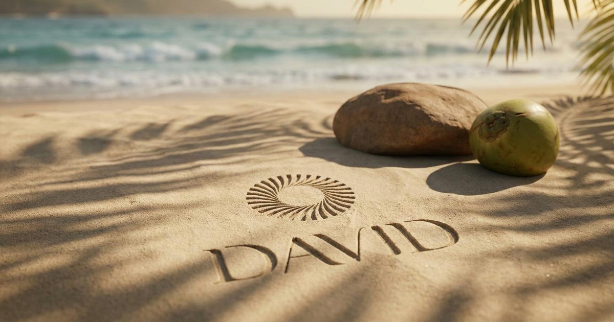
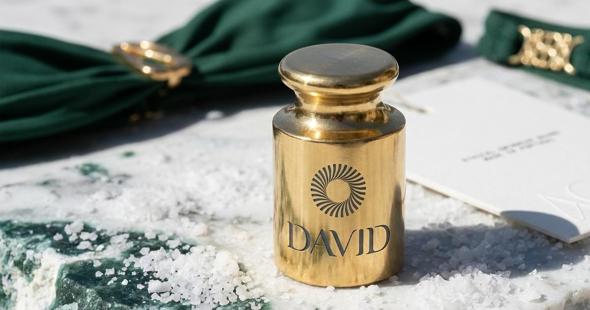
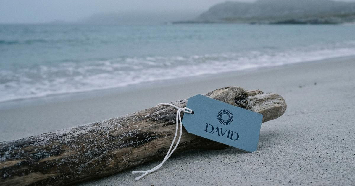
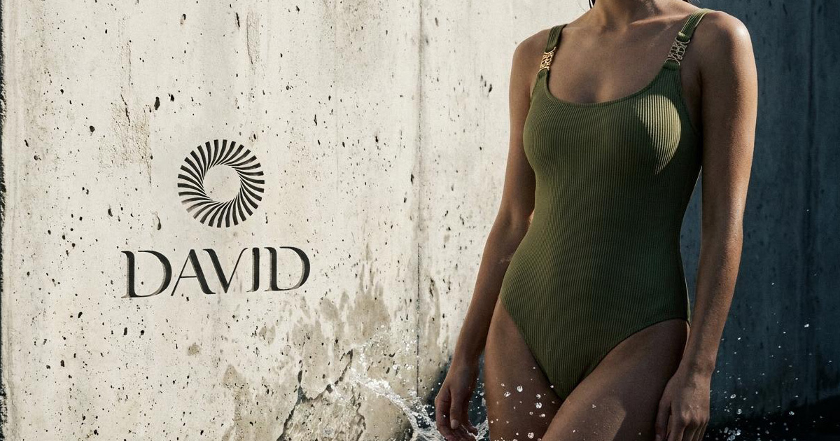
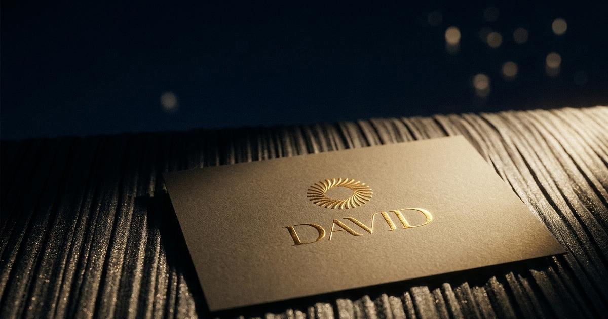
The visual direction was built around the brand's existing sunburst emblem: a circle of curved, radiating shards that read as summer light, ocean ripple, and the movement of fine fabric all at once. Rather than replacing it, the work refined and sharpened it: tightening the geometry, improving how it scales, and giving it the precision to sit comfortably in a contemporary luxury context without losing the warmth that made it work in the first place.
The wordmark received the same treatment. DAVID is set in a customised serif with calligraphic detail — a floating bar on the A, an extended drop on the letterforms that echo the flowing silhouette of the garments themselves rather than sitting as a flat, generic logotype above them.
The palette was pulled back to its essentials: obsidian black, sea-salt white, and a deep navy. That restraint does specific work — it turns every other surface into an editorial gallery wall, so the texture of the fabric, the colour of a seasonal print, and the photography of sun and water are always the thing the eye lands on first. Layouts across print and digital follow a haute-luxury grid with generous breathing room, mirroring the unhurried feeling of an elite beach club rather than the density of a typical e-commerce page.
The Work:
Brand Identity Evolution:
A refinement of the existing David visual system, sharpened sunburst emblem, polished calligraphic wordmark, and a clear brand architecture built to scale across global luxury retail without losing what already worked.
Packaging & Unboxing:
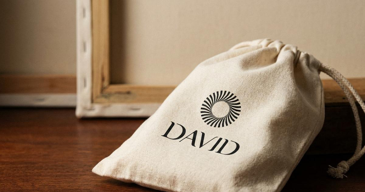
A full packaging system for high-end boutique environments, water-resistant frosted garment sleeves, rigid gift boxes with magnetic closures, silk-lined tissue wraps, and heavyweight linen shopping bags with blind-debossed logos.
Retail & Digital Guidelines:
A complete brand manual covering spatial layout, typography metrics, and photographic art direction ensuring the identity holds together across multi-brand luxury stores, standalone boutiques, and the David e-commerce site.
The Outcome
David now carries an identity that holds its seventy-year heritage and its contemporary resort positioning in the same hand, the sunburst mark and calligraphic type feel considered enough for an elite fashion house, and warm enough to still feel like a beach brand rather than a corporate one. Every product tag, every unboxing moment, and every digital touchpoint now carries the same level of care, which is precisely what a brand built on seven decades of fit and fabric precision deserves.
Seven decades of tailored charm, built for the world's most exclusive coastlines.
Project Details
Services: Brand Identity Evolution · Logomark Refinement · Art Direction · Packaging · Retail Guidelines
Industry: Luxury Fashion · Swimwear & Resort Wear
Location: Italy
Market: Italy · Saint-Tropez · Miami · Global Luxury Resort Markets