Trade Services Brand Identity Saudi Arabia
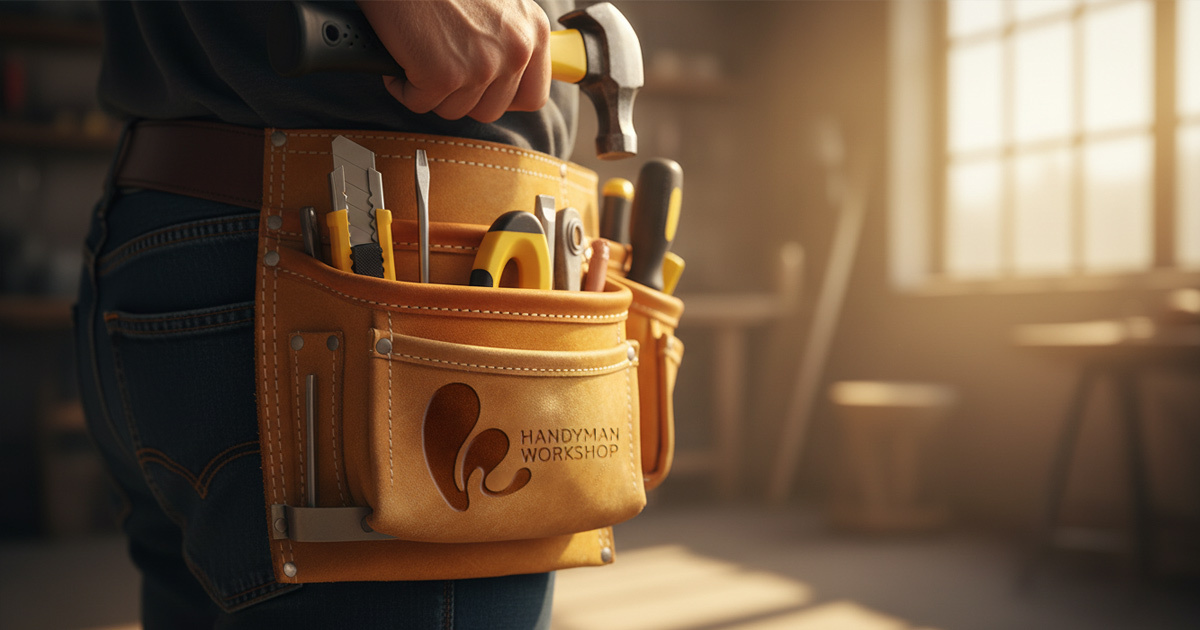
Handyman Workshop is a Saudi maintenance and servicing company operating across both residential and commercial sectors, the kind of business that lives or dies on trust. When a technician arrives at your home or your facility, the first impression is formed before they say a word: the uniform they're wearing, the vehicle they arrived in, the professionalism the brand communicates before a tool is touched. Mike Rock Studio built a clean, modern brand identity and livery system for a company that understood the commercial value of looking as good as they work.
The Challenge:
The maintenance and trade services sector in Saudi Arabia, as in most markets is visually underdeveloped. Most operators in this space compete on price and word of mouth, with little investment in brand identity and almost none in the kind of consistent, professional visual presentation that builds trust at scale. For a company with ambitions to serve both residential homeowners and commercial facilities management clients, that gap represented a genuine opportunity.
The brief was precise: clean, modern, trustworthy, and technically credible. An identity that communicated professionalism to a homeowner letting a stranger into their property, and to a facilities manager evaluating a maintenance contractor against a field of competitors. The same brand, doing two different jobs simultaneously and doing both convincingly.
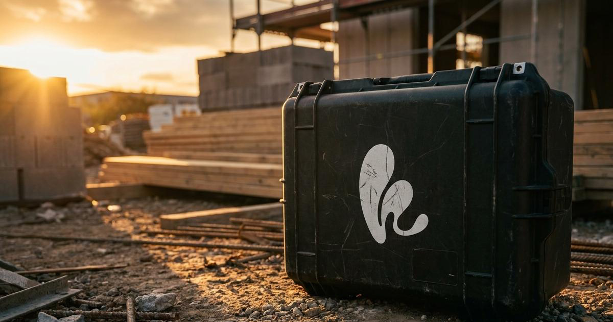
The practical demands of the brief added another layer. A brand identity for a trade services company is tested in conditions most identities never encounter: on the side of a vehicle in full sun on a Riyadh street, on a uniform worn by a technician in a dusty ceiling void, on a business card handed over at the end of a job. Every element needed to hold up in the real world.

The Approach:
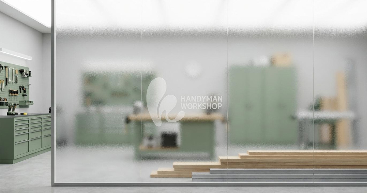
The creative direction was built around the word workshop itself not as a place, but as an attitude. A workshop is where problems are diagnosed and solved, where skill meets material, where things that are broken become things that work. The brand needed to carry that sense of practical intelligence and quiet competence: less the visual language of a corporate facilities company, more the confident identity of a specialist who knows exactly what they're doing.
Clean geometry and a modern typographic system gave the identity its structure, precise, legible, and built to work across every application from a business card to a van side. The colour system was selected for trust and legibility in outdoor conditions: tones that hold their integrity in direct sunlight and read clearly at the distances from which vehicle livery is typically seen.
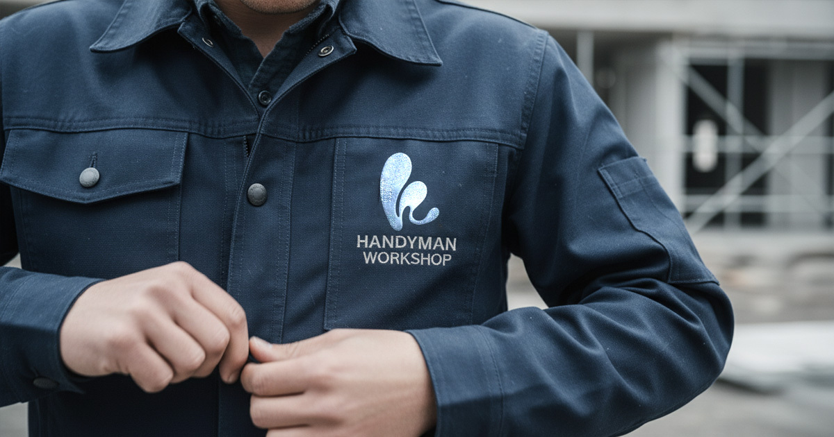
The livery design was treated as the primary brand application because for a mobile trade services business, the vehicle fleet is the most visible and most repeated brand impression in the market. A van that looks organised, professional, and immediately readable does more marketing work per day than most digital campaigns. The uniform system extended the same visual language to every technician on every job, ensuring that Handyman Workshop's brand standards travel with the people who represent it.
The Work:
Brand Identity & Guidelines:
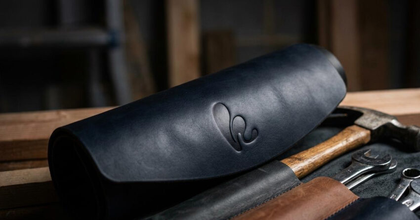
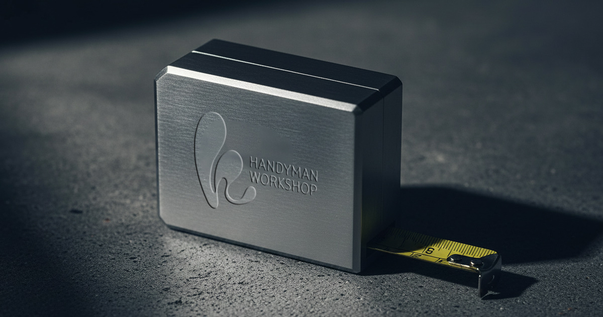
A clean, modern visual identity for Handyman Workshop — logomark, typography, colour system, and guidelines covering every application across the company's operations in Saudi Arabia. Built for trust, legibility, and the demanding physical environments of a trade services business.
Vehicle Livery:
A livery system for Handyman Workshop's vehicle fleet — designed to be immediately readable, professionally presented, and to communicate the company's standards to residential and commercial clients across Saudi Arabia at every encounter.
Uniform Design:
A branded uniform system that carries the Handyman Workshop identity into every client interaction — ensuring that the professionalism of the brand is consistent from the first call to the final handshake.
The Outcome:
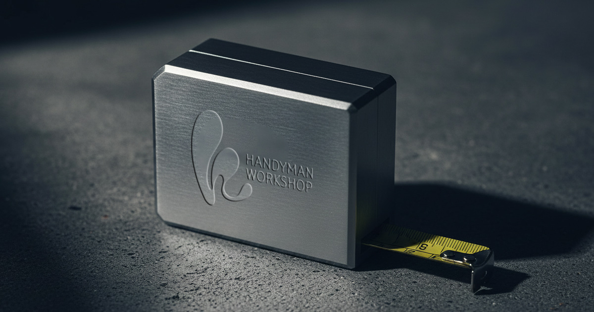
Handyman Workshop now has a brand identity that does what the brief asked: it looks as good as the work it represents. The vehicle livery and uniform system ensure that every technician on every job is a walking, driving expression of the company's commitment to trust, professionalism, and technical expertise. In a sector where most competitors look generic, Handyman Workshop looks like the obvious choice.
Project Details:
Services: Brand Identity · Logomark · Brand Guidelines · Vehicle Livery · Uniform Design
Industry: Maintenance & Servicing · Trade Services · Facilities Management
Location: Saudi Arabia
Market: KSA Residential · KSA Commercial & Facilities Management