Beauty Studio Brand Identity UAE
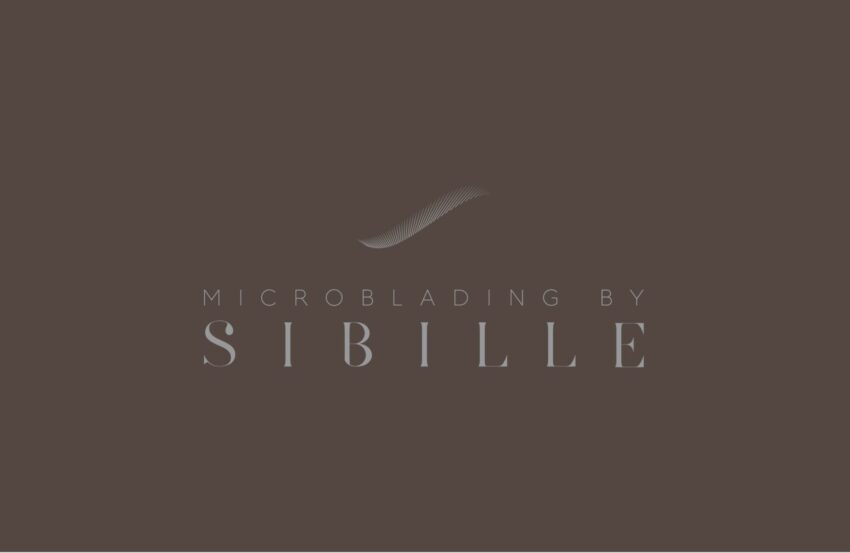
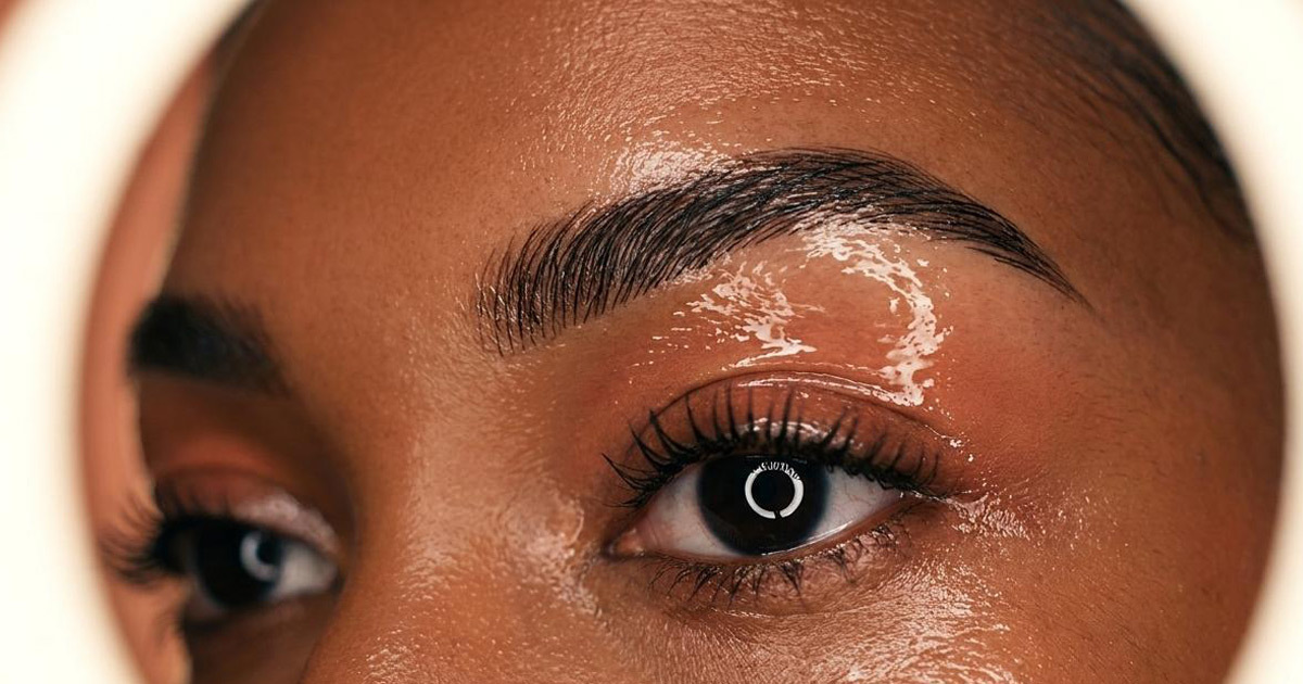
Microblading by Sibille is a boutique beauty studio in the UAE, founded by Sibille, a beauty artist whose passion for enhancing natural features with precision and care has built her a loyal clientele in a competitive market. Specialising in microblading, the semi-permanent eyebrow enhancement technique that requires as much artistry as technical skill, the studio's entire proposition rests on a single idea: that the best work is the kind nobody notices, because it simply looks like you, only better. Mike Rock Studio built the brand identity and guidelines for a studio whose standards deserved a brand to match.
The Challenge:
The UAE beauty and aesthetics market is saturated. Microblading in particular has moved from specialist service to mainstream offering in a short period of time, and the proliferation of studios offering similar treatments has made differentiation genuinely difficult. For a boutique studio founded by a skilled individual practitioner, the challenge was communicating what separates genuinely expert work from the cookie-cutter alternative, in a market where most studios make the same claims, and clients have to make decisions on the basis of visual presentation before they have experienced the work.
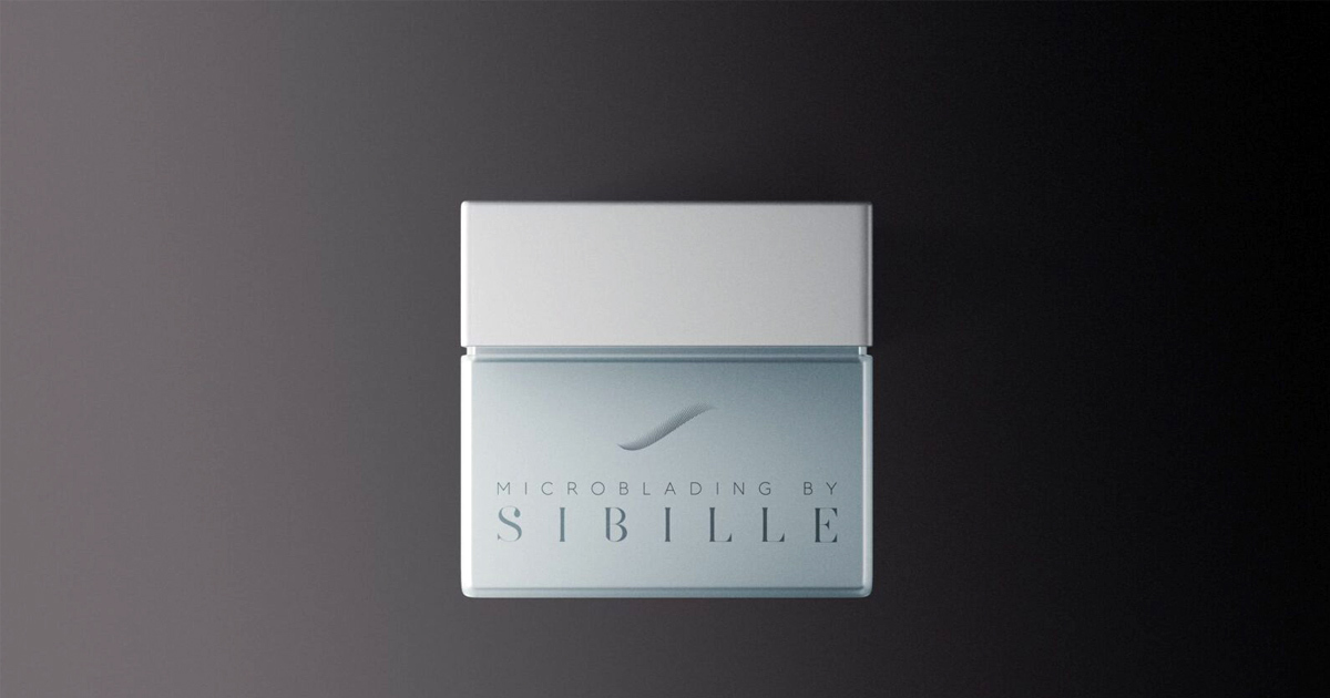
Sibille's differentiators were real: personalised consultations, custom-tailored treatments, extensive expertise, and a commitment to results that enhance rather than alter. The brand needed to make those differentiators visible, to communicate the precision, the care, and the specifically personal quality of the studio's approach through the identity before a prospective client ever made an enquiry.
The Approach:
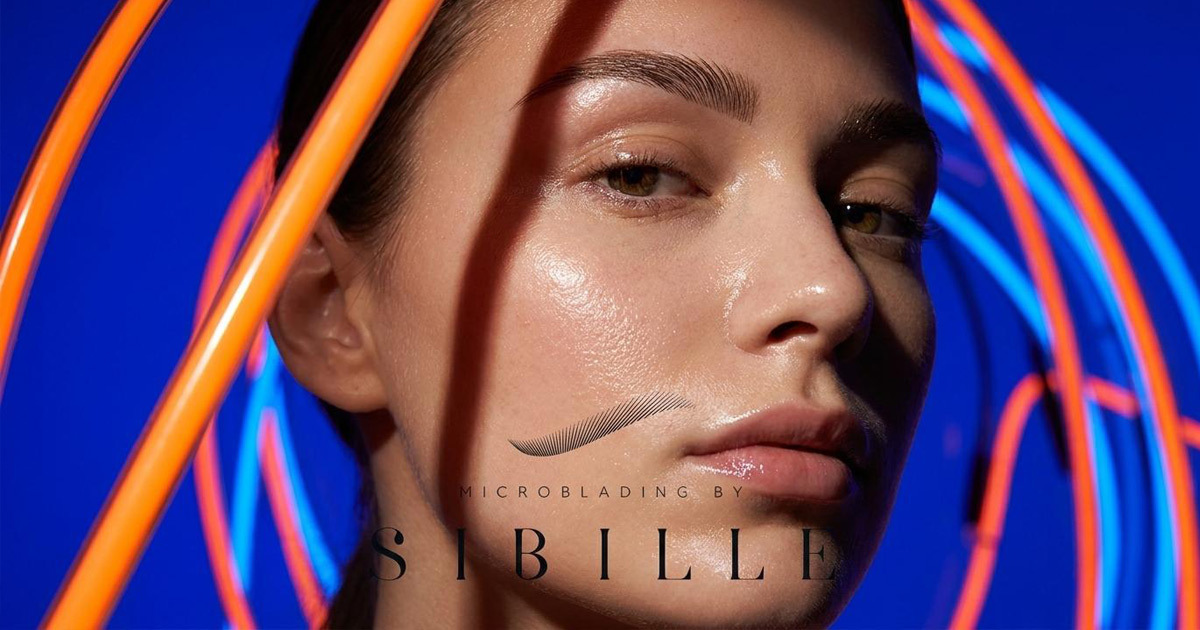
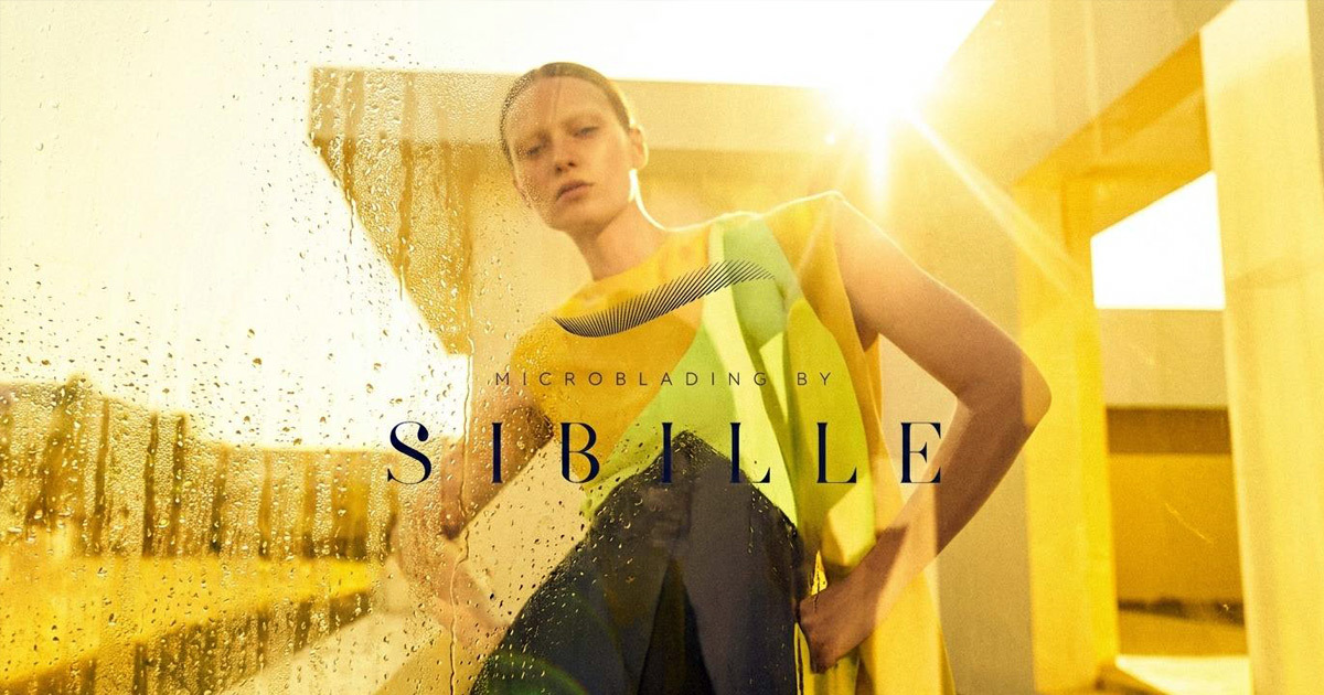
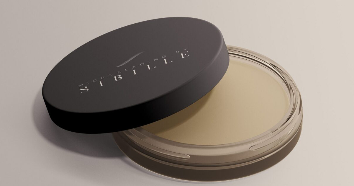
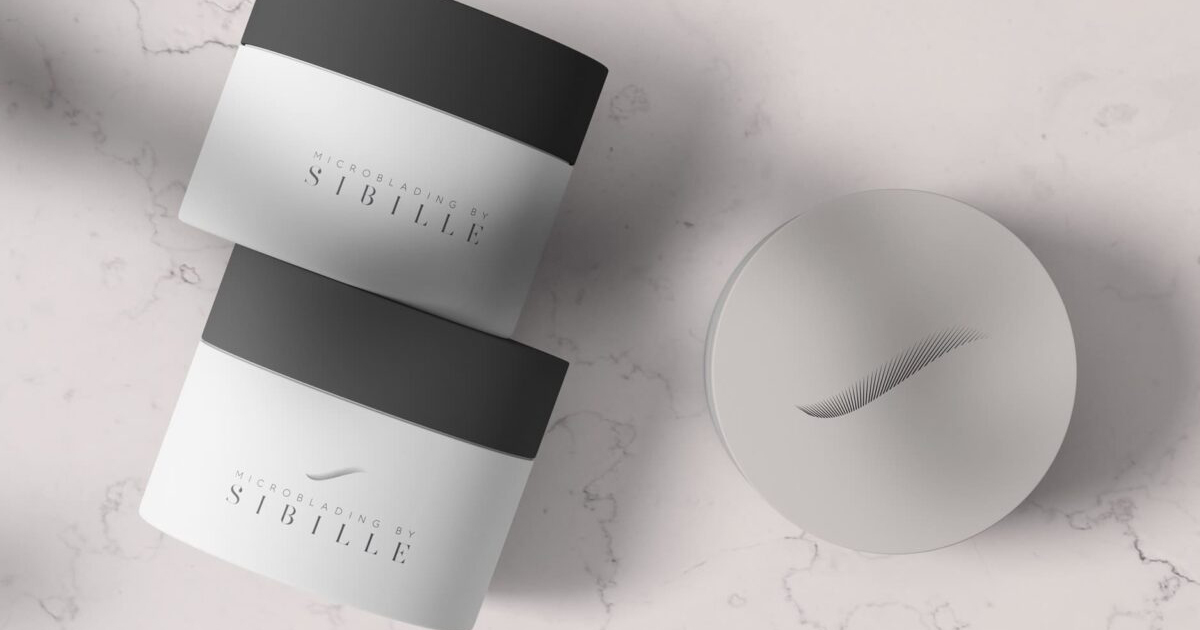
The creative direction was built around the studio's founding principle: precision in service of natural beauty. The most trusted names in high-end beauty, the studios and practitioners that serious clients seek out — communicate through restraint. A soft, earthy colour palette that evokes the natural tones the studio works with. Elegant typography that communicates the care and consideration applied to every treatment. Nothing that feels clinical, nothing that feels generic, and nothing that overstates because a studio whose work is defined by subtlety needs a brand identity that demonstrates the same quality.
The name itself gave the identity its warmth. Microblading by Sibille is a personal brand, the founder's name in the studio name is a statement of accountability and pride that the visual identity needed to honour. This is not a franchise or a chain; it is the work of a specific person with a specific standard. The brand was built to feel exactly that: personal, precise, and worth trusting.
The guidelines were developed to ensure consistency across every touchpoint from the studio environment and the materials a client encounters during their appointment, to the digital and social presence through which most clients first discover the studio.
The Work:
Brand Identity:
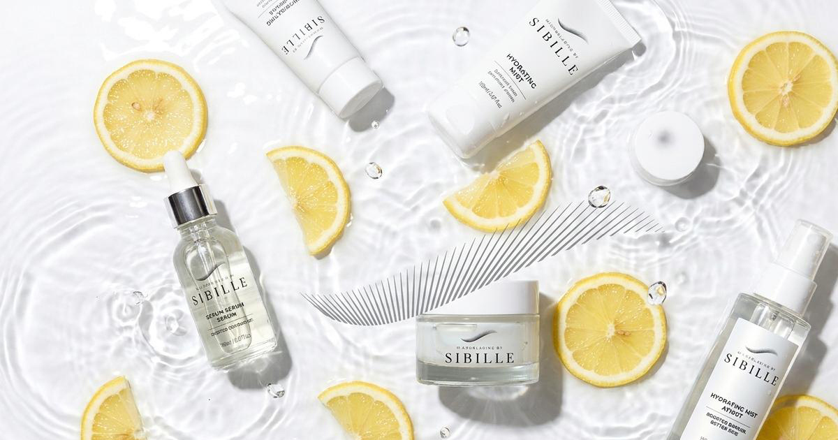
A complete visual identity for Microblading by Sibille, logomark, soft earthy colour palette, elegant typography, and the visual language of a UAE boutique beauty studio built on precision and natural enhancement. Considered, restrained, and unmistakably personal.
Brand Guidelines:
A comprehensive guidelines document covering every application of the Microblading by Sibille identity ensuring that the brand's warmth, precision, and personal quality are consistent across digital, print, and environmental touchpoints as the studio grows.
The Outcome:
Microblading by Sibille launched with a brand identity that communicates the quality of the work before a client has booked an appointment. The studio saw a significant increase in enquiries and bookings following the rebrand with clients consistently citing the personalised service and natural-looking results as the key reasons they chose Sibille over competitors. A boutique studio in a saturated market, with a brand that made the right people stop and look twice.
Project Details:
Services: Brand Identity · Logomark · Brand Guidelines
Industry: Beauty · Semi-Permanent Makeup · Aesthetics
Location: UAE
Market: UAE Beauty · GCC Aesthetics · Boutique Beauty Studios