Coffee Shop Brand Identity Abu Dhabi
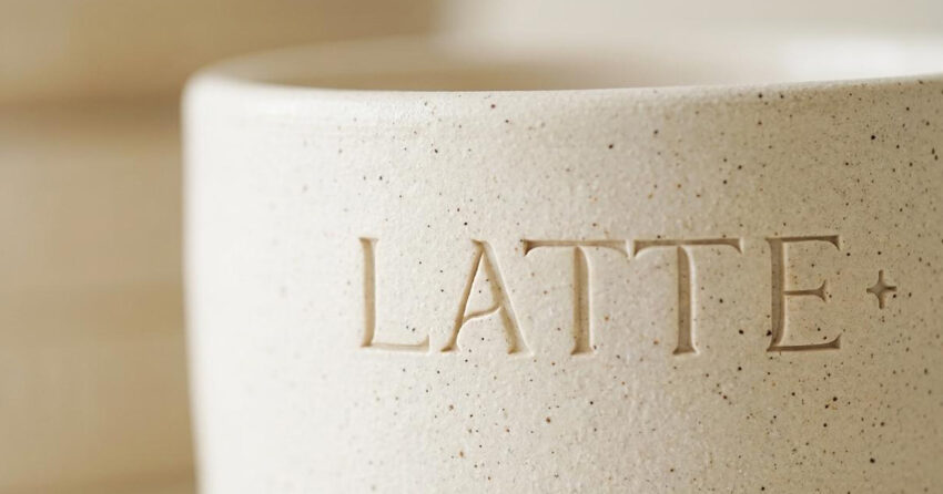
Latte Plus was conceived as more than a coffee shop. Located in Abu Dhabi, it was designed from the outset as a sanctuary within the city: a place where architecture, atmosphere, ritual, and hospitality combine to create an experience rooted in calm, simplicity, and the specific pleasure of being somewhere that has been genuinely thought about. Mike Rock Studio built the complete visual identity and conceptual brand world for Latte Plus, translating the cafe's architectural and emotional philosophy into a cohesive design system inspired by desert brutalism, natural materials, fluid movement, and understated luxury.
The Challenge:
The UAE cafe market is one of the most visually sophisticated hospitality environments in the world. In Abu Dhabi and Dubai, consumers expect more than good coffee from a specialty cafe: they expect atmosphere, identity, and a spatial experience worth the time it takes to sit in it. For Latte Plus, that expectation was the brief.
The specific challenge was building a brand that felt elevated and design-led without losing warmth or accessibility. Too minimal and it would feel cold; too warm and it would lose the architectural intention that defined the concept. The brand needed its own distinct language, something that read as both structured and human, both minimal and emotionally rich, and that worked holistically across interiors, signage, packaging, social media, and every moment of the customer's physical experience in the space.
The Approach:
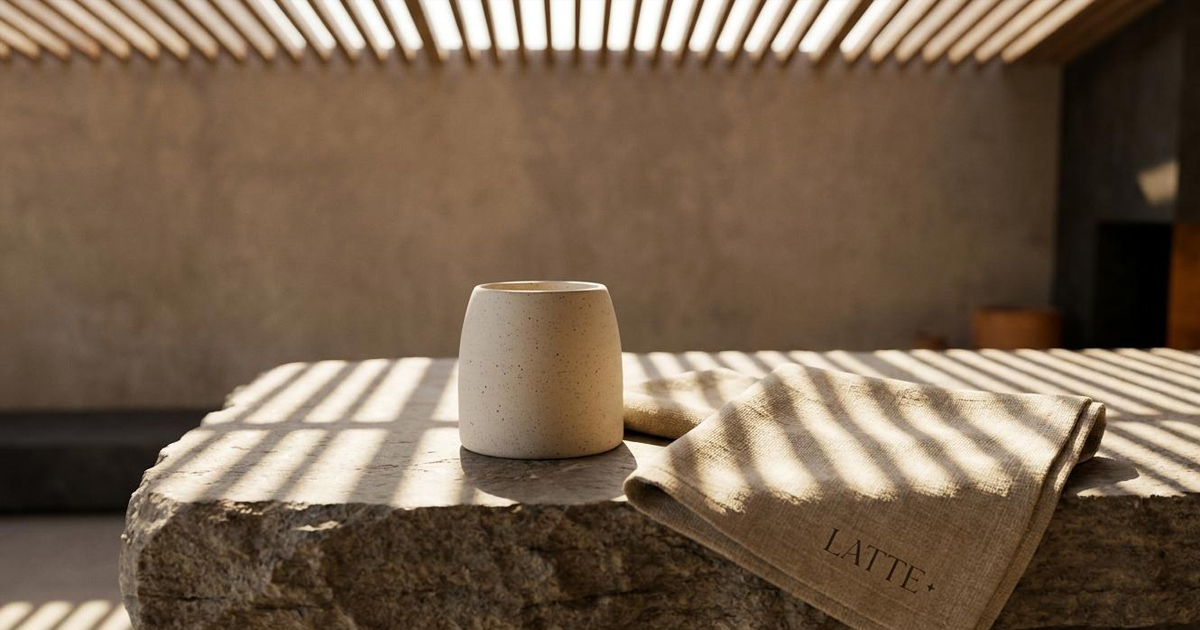
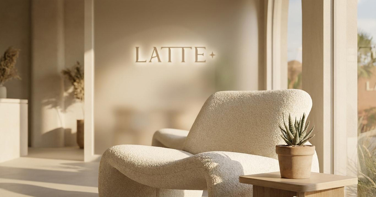
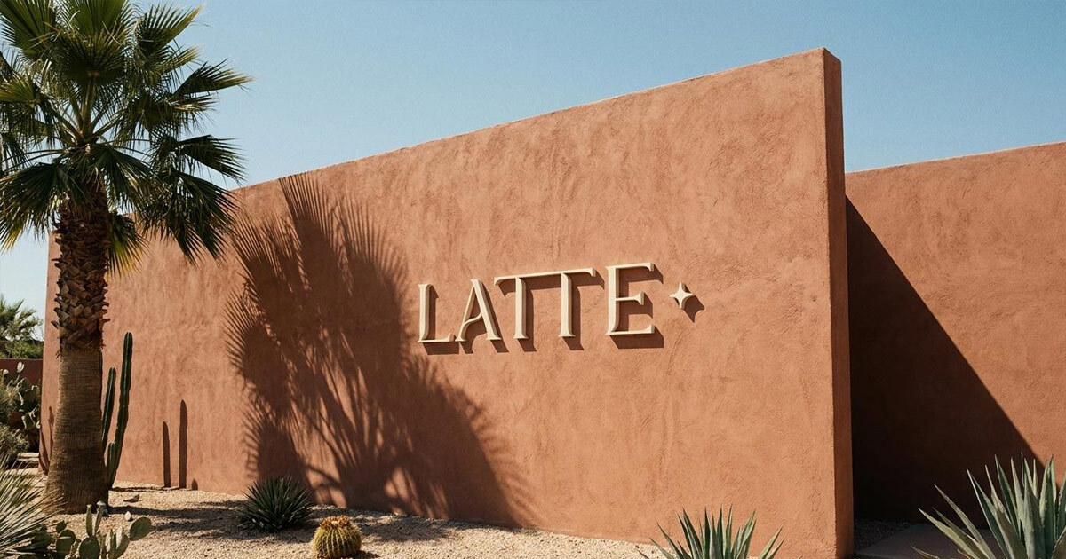
The creative direction centred on a single idea: the organic sanctuary. A spatial and visual identity built on the contrast between natural softness and structured geometry, taking its cues from desert brutalism in the architectural sense of the term: raw materials, monolithic surfaces, filtered light, and living greenery coexisting to create a particular kind of breathable calm.
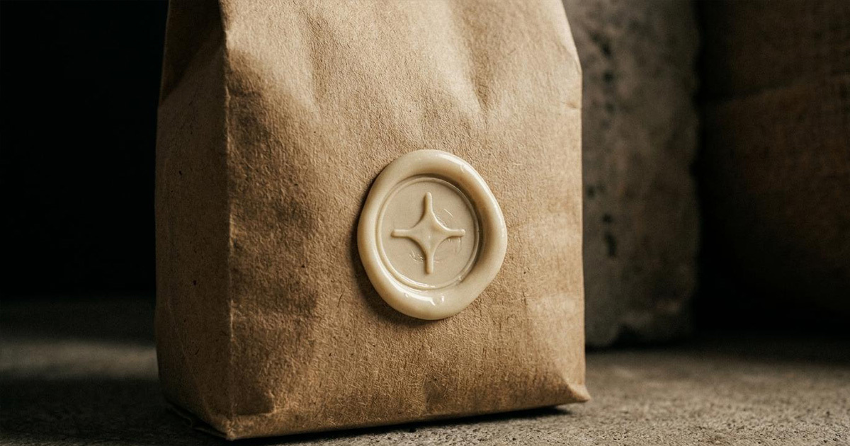
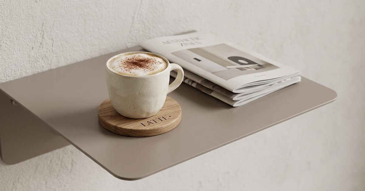
The LATTE+ logomark and its four-pointed star became the system's core repeated element. Rather than functioning only as a mark on a cup or a sign above the door, the star was embedded throughout the physical environment itself: repeated across textiles, surfaces, and spatial details as a subtle, consistent presence that customers absorb without necessarily noticing. That approach to environmental branding, where the identity is woven into the space rather than applied to its surfaces, reflects the cafe's wider philosophy of integration over announcement.
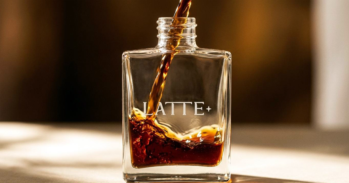
Water and movement ran as a secondary visual thread throughout: transparent materials, reflective surfaces, and flowing compositions introducing fluidity into a brand world that might otherwise feel too solid. The symbolism of the oasis, a place of life and rest within an arid environment, shaped how every element related to the ones around it.
The Work:
Brand Identity:
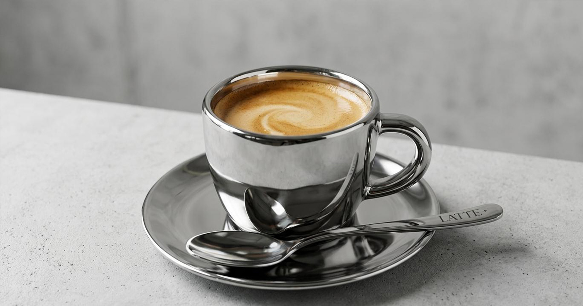
A complete visual identity system including logo design, typography, colour palette, and brand applications across the full range of Latte Plus touchpoints.
Interior Brand Direction:
Conceptual spatial branding inspired by desert brutalism, natural materials, oasis symbolism, and architectural minimalism: the visual and material world of the cafe, considered as a single coherent environment.
Packaging and Touchpoints:
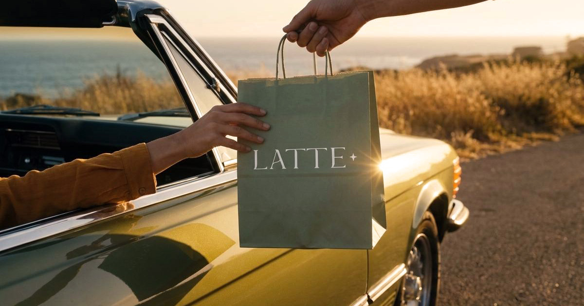
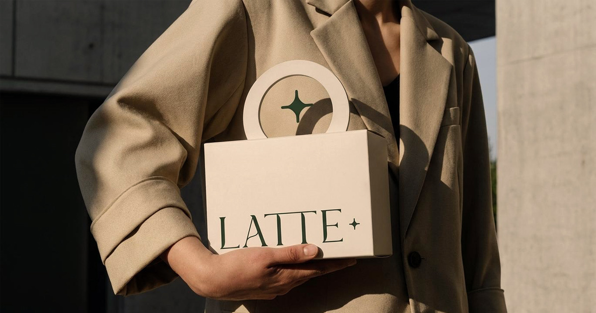
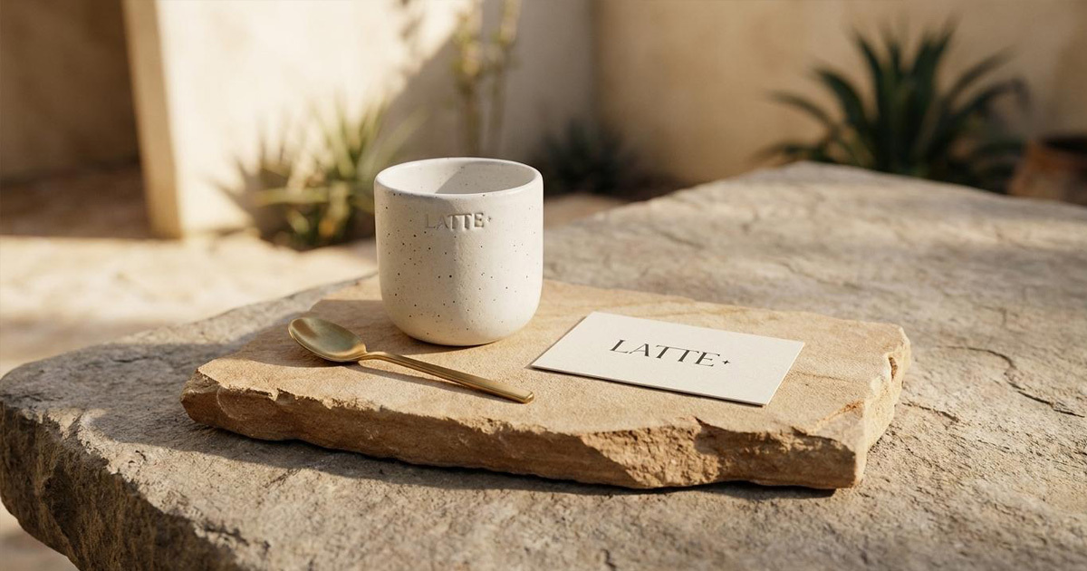
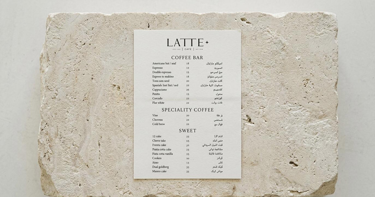
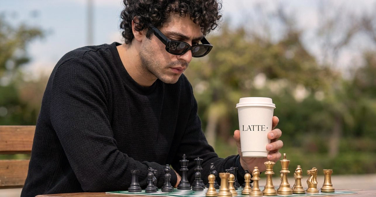
Coffee cups, takeaway packaging, menus, uniforms, and branded materials designed to maintain the identity's calm and integrity across every customer interaction, from the first coffee to the last receipt.
Digital Presence:
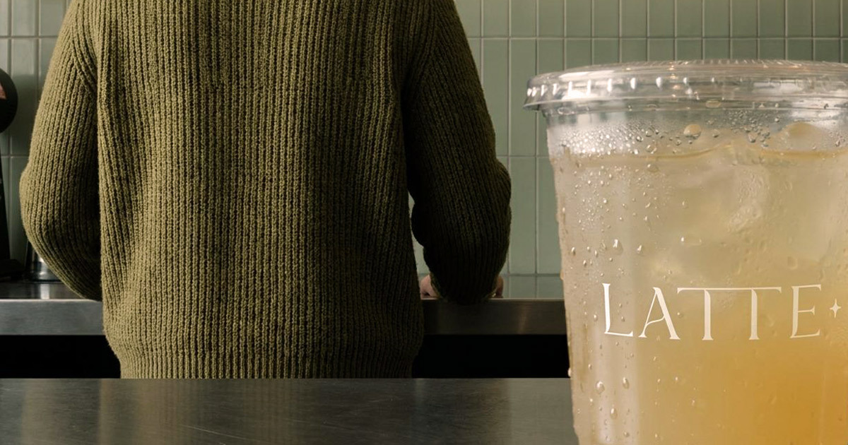
A visual digital identity built for social media storytelling and the lifestyle-driven hospitality audience that discovers and evaluates Abu Dhabi cafes through their feeds.
The Outcome:
Latte Plus has a visual identity that holds its own within the UAE cafe market through restraint rather than noise. The brand is architecturally distinct, emotionally warm, and consistent at every level from the logo to the spatial experience to the digital presence. A cafe designed as a sanctuary, with a brand built to the same specification.
Project Details:
Services: Brand Identity, Brand Guidelines, Interior Brand Direction, Packaging, Digital
Industry: Specialty Coffee, Food and Beverage, Hospitality
Location: Abu Dhabi, UAE
Market: Abu Dhabi Dining, UAE Specialty Coffee, GCC Hospitality