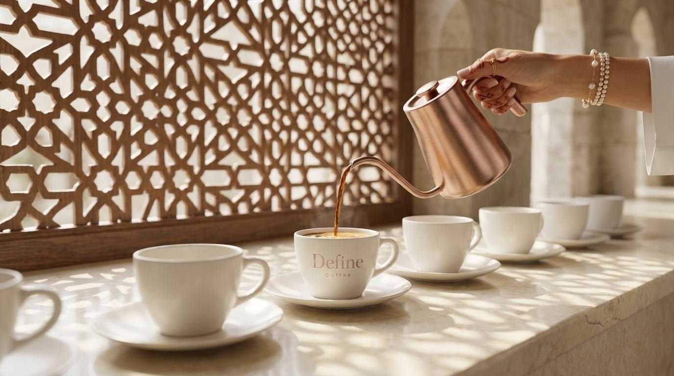
Coffee Shop Brand Identity Doha
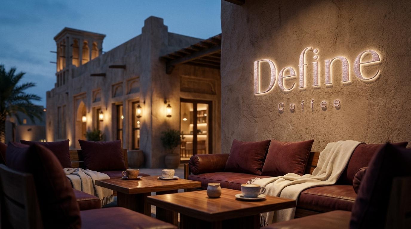
Define Coffee
... is an elegant specialty coffee and bakery destination in Doha, built around a precise and considered proposition: coffee and baked goods at a genuinely premium standard, presented with the visual care and spatial quality that a discerning Qatari audience expects. The name sets the standard immediately. To define something is to make it clear, to give it precise meaning, to distinguish it from everything that surrounds it. Mike Rock Studio built the complete brand identity, packaging system, and brand guidelines for Define Coffee, developing a visual world rooted in warmth, editorial elegance, and the specific sensory pleasure of a coffee shop that takes every detail seriously.
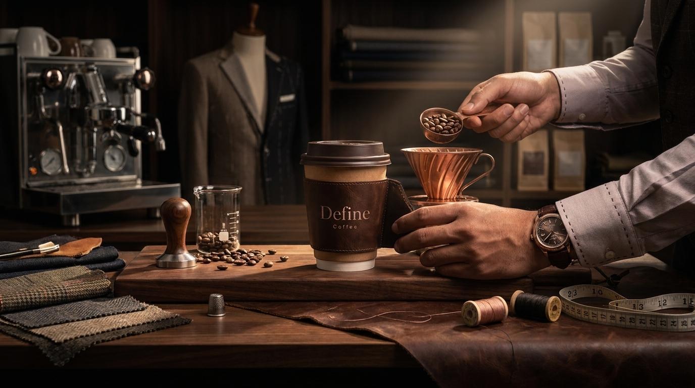
Doha's specialty coffee market has matured significantly. High-quality coffee is no longer a differentiator on its own, the standard of the product is assumed at the premium end of the market, and the competition for loyal customers is increasingly fought and won through the quality of the brand experience: the environment, the packaging, the visual coherence of every touchpoint from the cup in a customer's hand to the bag they carry out of the door.
For a new opening positioning itself as elegant and premium from day one, the challenge was building a brand system comprehensive enough to hold together across an unusually broad range of physical applications — four takeaway cup formats, special edition cups, luxe takeaway boxes, cake boxes, paper bags, shopping bags, bottle labels, staff uniforms, and business stationery — while maintaining the restrained, editorial quality that the positioning required. A system that works on a 60ml espresso cup and on a large shopping bag without losing coherence is a genuinely demanding design problem.
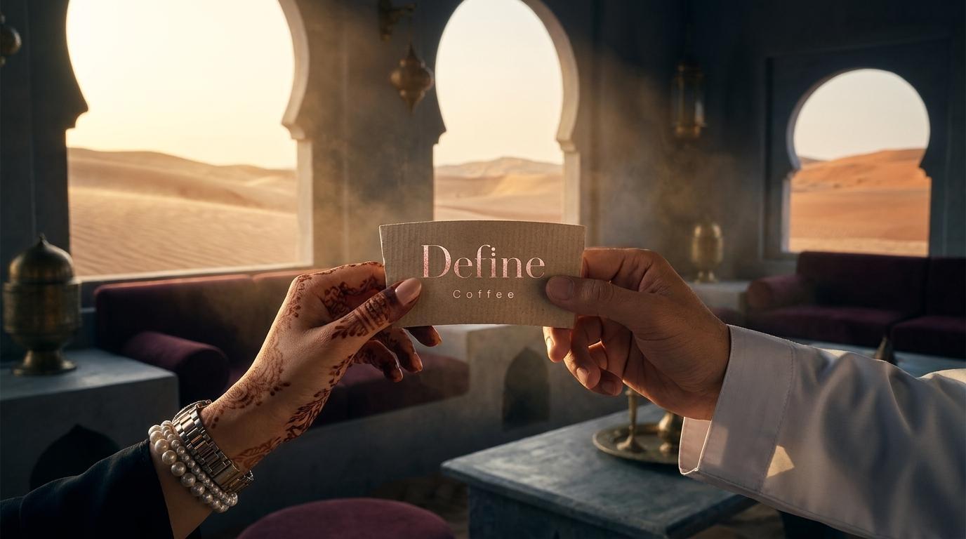
The Approach:
The wordmark is the creative foundation of everything. Define is set in a high-contrast editorial serif — a typeface with the proportions and detail of a fine fashion publication rather than a standard food and beverage identity. The letterforms carry their own weight and elegance without needing support from iconography, which is the right typographic choice for a brand called Define: the name does the work, the type does it beautifully.
The dual dot mark - two overlapping circles, slightly stacked, rendered in the brand's Pantone 7616 and 7614 palette of deep mauve and warm taupe — functions as both a secondary logomark and a repeating pattern element throughout the packaging system. It is the visual colon after the name: here is what Define means. The mark appears as a subtle surface embellishment on cup sleeves, as a bold element on shopping bags, as a textured pattern on special edition cups, and as the primary identifier on bottle labels and stationery. It travels the entire range without ever becoming decorative at the expense of meaningful.
The colour system is specific and disciplined: Pantone 7616 (deep brownish mauve) and Pantone 7614 (warm taupe) as the primary palette, with black and white for functional contexts. The palette references the sensory world of coffee and baked goods — the specific warmth of a well-made espresso, the colour of good butter in pastry — without illustrating any of it literally. Three photography categories were defined in the brand guidelines: brand photography focusing on the Define world and atmosphere, product photography showing the food and drink with editorial precision, and location photography capturing the store environment. Each category has its own visual logic while remaining coherent as part of the same brand world.

The Work
Brand Identity & Wordmark:
The Define Coffee editorial serif wordmark and dual dot secondary mark, built to hold their quality across every scale from a bottle label to a shopping bag.
Comprehensive Packaging System:
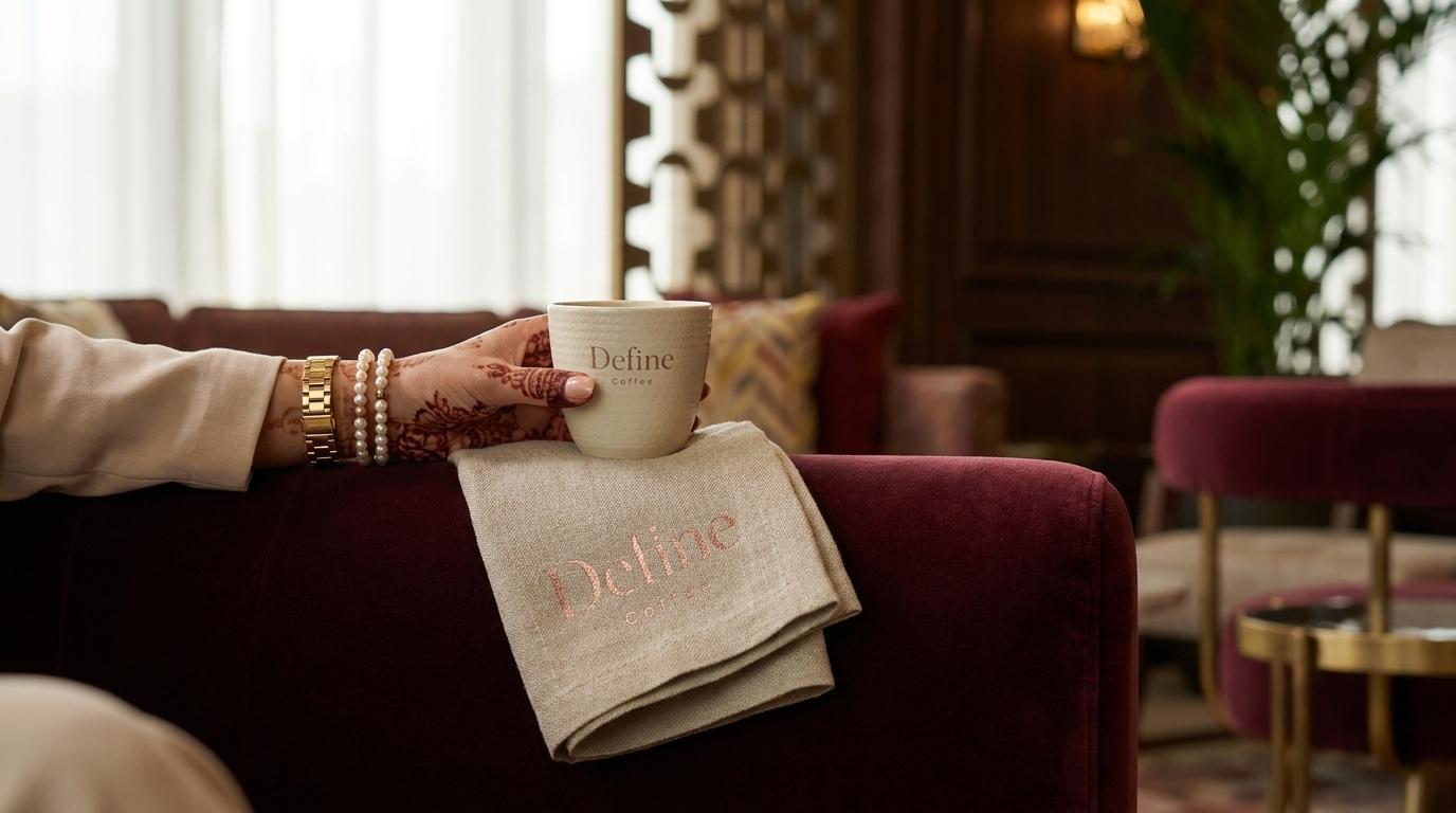
Four takeaway cup formats in the core palette, special edition cups with a dot-pattern surface, luxe takeaway boxes with magnetic closures, cake boxes with branded ribbon handles, paper bread bags with half-circle mark applications, standard and premium shopping bags in mauve and white, bottle neck labels, and the dual takeaway cup holder system. Every format developed from the same visual logic, every piece carrying the same quality signal.
Staff Uniform:
Full and half apron in Pantone 7616 with the dual dot emblem embroidered on the pocket, and branded shirt collars — the identity carried into the human element of the Define Coffee experience.
Brand Guidelines:
A comprehensive guidelines document covering colour specifications, typography rules, logo application, packaging formats, photography direction across three defined categories, and stationery.
Stationery:
Business cards in both the dark and light palette options, with the dual dot mark as the reverse face.
The Outcome:
Define Coffee opened in Doha with one of the most complete and coherent brand systems in the GCC specialty coffee market. The editorial serif wordmark and warm palette communicate premium quality immediately and consistently across every format. The packaging system is extensive enough to serve every customer interaction from a quick espresso to a gifted bakery box, without a single touchpoint feeling like an afterthought. A coffee shop that defines what it is at every scale.

Project Details:
Services: Brand Identity, Wordmark, Dual Mark, Packaging System, Staff Uniform, Brand Guidelines, Stationery
Industry: Specialty Coffee, Bakery, Premium F&B
Location: Doha, Qatar
Market: Qatar Premium F&B, Doha Specialty Coffee, GCC Hospitality