Commercial & Industrial Real Estate Branding USA
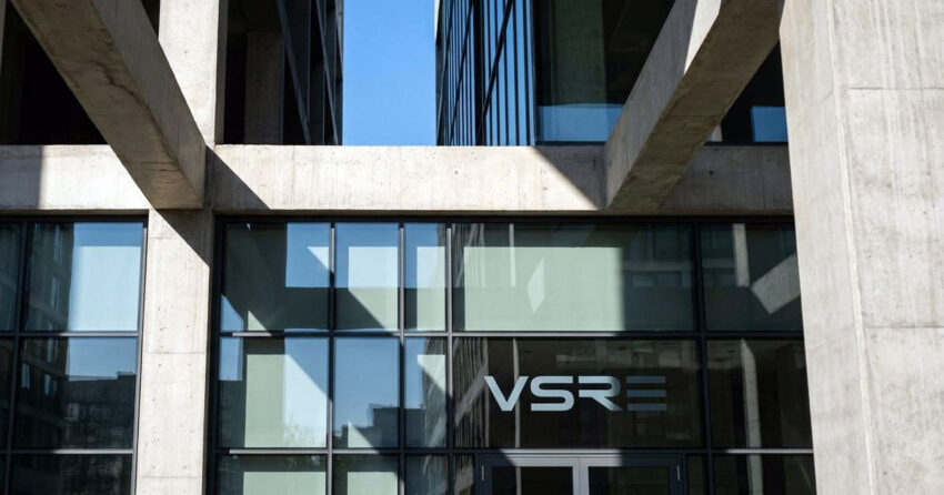
VSRE is an institutional-grade industrial real estate firm with over twenty years of experience across the full life cycle of industrial assets — development, capital investment, commercial sales, and industrial leasing. Operating in Miami, one of North America's key gateway markets for global trade, VSRE positions itself as more than a brokerage: a partner in logistical and architectural transformation for global logistics entities, institutional funds, and supply chain developers. Mike Rock Studio built the corporate identity, asset collateral, and B2B digital layout system for a firm whose category had never been branded with the seriousness it deserved.
The Challenge:
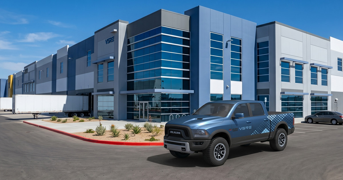
Industrial real estate: logistics hubs, distribution centres, manufacturing facilities, cold storage has historically been an afterthought in design terms. Luxury design studios gravitate toward skyscrapers and residential towers; industrial brokerage is left with generic warehouse clip art and templated corporate identities that say nothing specific about the firm behind them. For a brokerage managing high-value industrial portfolios in a competitive market like Miami, that visual vacuum was an opportunity.
VSRE's clients institutional funds, supply chain developers, global logistics operators evaluate spatial efficiency, transport connectivity, and structural longevity as a matter of course. They are sophisticated, data-driven, and entirely unmoved by decorative branding. The challenge was building an identity that communicated the same rigour the firm brings to its asset analysis: precise, structurally confident, and built on the genuine visual material of the industry it serves concrete, steel, the organised geometry of a distribution hub rather than borrowing the aesthetic of luxury residential brokerage and hoping it would transfer.
The Approach:
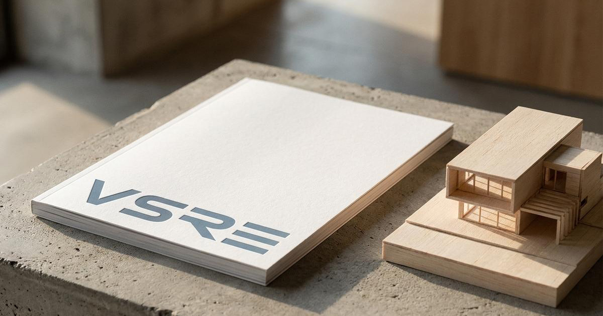
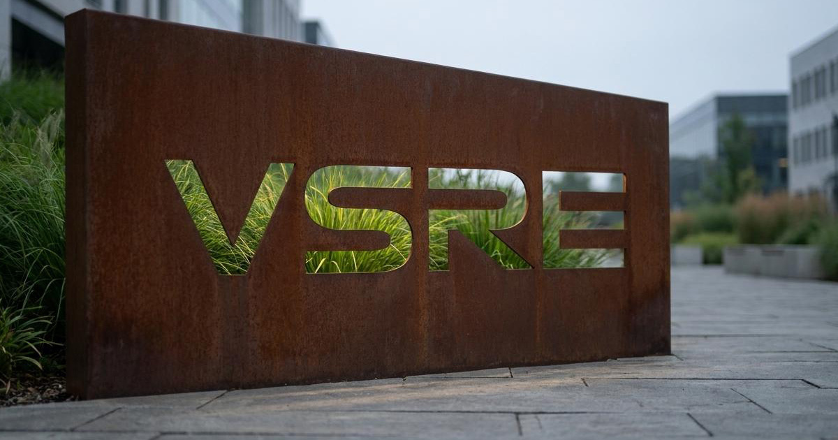
The wordmark was built from the ground up rather than selected from convention. VSRE is set in an ultra-wide, low-profile geometric sans-serif — wide and grounded enough to suggest the stability of a structural foundation rather than the verticality most real estate brands reach for. The R and E carry elongated horizontal bars and open, stencil-like cuts, a deliberate reference to logistical flow paths and structural steel rather than decoration for its own sake.
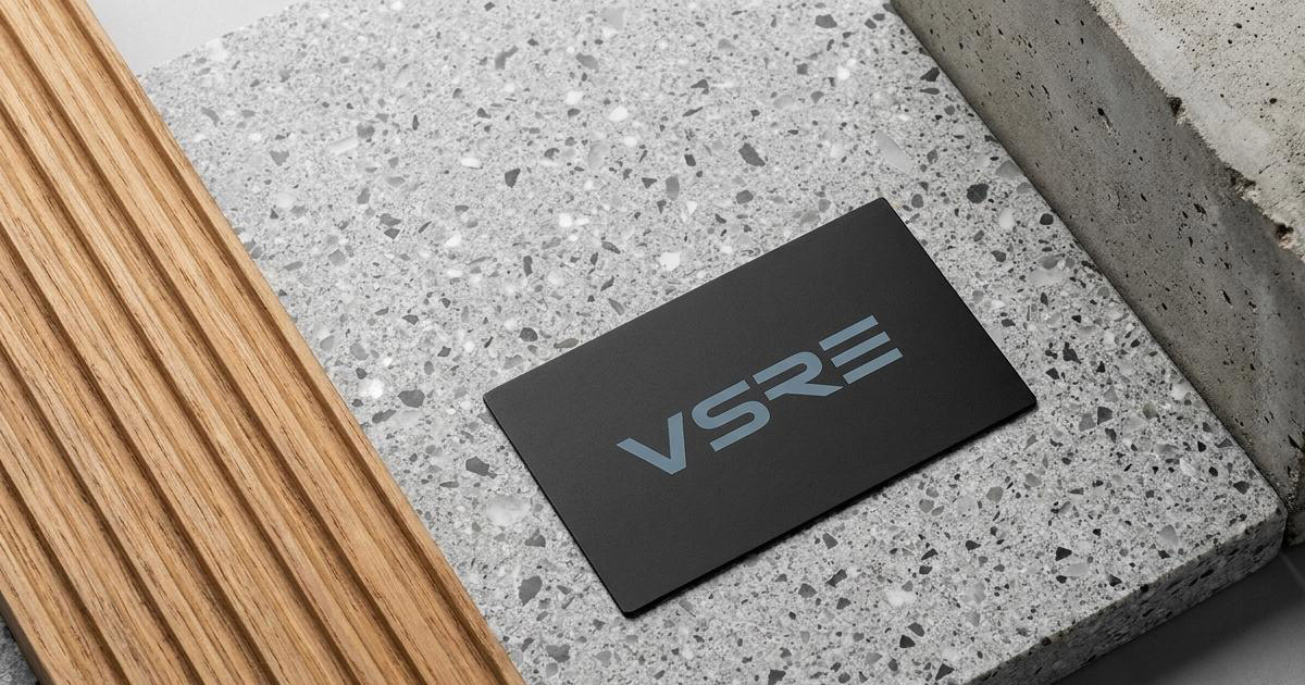
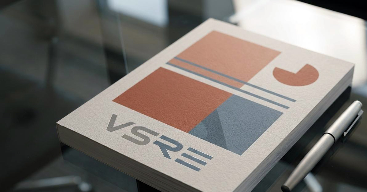
The colour palette: slate blue and steel grey was chosen for restraint. These are the actual tones of premium construction materials and modern logistics infrastructure, not an interpretation of them. The discipline of the palette matters as much as the colours themselves: an institutional client reviewing an asset prospectus responds to consistency and control, not visual flourish.
Layouts across every applicationL pitch decks, spec sheets, digital templates follow a strict grid with generous white space, mirroring the layout logic of a well-run distribution facility. Technical data: clearance heights, bay dimensions, investment yields is set with high-contrast typography in precise data grids, so the numbers that actually drive an institutional decision are the easiest thing on the page to read.

The Work:
Brand Identity:
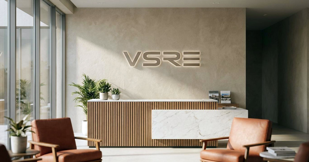
A complete corporate identity system built around the custom geometric wordmark, slate-and-steel colour palette, and a strict grid-based layout language built to read as institutional, precise, and unmistakably industrial rather than borrowed from luxury residential branding.
Asset Portfolios & Spec Sheets:
A full set of investor-facing sales materials, including technical property specification layouts, custom-bound development brochures, and investment prospectus templates built so that asset data is the most legible thing in the room.
B2B Digital Layout:
A digital template system for VSRE's institutional clients: clean asset filtering grids, regional capability maps, and a streamlined path from enquiry to consultation, built for buyers who already know what they're looking for.
The Outcome:
VSRE entered the Miami industrial real estate market with an identity built specifically for its category rather than adapted from someone else's. The geometric wordmark and disciplined slate-steel system give the firm a visual presence that matches the seriousness of the assets it manages — and a brand that institutional clients recognise as built by people who understand the business, not just the aesthetics of business.
A visual system for the infrastructure that quietly runs everything else.

Project Details:
Services: Brand Identity · B2B Corporate Positioning · Asset Portfolio Layout · Technical Collateral
Industry: Industrial Real Estate · Logistics Infrastructure · Commercial Investment & Leasing
Location: Miami, USA
Market: North American Industrial Real Estate · Institutional Investment · Global Logistics