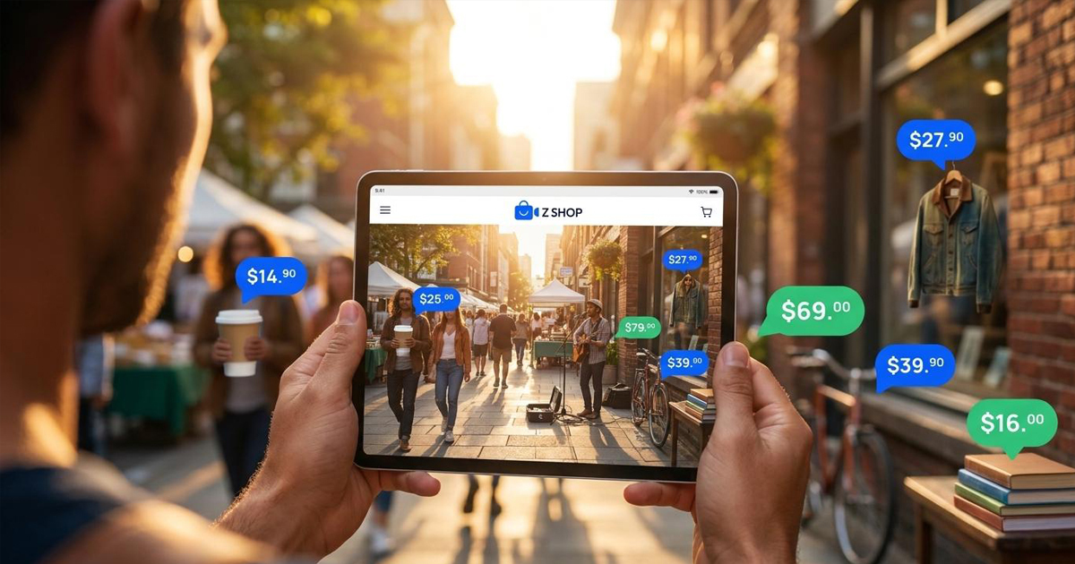
Social Commerce app Brand Identity

ZShop is a social commerce platform built around a single, genuinely novel idea: buying and selling products during Zoom meetings. Not a separate marketplace tab, not a parallel app, commerce happening naturally within live virtual conversations, where users can present, discuss, and complete transactions in real time without leaving the call. Mike Rock Studio created the logo and brand identity for ZShop, developing a clean visual system that reflects the platform's core proposition: simplicity, speed, and seamless digital interaction.

The Challenge:
Social commerce is a crowded category, but ZShop's specific context, Zoom - gave it a distinct positioning problem. Most e-commerce branding leans heavily into either corporate marketplace aesthetics or playful startup energy. Neither was right for a platform that needed to feel like a natural extension of a professional communication tool while remaining accessible enough for mass adoption.
The identity also had a demanding set of technical requirements. A logo that needs to work as an app icon at 64 pixels, as a Zoom meeting overlay, across mobile onboarding screens, social media templates, and presentation environments cannot afford any visual complexity. Every element has to earn its place by contributing to recognition and legibility rather than character. Simplicity at this level is a harder brief than it looks.

The Approach:
The creative direction centred on frictionless commerce: the visual equivalent of how the platform itself is supposed to feel. The logo system was built from minimal geometry and clean typography, designed to function as both a recognisable app symbol and a flexible digital identity asset across every format the platform needed it to serve.
Rather than reaching for literal e-commerce graphics shopping carts, arrows, currency symbols, the identity uses reduction and clarity to communicate the platform's speed and simplicity. The visual language reflects movement and connection without illustrating them, which produces a more scalable and future-focused result than anything more literal would achieve. The balance was between startup accessibility and enough sophistication to position ZShop as a credible technology platform rather than a side project.

The Work:
Logo Design:
A modern, scalable logo system built for app environments, social platforms, and digital interfaces performing at every size from an app store icon to a presentation deck header.
Visual Identity:
Typography, colour direction, and UI-inspired visual systems built for digital-first usability across the full range of ZShop's touchpoints.
App Branding:
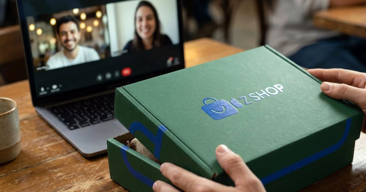
A lightweight, adaptable identity system designed to perform across onboarding screens, app stores, social media, and meeting environments without losing recognition or clarity at any scale.
Digital Art Direction:
Clean, contemporary brand applications focused on simplicity, usability, and modern tech aesthetics.
The Outcome:
ZShop launched with a visual identity that communicates its proposition immediately: clear, approachable, and digitally contemporary. The branding positions the platform between e-commerce and live communication, helping users understand its purpose without requiring explanation. A social commerce platform built for the era of virtual meetings, with an identity built to the same standard of frictionless simplicity.

Project Details:
Services: Logo Design, Brand Identity, Digital Branding, App Visual System
Industry: E-Commerce, Technology, Social Commerce
Market: Global Digital, Social Commerce, B2B SaaS-Adjacent