Community Brand Identity Dubai
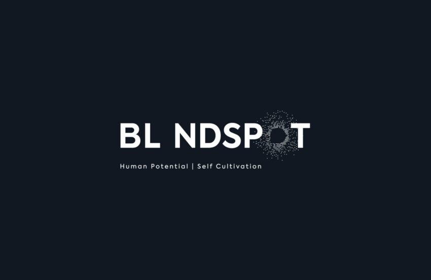
Blindspot is a Dubai-based community and membership platform built around a simple but ambitious idea: that access to inspiring thinking shouldn't be limited by geography, background, or who you happen to know. Members get curated ideas, exclusive content, and invite-only events with speakers who are genuinely worth hearing. Mike Rock Studio built the brand from the ground up, identity, digital, print, and collateral for a platform that needed to feel both intellectually credible and genuinely welcoming.
The Challenge:
Community brands carry a particular creative risk: they can easily tip into either elitism or earnestness, and both are equally off-putting. A platform built around exclusive invite-only events risks feeling closed; one that leads too hard on inclusivity risks feeling insubstantial. Blindspot needed to hold both accessible in its mission, distinctive in its execution.
The name itself was the most interesting starting point. A blindspot is something you can't see from where you're standing — a gap in your perspective, not a flaw in your intelligence. Framed correctly, it's an invitation rather than a criticism: here are the ideas, angles, and conversations you didn't know you were missing. The brand needed to carry that framing consistently, across every touchpoint from a digital platform to an event lanyard.
The Approach:
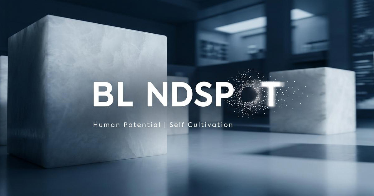
The creative strategy was built around the concept of illumination not in the clichéd lightbulb sense, but in the more considered idea of bringing something previously unseen into view. The visual language needed to suggest discovery, perspective, and the particular energy of a room full of people who have just encountered an idea that changes how they see something.
The identity was designed to feel intelligent without being academic, premium without being exclusive, and warm without being generic. For a brand operating across Dubai's diverse international community and reaching a global audience online, that tonal precision mattered enormously. The wrong register - too corporate, too casual, too niche would undermine the platform's core proposition before anyone read a word of the content.
Every design decision was tested against the member experience: how does this feel when you receive an invitation? When you arrive at an event? When you share something from the platform online?
The Work:
Brand Identity & Guidelines:
A complete visual identity system built around the Blindspot concept: logomark, typography, colour, and comprehensive brand guidelines covering digital, print, and event applications. A system coherent enough to scale as the community grows.
Digital:
A digital identity designed for the platform and its social presence — built to carry the brand's intelligence and warmth into the channels where members and prospective members first encounter it.
Print & Event Collateral:
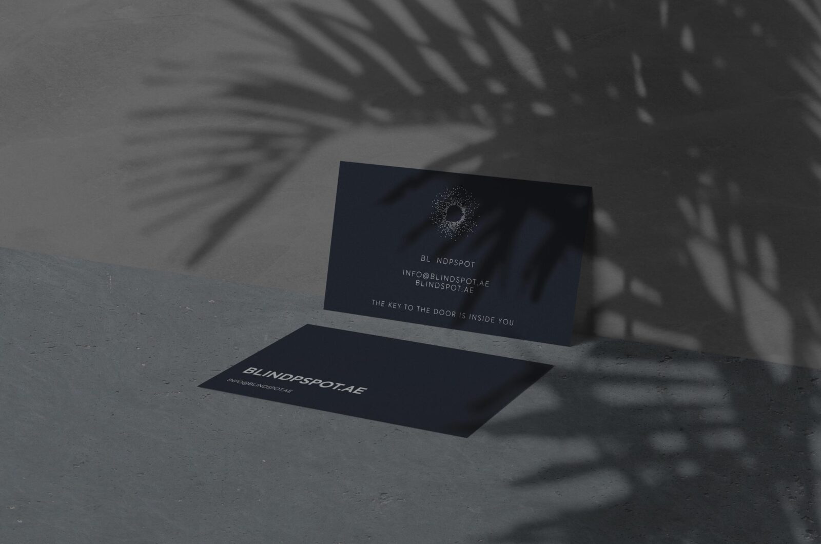
Invitations, event materials, and physical collateral designed to make membership feel tangible. In a world of digital-first brands, considered print materials signal that Blindspot takes its community seriously enough to invest in the physical experience.
Membership Collateral:
A suite of member-facing materials that communicate the value of belonging — reinforcing the platform's promise of exclusive access, curated thinking, and genuine community.
The Outcome:
Blindspot launched with a brand identity that resolves its central tension cleanly: it feels exclusive without being closed, intelligent without being intimidating, and global in its ambitions while remaining rooted in Dubai's remarkably international community. The identity system is built to carry the platform as it grows — locally, regionally, and worldwide.
Project Details:
Services: Brand Identity · Brand Guidelines · Digital · Print · Event Collateral · Membership Collateral
Industry: Community & Membership · Events · Ideas & Culture
Location: Dubai, UAE
Market: Dubai International Community · Global Online Membership