Green Construction Brand Identity
Modula is a green construction technology company operating at the intersection of two things the global investment market has historically struggled to reconcile: genuine environmental responsibility and attractive financial returns. Working with project developers and private equity firms worldwide, Modula brings proprietary building technologies to high-value sectors, affordable housing, specialised industrial facilities where the case for sustainable construction is as much financial as it is ecological. Mike Rock Studio built the brand identity and guidelines for a company that needed to be trusted by the most risk-averse audiences in global finance.

The Challenge:
Green construction has a credibility problem. In a market where "sustainable" has become a modifier applied to almost anything, and where genuinely superior technology sits alongside a great deal of greenwashing, the burden of proof for a company like Modula is significantly higher than in most sectors. Project developers and private equity firms don't invest in good intentions, they invest in demonstrable, quantifiable returns. The brand needed to communicate exactly that: not sustainability as an aspiration, but as a proven financial and operational advantage.
Modula entered this market as a new name with serious technology and no established visual identity. The challenge was building a brand from scratch that could earn the confidence of risk-averse commercial stakeholders, people who have seen a great many green technology companies come and go while clearly communicating what makes Modula's approach genuinely different.
Three principles defined the brief: solidity, integrity, and reliability. The brand needed to embody all three before a prospective investor read a single line of the proposition.

The Approach:
The audience shaped every creative decision. Private equity firms and project developers operate in a visual environment of established financial institutions, law firms, and asset managers, brands built on authority, restraint, and the careful communication of competence. A green construction brand pitching to this audience cannot afford to look like an environmental campaign or a startup. It needs to look like it belongs in the room.
The creative direction drew on the structural logic of Modula's own technology: precision, modularity, the careful assembly of proven components into something greater than its parts. A visual language built on those principles communicates the company's approach before any explanation is required which, for an audience that makes decisions about where to place significant capital, is exactly the right starting point.
The identity was designed to travel without translation. A global brand serving investors across multiple markets and regulatory environments needed a visual system that was culturally neutral in the right ways, authoritative and consistent whether encountered in a London boardroom, a Dubai investor presentation, or a North American project development context.

The Work:
Brand Identity:
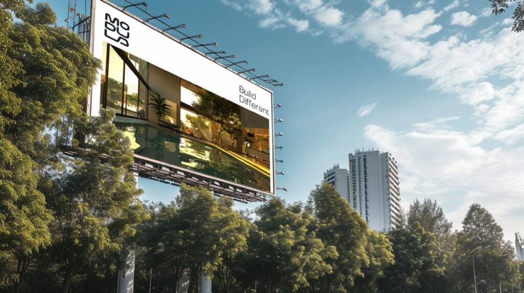
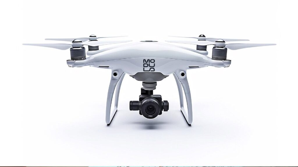
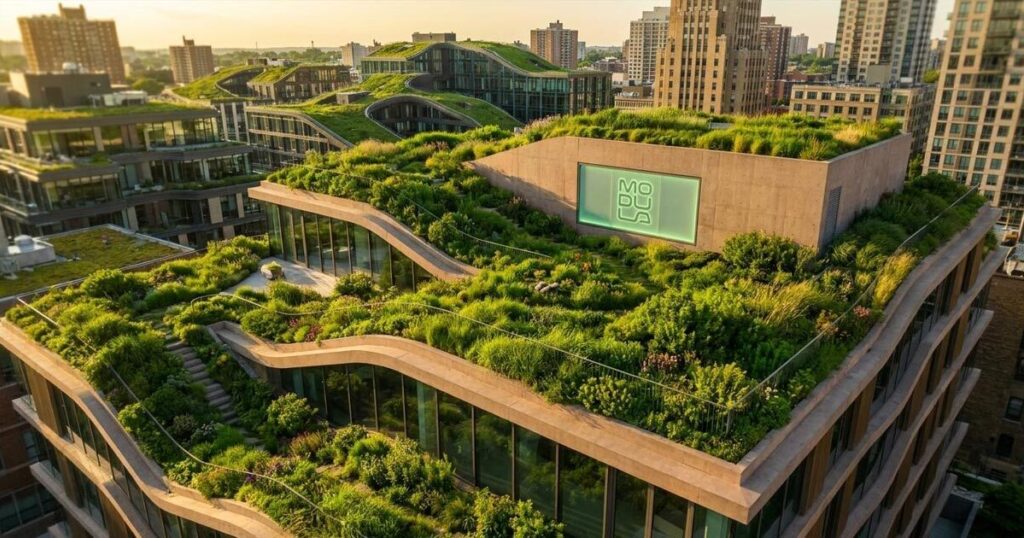
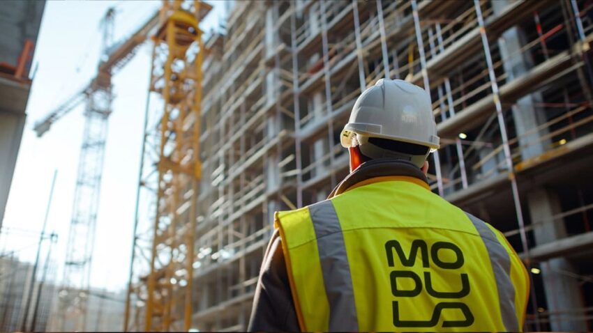
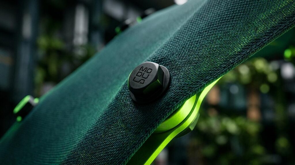
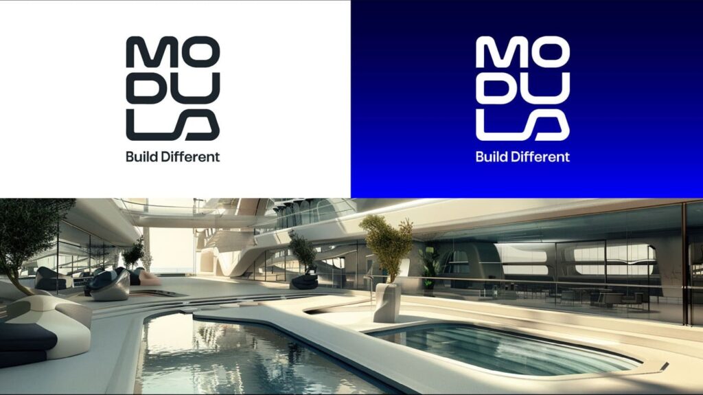
A complete visual identity for Modula: logomark, typography, colour system, and the visual language of a global green construction technology brand. Built to communicate solidity, integrity, and reliability to the most discerning financial audiences in the world.
Brand Guidelines:
A comprehensive guidelines system covering every application of the Modula identity across digital, print, investor materials, and environmental contexts. Designed to ensure consistency as the company grows its presence across global markets.
The Outcome:
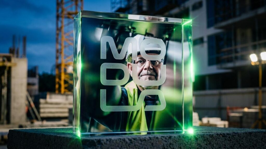
Modula launched with a brand identity that earns its place in the rooms where investment decisions are made. The visual system communicates the company's core proposition, that ecological responsibility and financial profitability are not mutually exclusive without needing to argue for it. The brand does that work before the conversation begins.
The identity is built on the same principles as Modula's technology: solidity, integrity, and reliability. It is designed to last as long as the investments it represents.
Project Details:
Services: Brand Identity · Logomark · Brand Guidelines
Industry: Green Construction · PropTech · Sustainable Investment
Location: Global
Market: Private Equity · Project Developers · Institutional Investors