Luxury Kimono Brand Identity Qatar
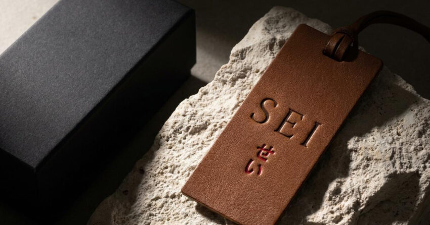
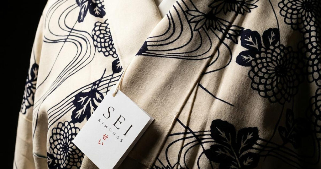
Sei Kimonos is a luxury fashion brand built at the intersection of Japanese artistry and Gulf elegance, a label that reinterprets traditional Japanese silk kimonos through a contemporary Middle Eastern lens, creating garments that function as both collectible wearable art and refined abayas. The name Sei originates from Seigaiha, a traditional Japanese wave motif symbolising resilience, peace, continuity, and good fortune. Every kimono in the collection is hand-painted, hand-embroidered, and made from pure silk, making each piece inherently unique. Mike Rock Studio built the brand identity, art direction, packaging, and positioning for a label whose brief was among the most philosophically considered in the portfolio.
The Challenge:
Sei Kimonos sits between two things that rarely share the same space in fashion branding: authentic cultural heritage and contemporary luxury positioning. The risk in a brief like this is always the same, the brand tips toward costume rather than fashion, or toward trend rather than timelessness, and in doing either it misrepresents both traditions it is drawing from.
Each garment in the Sei collection is made slowly and individually, placing it firmly outside the seasonal fashion cycle. The brand needed to communicate that distinction clearly: this is not a fashion label that makes kimono-inspired pieces. It is a maker of collectible garments that happen to function beautifully as contemporary abayas within Gulf fashion culture. The visual identity needed to carry that distinction without requiring an explanation.
The Approach:
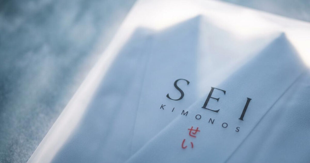
The creative direction centred on cultural fluidity through minimalism. A visual identity built on restraint, allowing typography, spacing, materiality, and symbolism to carry emotional weight rather than relying on surface ornamentation. Inspired by Japanese editorial design philosophy, the identity embraces silence, negative space, and controlled elegance.
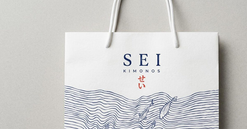
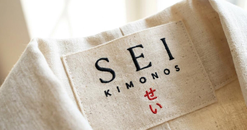
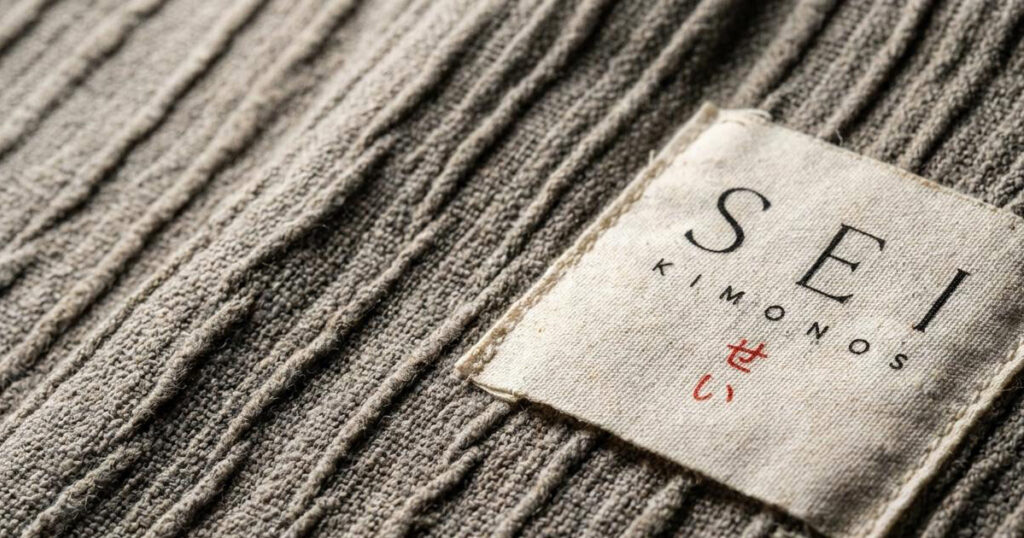
The Seigaiha philosophy, waves of continuity and resilience, informed the wider visual language without being made literal. Flowing compositions, gentle movement, layered textures, and rhythmic balance drawn from the symbolism of water rather than its illustration. The logo uses refined serif typography with delicate spacing, letterforms that feel timeless and poised rather than trend-adjacent, echoing fashion-house sophistication and traditional craft in the same mark.
The brand world was shaped to feel at home within Gulf luxury culture as naturally as it references Japanese aesthetic tradition. The garments themselves are the cultural bridge the brand is built around, so the identity was never going to achieve that through visual symbolism alone. It achieves it through atmosphere: the quality of restraint, the pace of the visual language, and the deliberate slowing down that the brand embodies as a philosophy.
The Work:
Brand Identity:
A refined luxury identity system including logo design, typography, colour direction, and visual language built on Japanese minimalism and editorial fashion aesthetics.
Fashion Brand Positioning:
Strategic positioning placing Sei Kimonos within the collectible luxury category rather than trend-driven retail fashion, communicating rarity, artistry, and cultural depth to both Gulf and international audiences.
Packaging & Brand Touchpoints:
Premium packaging concepts and tactile brand applications designed to reinforce the craftsmanship, rarity, and gifting value of each hand-made piece.
Art Direction:
A visual world built on silence, softness, movement, layered textiles, natural light, and the specific quality of cultural elegance that defines the Sei Kimonos proposition.

The Outcome:
Sei Kimonos launched with a brand identity that holds its position between luxury fashion, wearable art, and cultural storytelling without needing to choose between them. The visual language is slower and quieter than most fashion brands, which is precisely right for a label built on the opposite of the seasonal trend cycle. A brand for garments that are meant to be kept.
Project Details:
Services: Brand Identity, Logomark, Art Direction, Packaging, Fashion Positioning
Industry: Luxury Fashion, Artisan Textiles, Cultural Fashion
Location: Qatar
Market: Qatar Luxury Fashion, GCC Modest Wear, International Collectible Fashion

